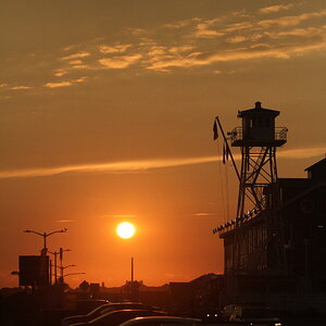
Photography books say that if horizon is placed at one third of the frame then it creates more impact. To me this pic seems to be divided into two equal parts with horizon at the dead centre. Try cropping it and see if it can be made more eye catching to the viewers.




![[No title]](/data/xfmg/thumbnail/39/39438-1eb8b5f82b59d9d0c72ae9025778ed4c.jpg?1734173528)
![[No title]](/data/xfmg/thumbnail/39/39182-efc21fe87c9b5f9b2fa9ab0f8f01c205.jpg?1734173056)

![[No title]](/data/xfmg/thumbnail/39/39443-45e1b162b6c7c1d8ebbc8faf5623b705.jpg?1734173533)