What's new

Nighttime city shoreline for C&C

crimbfighter

Been spending a lot of time on here!
Joined
Jun 4, 2010
Messages
2,219
Reaction score
1,784
Location
Wisconsin, United States
Can others edit my Photos
Photos OK to edit
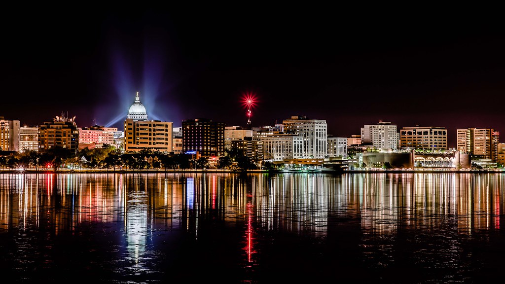
I took a similar photo a week or so ago, but wasn't satisfied with it, so I re-shot it tonight. This is the Madison, WI shoreline. Here's my best effort. This is actually a composite due to the capitol dome being so much brighter than the rest of the buildings. I had to layer mask in a more appropriately exposed dome. C&C appreciated. I'm going to end up getting this printed in large format canvas (probably 36x20) for a co-worker of mine when I'm satisfied with the end result.
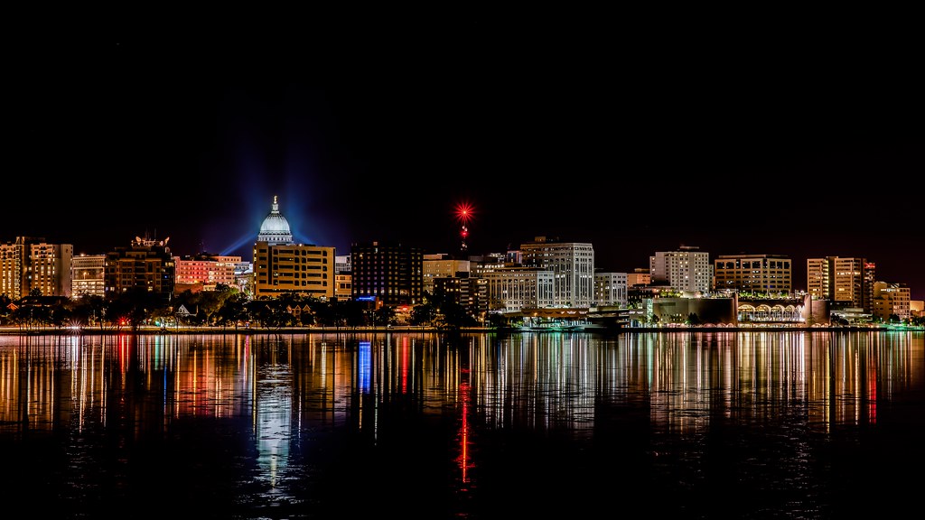
14260530631_bb099a1a11_b.jpg
 
Love it! it's gorgeous. I wish there were stars, but the picture is amazing as it
 
It's a little underexposed (or possibly just dark), and you have an awful lot of dead sky you can crop.

Read the nighttime photography guide in my sig.
 
Love it! it's gorgeous. I wish there were stars, but the picture is amazing as it

Thanks!

It's a little underexposed (or possibly just dark), and you have an awful lot of dead sky you can crop.

Read the nighttime photography guide in my sig.

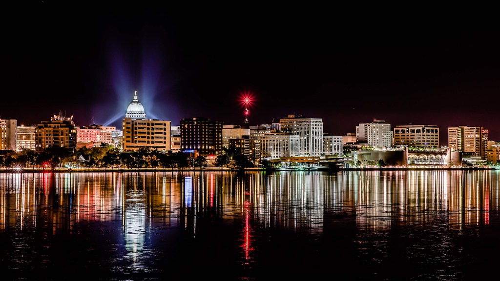
Thanks for the feedback, manaheim. I actually read your guide some time ago, which was where I was deriving most of my technique from. I adjusted the photo a tad after taking another look at it this morning. I agree, it was dark. I brought up the exposure and shadows a little, and dialed the highlights back down accordingly. As for the large amounts of dark sky, I find a bit of a conundrum with it. This particular shoreline is comprised of a series of short buildings, and you can't get closer to it because it's, well, a shoreline on a big lake.. As a result, the challenge I found was composing it to get a decent amount of the shoreline in the image without making it feel like a pano, which is what I didn't want. I tightened up the crop a little bit, which I think helped, but I just don't want to lose any more of the shoreline in order to lose more sky. I also reduced the vibrance a little. I thought the color was just a bit too intense. What are your thoughts on this re-edit?

14080390538_5ee7ff00c6_b.jpg
 
I'm going to end up getting this printed in large format canvas (probably 36x20) for a co-worker of mine when I'm satisfied with the end result.
According to my grid, it needs straightening by 0.3 degrees.
 
According to my grid, it needs straightening by 0.3 degrees.

Are you measuring the horizontal shoreline, or the verticle buildings? I ask because the horizon IS slightly tilted, which is because the right side of the shore is significantly farther away than the left side, creating an upward slant to the right as a result. However, the buildings are verticle. I tried correcting the horizon, but then the buildings lean, which feels worse.. I suppose I could try a slight perspective adjustment.
 
I think that did it. +7 horizontal distortion adjustment seems to have brought it level. Thanks for the feedback.

14080753097_92cf624d7b_b.jpg
 
Agreed with manaheim with too much dead sky. You can either crop the sky a little bit or play with it in lightroom to create your own sky.
 
Looks good, but I agree with the above about the dead sky. Either way, I like it though.
 
According to my grid, it needs straightening by 0.3 degrees.

Are you measuring the horizontal shoreline, or the verticle buildings? I ask because the horizon IS slightly tilted, which is because the right side of the shore is significantly farther away than the left side, creating an upward slant to the right as a result. However, the buildings are verticle. I tried correcting the horizon, but then the buildings lean, which feels worse.. I suppose I could try a slight perspective adjustment.

Actually, you don't see the horizon in this shot.

I did not use the opposite shoreline, but rather the verticals near the center. Remember that the lake is presumed to be level, therefore it acts as a mirror that is level. I used the Capitol building and the tower and their respective reflections in the water.

Your distortion correction did not fully account for the tilt, which is still 0.3 degrees.

Here's the level version:

$14080753097_92cf624d7b_b - Version 2.webp
 
Last edited:
Looking better! I get your concern with the pano... I try to avoid that when I can, but find even on taller skylines I pretty much have to do it.
 
According to my grid, it needs straightening by 0.3 degrees.

Are you measuring the horizontal shoreline, or the verticle buildings? I ask because the horizon IS slightly tilted, which is because the right side of the shore is significantly farther away than the left side, creating an upward slant to the right as a result. However, the buildings are verticle. I tried correcting the horizon, but then the buildings lean, which feels worse.. I suppose I could try a slight perspective adjustment.

Actually, you don't see the horizon in this shot.

I did not use the opposite shoreline, but rather the verticals near the center. Remember that the lake is presumed to be level, therefore it acts as a mirror that is level. I used the Capitol building and the tower and their respective reflections in the water.

Your distortion correction did not fully account for the tilt, which is still 0.3 degrees.

Here's the level version:

View attachment 74923

Thanks for taking the time to continue to look at this one, Designer. I have to admit, I was just not seeing the 0.3 deg tilt, but I trusted your eye and input the value. I couldn't tell the difference until I toggled back and forth, but then I can see there is enough of a difference to be discernible. And I mis-typed. Clearly there is not horizon in the image, but the water (which is typically level) is what I was intending to reference as the horizon.

Looking better! I get your concern with the pano... I try to avoid that when I can, but find even on taller skylines I pretty much have to do it.

Thanks manaheim. I think it may certainly end up that way.. Though, I think one thing to take into consideration, is that a gallery wrap will take nearly 3 inches off the length and width of the image, so some of the sky will be consumed with that.

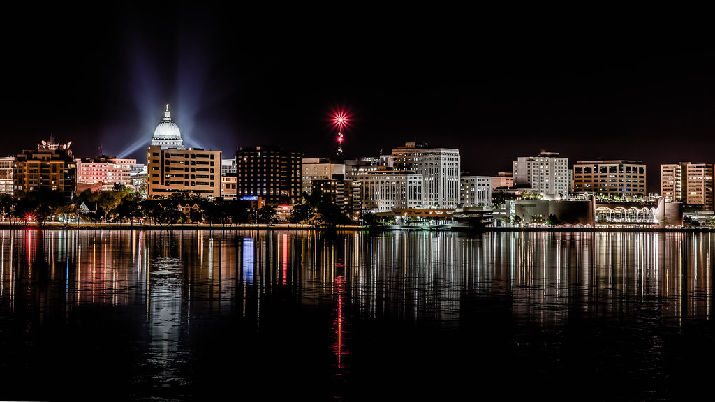
Anyway, taking many things into consideration, including the new 0.3 degree rotational adjustment, a slightly new crop with even less sky, an adjustment to bring the color vibrance down even more, a GND to bring down the reflections, and finally a some last shadow/highlight adjustments, I think I have my final edit...

14248703126_f616bba3d1_b.jpg
 
Thanks for taking the time to continue to look at this one, Designer. I have to admit, I was just not seeing the 0.3 deg tilt, but I trusted your eye and input the value. I couldn't tell the difference until I toggled back and forth, but then I can see there is enough of a difference to be discernible.

It's a blessing.

And a curse.

And I don't want to come off as a nag, but you tilted it the wrong way. It is now 0.6 degree off. Sorry. :blushing:
 
Thanks for taking the time to continue to look at this one, Designer. I have to admit, I was just not seeing the 0.3 deg tilt, but I trusted your eye and input the value. I couldn't tell the difference until I toggled back and forth, but then I can see there is enough of a difference to be discernible.

It's a blessing.

And a curse.

And I don't want to come off as a nag, but you tilted it the wrong way. It is now 0.6 degree off. Sorry. :blushing:

You're killing me, Designer! :lmao:

Ok, here's my last final, wont happen again, edit, with the correct corrected rotational adjustment.

14248703126_f616bba3d1_b.jpg
 

Create an account or login to comment

You must be a member in order to leave a comment

Create account

Create an account on our community. It's easy!

Log in

Already have an account? Log in here.

Back
Top Bottom