You are using an out of date browser. It may not display this or other websites correctly.
You should upgrade or use an alternative browser.
You should upgrade or use an alternative browser.
No More the Hero
- Thread Starter ceeboy14
- Start date
- Joined
- Aug 27, 2012
- Messages
- 2,289
- Reaction score
- 661
- Location
- Orlando, FL
- Can others edit my Photos
- Photos OK to edit
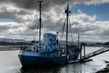
Its not bad, I'd say the "star" being the boat is a little dark, looks like you are exposed for the sky. Pretty cool though.
ceeboy14
TPF Noob!
- Joined
- Dec 5, 2012
- Messages
- 2,566
- Reaction score
- 788
- Location
- Florida
- Can others edit my Photos
- Photos OK to edit
- Thread Starter 🔹
- #3
Actually I shot for the midtones. In hindsight, I wish I'd done a three shot bracket. Try this view: http://www.flickr.com/photos/54965930@N07/9417824439/
- Joined
- Aug 27, 2012
- Messages
- 2,289
- Reaction score
- 661
- Location
- Orlando, FL
- Can others edit my Photos
- Photos OK to edit
Link came up private. Post it here.
amolitor
TPF Noob!
- Joined
- May 18, 2012
- Messages
- 6,320
- Reaction score
- 2,131
- Location
- Virginia
- Can others edit my Photos
- Photos OK to edit
- Banned
- #6
This looks to me like you got interested in the subject, which is a good and interesting subject, but lost track of the frame in that interest. Or, possibly, you had the wrong lens and no room to back up?
Anyways. I like the blue tones, it's an interesting and nearly surrealist color palette, with the boat matching the sky in general color terms. While it looks underexposed at first, I don't find it so. On the one hand, in technical terms, the boat is fairly obviously under one of the scattered clouds, and hence in "open shade" as it were. In artistic terms, the muted, slightly dim, tonality contributes to the feeling of dereliction that I think you were going for here. In fact, I suspect the boat is no more derelict than I am, it's merely a working boat that's been shut down for a few days or weeks and has some makeshift covers on her. So, I am reading this strong feeling of dereliction as largely your creation. Well done!
The frame, to my eye, needed to be a fair bit looser. This might even work as a portrait orientation, with the boat filling the bottom of a frame filled with dramatic skies. But then, I just got done shooting my ass off in pretty much that format, so I am assuredly prejudiced.
ceeboy14
TPF Noob!
- Joined
- Dec 5, 2012
- Messages
- 2,566
- Reaction score
- 788
- Location
- Florida
- Can others edit my Photos
- Photos OK to edit
- Thread Starter 🔹
- #8
More so no room to back up than not enough lens. Backlit, moody sky, blah-blah-blah. For me, this is so much more about the processing and working within the image than the setting itself - though I do like the shot. I agree as to needing more headroom above the masts and may go build some later today. I may even give the portrait orientation a shot. I hadn't thought of that.
As to the boat not being a derelict..it is very much so. In fact it was so cluttered with crap, I couldn't make a sun behind me shot of any great interest.
As to the boat not being a derelict..it is very much so. In fact it was so cluttered with crap, I couldn't make a sun behind me shot of any great interest.
KenC
Been spending a lot of time on here!
- Joined
- Jan 18, 2010
- Messages
- 5,699
- Reaction score
- 1,472
- Location
- Philadelphia
- Can others edit my Photos
- Photos NOT OK to edit
I like the relative darkness of the boat for pretty much the reasons Andrew gave, and I prefer it to the alternate version. I also like the tight crop which I think works together with the lighting. In fact I'd crop most of the space on the left as well. This would have the added benefit of getting rid of some trees and shore which I find just a little distracting.
KenC
Been spending a lot of time on here!
- Joined
- Jan 18, 2010
- Messages
- 5,699
- Reaction score
- 1,472
- Location
- Philadelphia
- Can others edit my Photos
- Photos NOT OK to edit
I'd go even further in on the left. It's tightly framed on the other three sides (the ramp on the left, not the boat).
- Joined
- Aug 27, 2012
- Messages
- 2,289
- Reaction score
- 661
- Location
- Orlando, FL
- Can others edit my Photos
- Photos OK to edit
Most reactions
-
 220
220 -
 119
119 -
 111
111 -
 109
109 -
 107
107 -
 100
100 -
 91
91 -
M
80
-
 72
72 -
 64
64 -
 61
61 -
 59
59 -
 55
55 -
 54
54 -
 46
46
Similar threads
- Replies
- 1
- Views
- 251
- Replies
- 4
- Views
- 143


