Welcome! So, ok, my opinion (remembering the old adage about opinions and a certain part of the body)...
1. I like this shot -- good idea, good composition. Like someone else said, her face is a bit blown out, but it's not bad. Beyond that, her hair is distracting -- it's distracting to see part of the earring through it, and there are a few strands in her face. Maybe better pulled back? But a good shot.
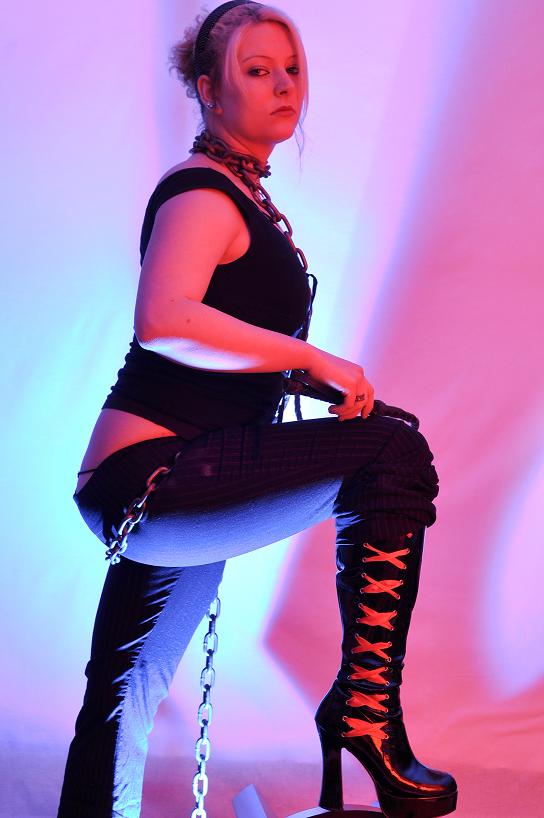
2. Ummm...I'm not sure how to put this, but that pose isn't flattering in those pants. The boots look like they should be the focus of the picture -- but my eye is instead drawn to the triangle of skin below her shirt and above her thong. Beyond that, it looks like the part most in focus is her elbow, and that her face isn't. The lighting is interesting, but the colors don't strike me as appropriate for the scene -- too pastel. (Also, the lighting is such that the only parts well lit are her elbow and her butt.) This looks like an interesting concept, but it doesn't look like it worked out quite right.
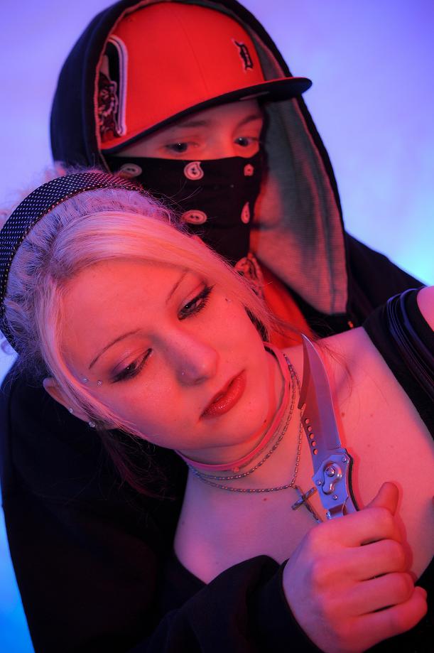
3. I don't care for the concept here, but different strokes. However, the lighting (as above) just doesn't seem to me to make sense for this picture. Lighting should direct your eye, build a mood, etc. -- this lighting just gives the people a sort of funny pastel skin color.
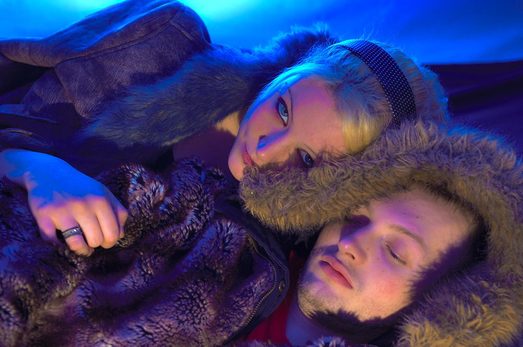
4. Her expression here is great -- but it's hidden by the fur and the shadows. The lighting here is better, though -- if a bit harsh.
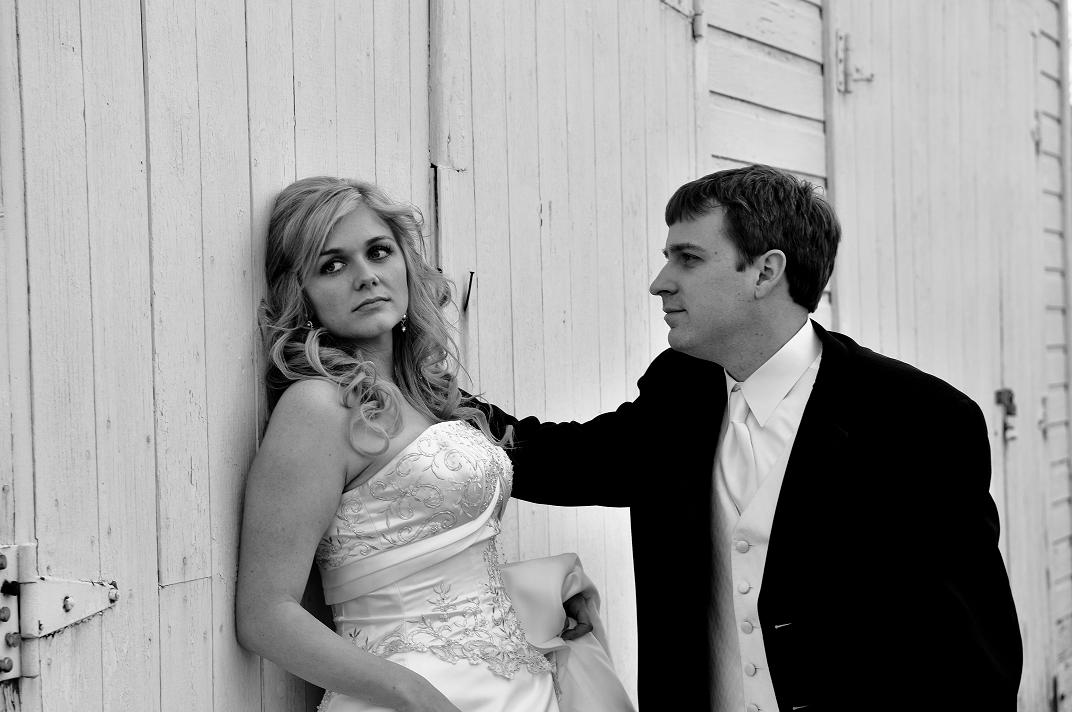
5. The shadows here are a problem -- harsh lighting is fine, but he's got a huge shadow over half his face, and she's got a huge shadow that hides her neck and makes it look like she has no chin. (The pic also appears to be over-saturated.) Their expressions are nice, though -- not a bad shot, in my view.
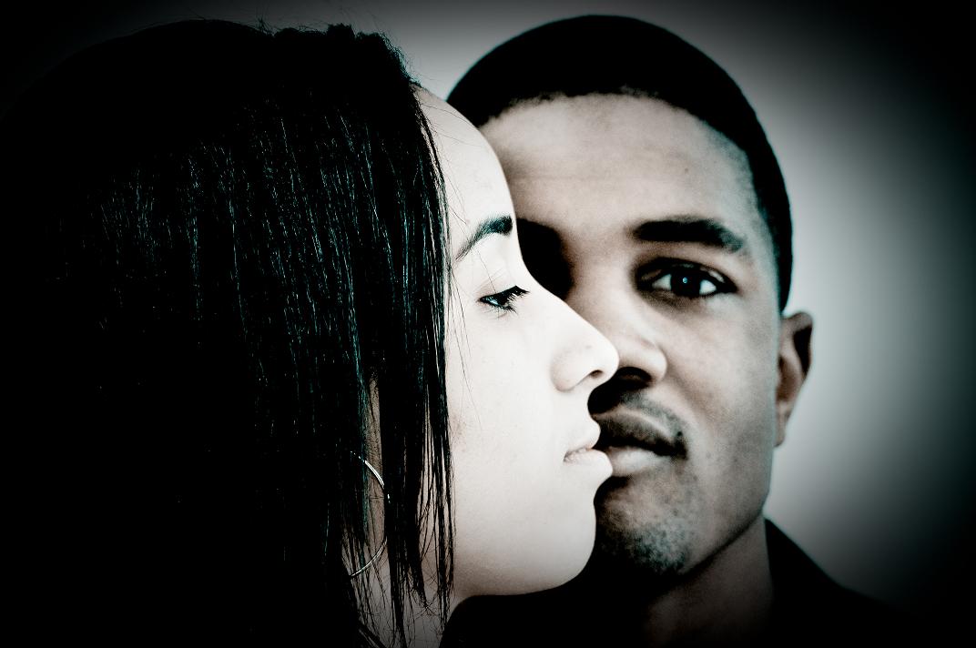
6. I like this shot -- there seems to be something odd going on around the edges of the guy, but the composition is good, and the shot seems to be well-lit and executed. Good stuff. :thumbup:
Just my opinion, for whatever it's worth -- hope it's helpful!


![[No title]](/data/xfmg/thumbnail/35/35224-c14babe4157e05767660f47e7de82aef.jpg?1734166901)
![[No title]](/data/xfmg/thumbnail/35/35223-d0fc07fee19dabe0456b4eeae54536fb.jpg?1734166895)

![[No title]](/data/xfmg/thumbnail/37/37090-2836dacbe52360ec3fdc1246a4e1d045.jpg?1734169826)


