What's new

Not another portrait C&C

rad :thumbup: that'd make a sweet poster!
 
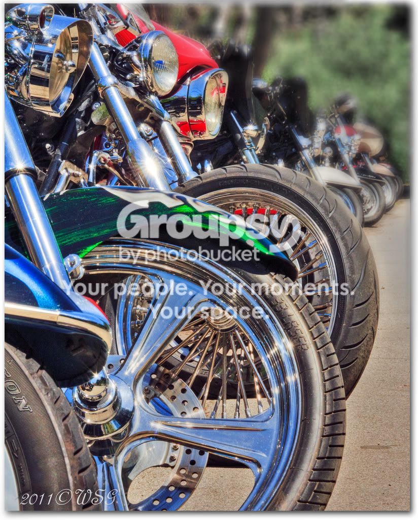
It's OK, but for me the green bush in the background is massively distracting and over-saturated. I would try selectively de-saturating that area, and perhaps trying a different crop with a bit of a counter-clockwise rotation to help hide all background which is not bikes. I would show you what I mean but your pictures are not OK to edit.
 
I understand and thank you for the tip :)
 
Slight desat on the background and counter-clock wise rotation...


lined up crop by Trever1t, on Flickr


Maybe I like it better too :D

BTW mine is the first one.
 
Better, still not quite there though.
 
I'm listening ;)
 
Can I do an edit of it? Picture, thousand words etc....
 
sure, go for it!
 
I'm motorbike mad but it is doing nothing for me, i would rather see 1 bike well shot
 
You'll have to excuse my poor job of the masking, but this was just with a bit of lens blur and desaturation added to the background. The rotation/crop didn't really work as well as it did in my head so I left that out.

5676312689_9e66ceae17_b.jpg
 
I was going for a candy, poster feel.

That being said, I think you nailed it.

The only thing that really bothers me outside of the previously oversaturated green bush is the blue tint to all the chrome. I'm not sure that anything can be done about it in post, but for the most part I think you have the "Candy, poster feel" nailed in this one, oversaturated green bush and all.

Kudos!
 
When you have a busy background and it becomes a pain, you can always go to Black and White to see if that works.
-
Shoot well, Joe
 

Create an account or login to comment

You must be a member in order to leave a comment

Create account

Create an account on our community. It's easy!

Log in

Already have an account? Log in here.

Back
Top Bottom