Thanks everyone.
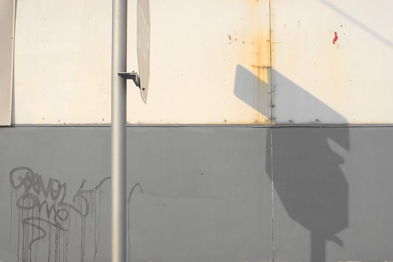
For me this image isn't only about the shadow, it's more about spacial ambiguity, tension and environment. So I didn't want the shadow to dominate the image, this got my attention more as a spacial cue than a formal element. I think if I got rid of the rectangle at upper left, the composition would run off on teh left side, drawing the eye away from the image. IMO it's a closed composition, so opening up one edge would not be beneficial. I approach composition a bit differently than most people do, I shy away from the traditional hierarchal approach. I like elements to be evenly distributed with little emphasis on any one element, I'm not saying that the stop sign and shadow aren't at all more dominant, but at the same time I don't want these elements to dominate. I like tension and ambiguity.
B/W was a hard choice, but in this case I think that the warmer colors at right further close the composition and de-emphasize the stop sign, though I was a bit torn between B/W, and the B/B version did work, but in a different way. Furthermore I also feel it is representative of the project, which I am planning to be color. The EBURD area has this kind of color quality which strikes me, and is one of the qualities about the neighborhood which will change as it modernizes.
I hope I didn't come across as "you're all wrong! how dare you disagree", your points are valid, just not really the direction I wanted to go with this image.
Jaimee - it was shot on an a350 using a Minolta 50/1.8 at 1/320 f/8, ISO 200 - IIRC, and processed in Raw Photo Processor, Daylight, Normal Color mode with a Brightness Number of 50, everything else default. Some post processing to saturation, with modest local sharpening.







![[No title]](/data/xfmg/thumbnail/41/41893-f4e56dae79851bac6e79639bcf9e7473.jpg?1734176246)



![[No title]](/data/xfmg/thumbnail/41/41894-692c98920dde335de241400937ed6166.jpg?1734176247)
![[No title]](/data/xfmg/thumbnail/41/41891-e5bba75ac5ce57c6892ade4cfc3f7d4c.jpg?1734176244)