I apologize in advance, as I tend to write very long posts, and tear things apart. I don't intend anything to be mean, or to say that what I'm looking at are bad photographs. On the contrary, I don't spend as much time commenting in the galleries as I should, but when I do, it's because I really like the photos I see, and want to help unlock the potential.
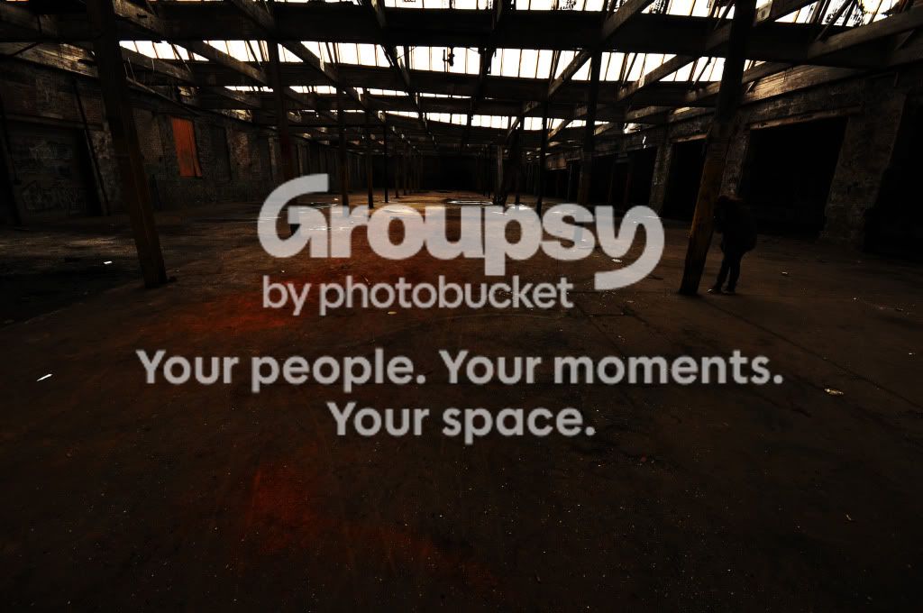
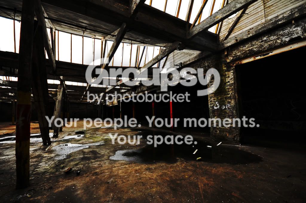
1: As overused as it is, this is a prime candidate for HDR.
Looking back, I can see this. Definately. Back then, I thought that HDR strictly required a tripod, cable, Mup capability, etc, etc. I thought it too daunting a task, so I didn't attempt it. I thought the same thing after posting the photos, and will definately revisit to get the shots again. Thanks. Between the brightness of the sky (good here, we don't want it to distract from the "entropy") to the darkness of the room, there is a lot of detail I'm not seeing (I am using a monitor calibrated within the last 2 weeks using a Spyder 3, so I'm fairly confident that what I'm seeing is how it should be). There are a lot of beautiful browns, oranges, and reds in the floor, and I just wish I could see those play against each other a bit better.
Agreed. By making this HDR, you would bring the levels of those up, and the texture could better create interest. However, I'm not suggesting more saturation, and would actually recommend toning it down a little bit. The reds are getting kind of spotty, and with slightly less saturation, the colors would blend better.
Thank you. I may try a re-edit. My editing technique has changed quite a bit with time (See PART 1 of the series), and would do this photo completely different given the chance for a reshoot. Next is the composition. First, the bit of sky at the very top is distracting, and makes the photo look crooked, whether or not it actually is. I'd crop that out. Second, did you try a lower angle?
No, but, again, something I was contemplating for a re-shoot. Because the floor is such a large compositional element, and rightly so, I think it might work better to have the camera nearly on the ground for a more striking angle. The last is a purely technical exercise in photoshop patience. All those bright spots are a bit distracting, so I'd go through and clone them out.
Actually something already done with an altered copy of the image. I will post the re-edited image a little later on. Thanks so much!
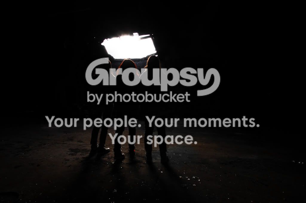
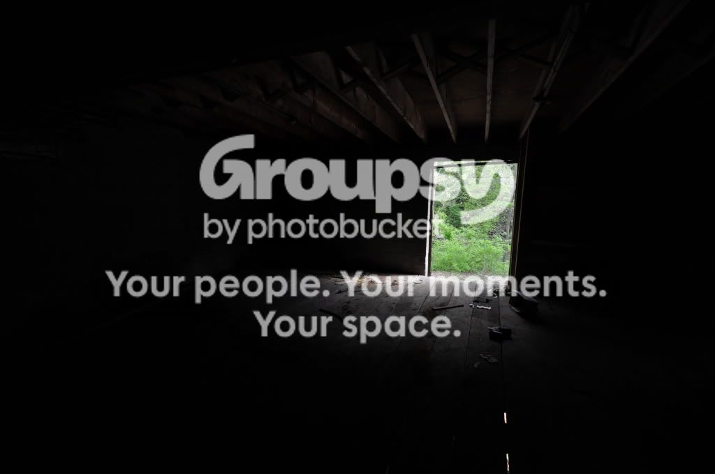
2. Honestly, this isn't one of my favorites from the series. It's simply too dark, and the light bloom looks a bit blotchy (My guess is that it is a relatively wide aperture). The concept, however, I can get behind, but I think it needs a reshoot. Try a much tighter aperture to focus the light. Not only would you get some definition in the bloom, but you might even be able to see the beams coming through the room onto the people. Either way, there needs to be more brightness overall. It's fine to have most of the photo black, and I think it's best, but I'd like to see a more complete outline of the silhouettes.
Ideas for a re-shoot. This was a purely on-the-spot photo, with no posing, so I grabbed it and ran. But I will surely stage another and work from there. Thanks.
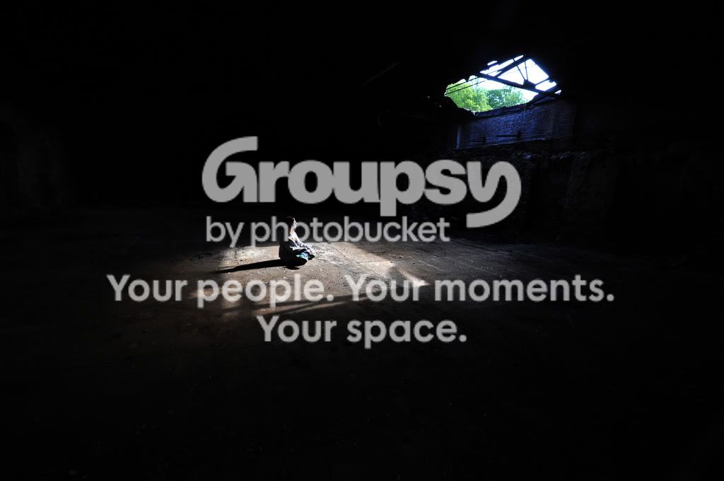
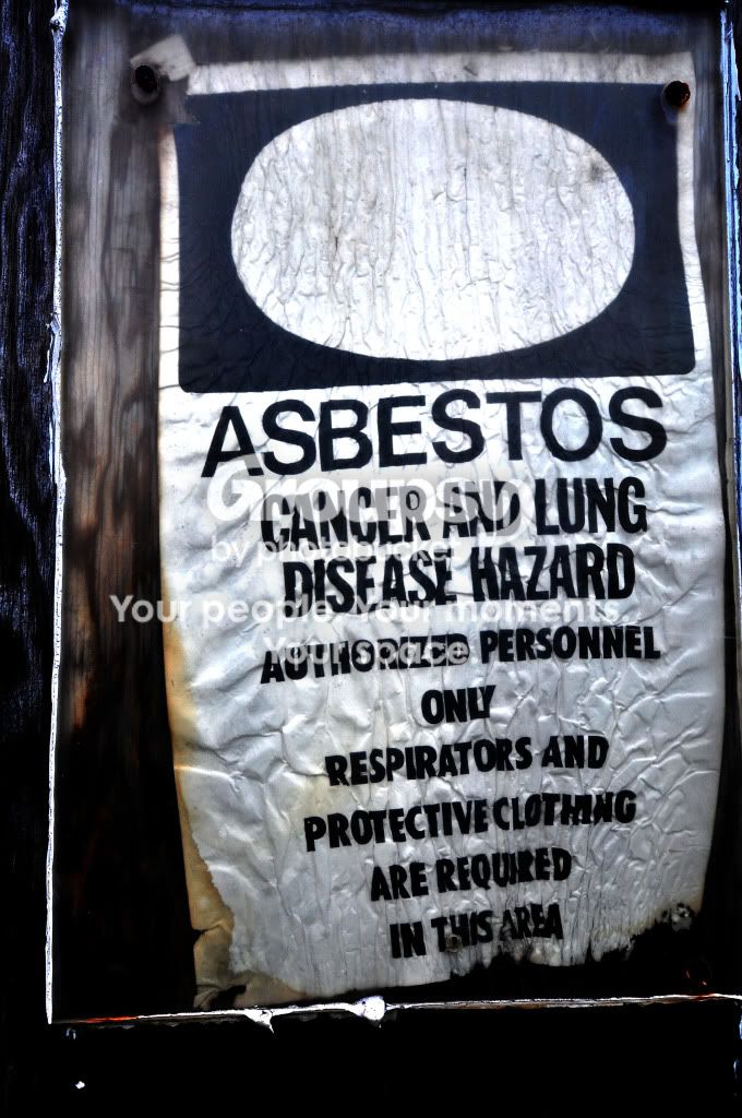
3. This is my favorite of the series. Like the last one, I'd use a smaller aperture to see if I could get the light beam coming into the room, but I think it's compositionally more interesting. I would try a tighter crop however, to eliminate some of the dead space. My other suggestion is to change angles, and do some color work. The tree line seems out of place in the opening. The colors of the composition are browns mainly, and the vivid green on a part that is not the main focus seems out of place. You can either change angles so that the trees aren't there, clone them out, or just back off the color until the focus returns to your subject. The last bit is that there is some strong blue color-casting around the opening that really needs to go.
I'll take all of that into consideration with a new edit. I agree entirely with all of it, and would like to think I would have noticed and fixed all of it had I taken this series recently. This is quite aged as well, and is due for a re-edit. Thanks alot for your thoughts. I will post the re-edited copy a little later on with the first one.
4. This is what I wanted from the first one. The added detail in the building makes this infinitely more interesting. Honestly, besides cleaning up the tiny white spots on the floor again in photoshop, I don't have any critique here. It would be my favorite except that I think that 3 has better potential for an emotional response.
Thank you. 
5. This is another one that doesn't do a lot for me. Maybe if there was less of the door, and more of the light play in the room, but as is it just doesn't hold my interest very long.
Understandable, and I agree. I did try a one-stop brighter exposure, and the cabinets, trash cans, and grafitti in the room all became clearly visible. Looking back, I should have accepted it and got it all out in photoshop, you're right. Possible reshoot if I can remember how to get there in the complex.
6. Again, compositionally, there's not a lot going on here. Humor definitely (in the slightly dark "haha, now you're going to get cancer" genre), but pictures of signs rarely rise above the level of a picture of a sign.
I agree. I mainly took this one to function as a cover image for the album the series is hosted in. Thanks.
If you get out there for another shoot, or rework these, I definitely want to see them. Nice work!
I will try to do both, and will definately love you to look at them.
Lastly: I see you're from Baltimore! Was this near/in the city? If so, wherein? I just moved away from there a few months ago.
Yes, all of these were close-by, but none actually in the city. Within about 20 minutes. As was the rest of the two series and more to come this weekend. I don't like to post where they are located on forums publically, but I will be sure to PM you with details.
EDIT: Man, I need to spend more time in the galleries. I forgot how much picking through photographs can get the brain going in such a satisfying way.
Please do! I'd love to hear more from you! (Particularly on the other two parts of this series )




![[No title]](/data/xfmg/thumbnail/32/32154-8c44f76cb4a7777142bd645c3624daac.jpg?1734161045)
![[No title]](/data/xfmg/thumbnail/32/32155-5dfb2c8aee58498ba1862d4f34389669.jpg?1734161045)
![[No title]](/data/xfmg/thumbnail/38/38263-ad5e4c9e677626ddb5b1e7cdf9ebe40e.jpg?1734172152)