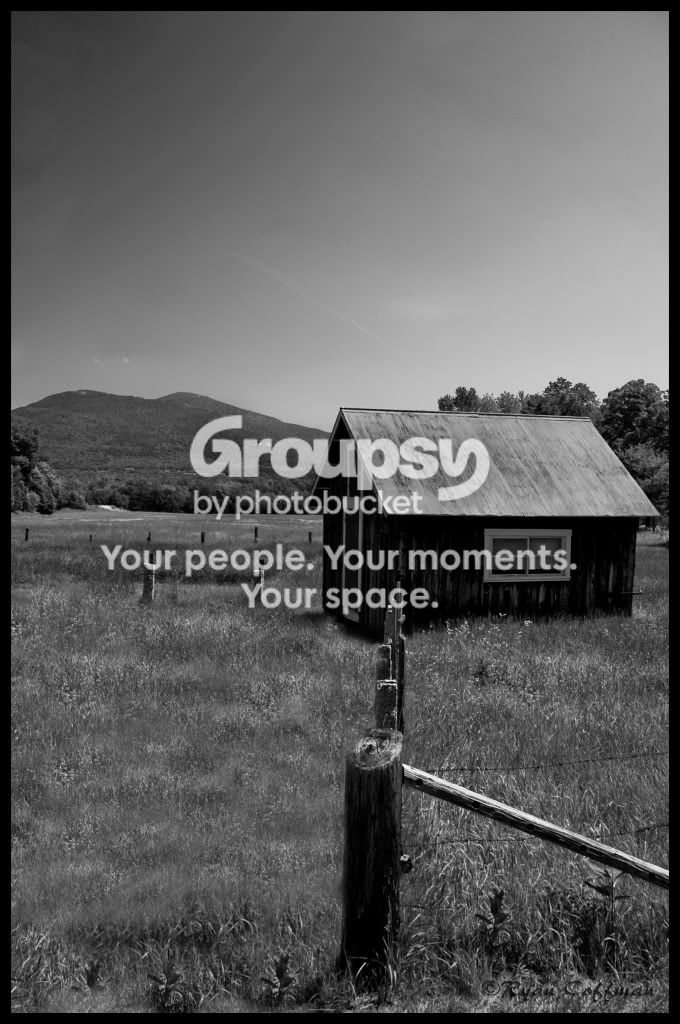
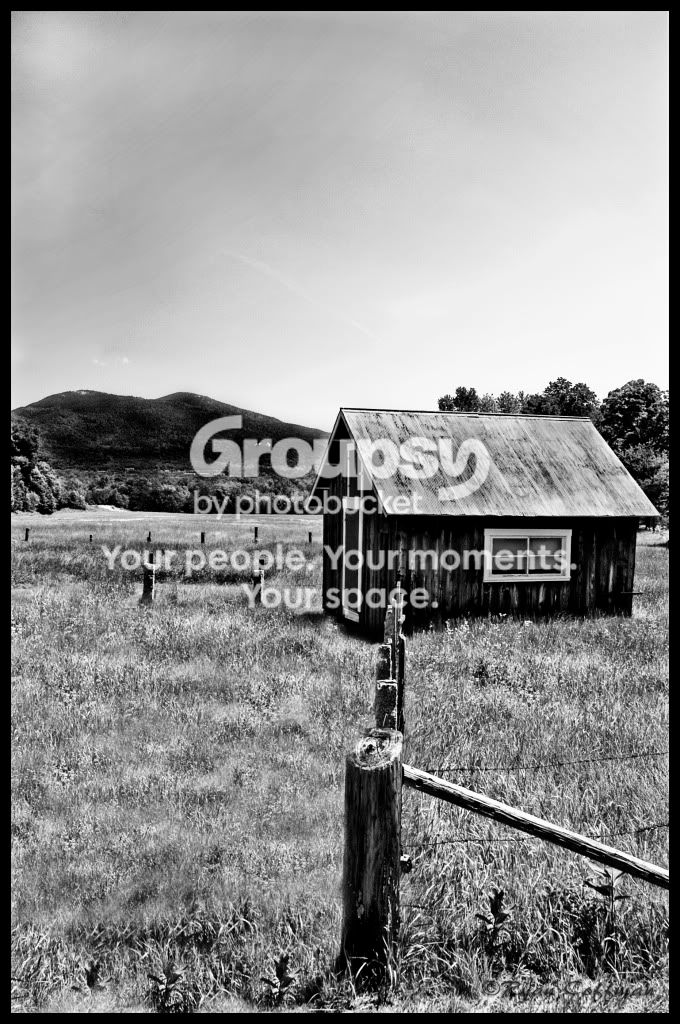
Perhaps it should be titled Gray Barn in the Gray Mountains?
Too much gray. For me, it doesn't work as a black & white image because the scene (and the way it's shot) does not emphasize the strengths of b&w imagery. There's no texture or contrast, which is like Rule no. 1 when it comes to b&w.
Green and blue are both reduced to middle gray. The same is true for red. Was the barn red? I will slice my wrists to the consistency of cured ham if you shot a scene with red, green, & blue as black and white. What a waste of color!
But the barn is probably a boring, country brown. I still think that would be better than what you have here. The picture needs contrast -- color contrast, or more b&w contrast.
I like the diagonal fence line leading from the right side. I don't like the nearly vertical fence line going toward the house. Right idea, bad execution. Get a better angle on the fence, like moving to the left or right more. Turn both lines into diagonals.








![[No title]](/data/xfmg/thumbnail/30/30882-ce388519574371448d7493784524607a.jpg?1734158883)
![[No title]](/data/xfmg/thumbnail/37/37605-90c8efaef5b7d1f52d4bf8e7dfd33673.jpg?1734170732)
![[No title]](/data/xfmg/thumbnail/30/30883-04222f7ae234efdf80dff6f96ddad16f.jpg?1734158884)
![[No title]](/data/xfmg/thumbnail/30/30881-c36788e79b12973b7bf57c94b46961e9.jpg?1734158883)
![[No title]](/data/xfmg/thumbnail/34/34114-dd12be026979ccd4182c5f478bd91448.jpg?1734164566)