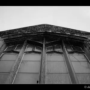
i agree with spacefuzz. the shadow seems out of place to me, it takes away from the awesomeness in the glass. also, the stem of the glass seems a little too dark. lastly, i would get rid of the border and vignette.
i know that was a good amount of critique, but i really do like this photo. very nice.