What's new

One night at the beach

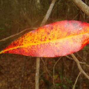
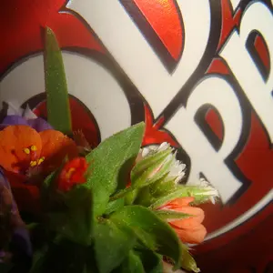
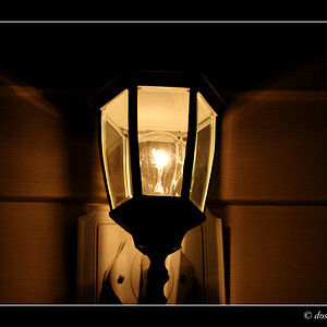
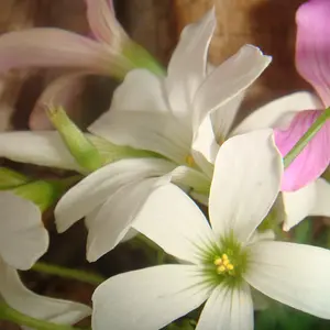
I like them all especially No. 1 & No. 2 - but if push comes to shove: No. 2 wins for me!!!

Nice Set!!!
 
I like number 2.
The others just don't have anything that catches my attention and I hate BW for nature shots, nature has colours, not monochrome.
 
I like them all especially No. 1 & No. 2 - but if push comes to shove: No. 2 wins for me!!!

Nice Set!!!

Thanks Enezdez. I agree that 2 is the stronger image, although I wish I could get it less muddy.
 
I like number 2.
The others just don't have anything that catches my attention and I hate BW for nature shots, nature has colours, not monochrome.

Thanks Shafty. It's always good to hear how others view my work. It helps me to understand what I like, and don't like about it. For me these aren't nature shots as there is very little that is natural about them. I think I'm going more for the surreal.
 
I like number 2.
The others just don't have anything that catches my attention and I hate BW for nature shots, nature has colours, not monochrome.

Thanks Shafty. It's always good to hear how others view my work. It helps me to understand what I like, and don't like about it. For me these aren't nature shots as there is very little that is natural about them. I think I'm going more for the surreal.

Ah ok.I'll keep that in mind and will look again when I'm sober :P.
 
Really like that second shot.
 
Hands down #2, is the winner. I don't see the "muddy" you refer to, maybe because of the strong visual elements and leading lines. #1 and #3 lack direction, allowing the eye to wander searching for a focal point.
 
I agree that #2 is it, but can't get past the feeling that it has a strong lean to the right. That far shoreline is just too strong and too tilted for me, whether it is reality or not. But then again, photography really isn't anything more than a perception of reality for any shot.

 
Hands down #2, is the winner. I don't see the "muddy" you refer to, maybe because of the strong visual elements and leading lines. #1 and #3 lack direction, allowing the eye to wander searching for a focal point.

Thanks Smoke. I've had my suspicions about #1 and #3, and I think you are right.
 
I agree that #2 is it, but can't get past the feeling that it has a strong lean to the right. That far shoreline is just too strong and too tilted for me, whether it is reality or not. But then again, photography really isn't anything more than a perception of reality for any shot.

#2 is very nice, but desperately needs leveling!


Thanks Deeky, and Tirediron. Now that you mention it you are both absolutely right. I wonder how I missed such an obvious thing? I usually look specifically at the leveling too. I will be reworking this one for sure. Thank you both.
 
IMG_7384-3r.webp
 
Your remix (leveled) is MUCH better! #2 wins for me now!
 

Create an account or login to comment

You must be a member in order to leave a comment

Create account

Create an account on our community. It's easy!

Log in

Already have an account? Log in here.

Back
Top Bottom