What's new

opinions please

jme_cay

TPF Noob!
Joined
Dec 7, 2011
Messages
41
Reaction score
1
Can others edit my Photos
Photos OK to edit
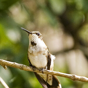
I think the color in this one turned out dull, what can I do to fix it (in camera, not in photoshop.) I tend to have contrast and saturation issues in my pictures. Why? What other critiques can you give? (I know the bird in the background is missing his tail feathers... I wish I could've done that differently).
Thanks.


showphoto.php
[/URL][/IMG]
 
My equipment is Sony A230 with the 18-55mm kit lens.
 
A few questions:

Are you shooting raw or jpeg?
What software are you using for post-processing?
How much post processing do you do? What do you do in postprocessing?
What does your histogram look like?

This image does not look over saturated and I am not sure that there is a contrast issue with it either; however, it does look a bit underexposed because ti seems to be a bit on the dark side. It would appear that there are no shadows, so can I assume that this was an overcast day(?). Days like that will often produce "dull" images, because there is no sunlight to produce significant highlights or shadows, or provide the contrast you might like to have, particularly when the image is composed of a lot of components that are some shade of grey. This image does look a little fuzzy in places, almost like it was out of focus because the bird(s) moved a bit or it was a bit windy. Did you do any sharpening, because maybe this image could use a little sharpening. Not sure what else to suggest, because if it is out of focus, or fuzzy because the shutter speed was not fast enough, or the speed was low and camera shake got in the way, then these things can be fixed by increasing the shutter speed and/or find some way to reduce camera shake. I am just sort of stabbing in the dark, but these are the sort of questions I would ask myself if it were my image. HTH.

Cheers,

WesternGuy

 
Either go out at a better time of day of adjust the artistic setting in the mode you are using and change the contrast and saturation values for each. I would just tweek it in photoshop and call it good.
 
The image is very lopsided. I think you have a composition problem, not a color problem. Look how everything is happening on the left side of the frame, and almost nothing is happening on the right. Having room for the bird to look into is fine unless it makes the image feel so imbalanced. You might have even done a portrait aspect. I will say the image is very sharp though, good job with that.
 
Bazooka - I see what you are saying. Like you said, I was trying to give him room to look into, but it didn't work here obviously. I put it in photoshop and tried different crops on it and found a few ways that it looks better. Thanks!
Disco Joe - I didn't even think of that, I rarely use those settings. Just never think about it. It has been overcast here for the past few days so I took your advice and went out shooting around the yard. I got a lot better results, more of what I was looking for. Thanks!
Western Guy - this photo was taken awhile back ( a year ago?) in jpeg. I have since started shooting in raw. I use PSE9 for post-processing, as far as how much, it depends on what I want from the picture. Normally just tweak the exposure, sharpness, crop or whatever is needed. I pulled this photo up in pse to look at the histogram. It leans a little more to the left/black and extends to a little past halfway through the middle. Nothing on the right/white side. Not peaked high anywhere. If the mountain in your picture was a histogram, that's about what it looked like, minus the mountain on the far right. (best way I could think of to describe it..). As far as the saturation, I was more concerned with it being under-saturated/dull vs over-saturated. This photo hasn't had any editing yet, so no sharpening yet.
I took a summer photography course at the local junior college. The teacher mentioned that one of my photos was grey looking (taken on an overcast day again) but when I asked what to do about it I couldn't get a clear answer. Very frustrating. So I'm really thankful for everyones help.
 
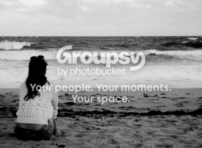
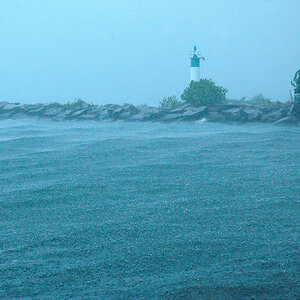
I think for this kinda image, you need a lot more space

See from mine

She looks kinda akward in this photo
PC030641-1.jpg


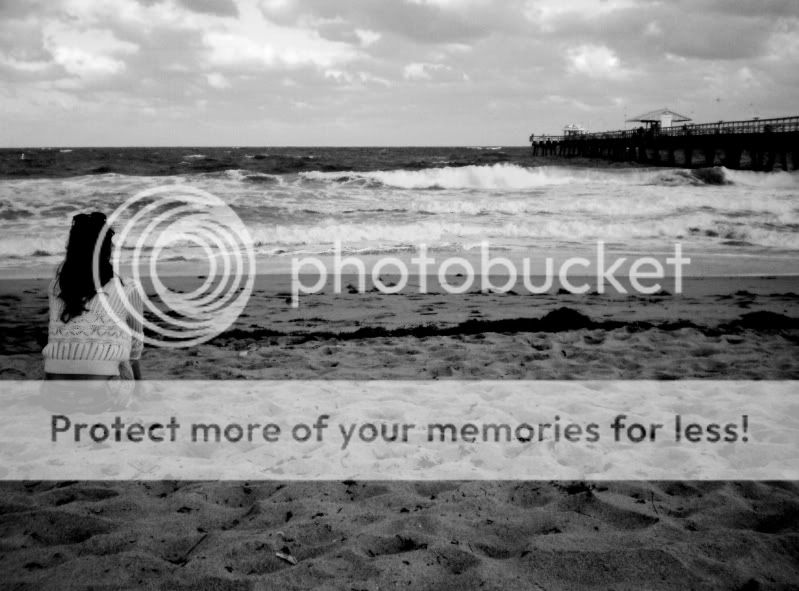
But the composition seems more balanced and pleasing here

PC030643.jpg
 
She looks akward in the second one too, but the pier adds a bit of visual weight to the right side of the frame. So the slight improvement in balance is more from the addition of the pier than the additional space.

Had the second image been made from further to the left, the pier could have been used more effectively as a line leading to the lady, giving her more visual weight and connection to the pier.

PC030643edit.jpg
 
Last edited:

Create an account or login to comment

You must be a member in order to leave a comment

Create account

Create an account on our community. It's easy!

Log in

Already have an account? Log in here.

New Topics

Back
Top Bottom