What's new

Orange Daisy New Edit

PixelRabbit

A naughty little bunny...
Joined
Nov 28, 2011
Messages
6,593
Reaction score
3,719
Location
Ontario
Can others edit my Photos
Photos NOT OK to edit
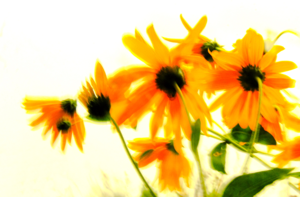
I'm playing around in Lightroom today learning the ropes and this is a series I wasn't happy with the edit on originally, it was "dirty" somehow.
My remaining issue now is I wish it was a little bit sharper but I think it is about as sharp as the image can be as shot. Also wondering if I should clean up the bit of "background" that remains in the stems? Does it add to the image at all?
Otherwise I'm pretty happy with it.

Would love to hear your thoughts.
Thanks for taking a look :)


**wanders in with a steaming cup of coffee and enjoys the quiet peaceful morning**
 
It's been a lot of "quiet, peaceful mornings" around here, when it comes to getting comments on posted photos. My last three threads have all pretty much died of neglect. :lol:
I've probably been just as guilty recently of looking but not commenting; I've seen several of your recent threads but haven't commented. I mean to, but...well, I'm easily distracted. :D

I *almost* really like this. :D
But there is something about it that throws me off a little, and I'm not even entirely sure what it is. It might be that the colors are a bit over-saturated and yet the background area between the flowers seems like it calls for softer colors, to me. I also don't like that the background color gets lost on the screen and so there's no "edge" to the photo, it just slowly fades into the computer screen. Of course, that wouldn't be a problem if it were printed, but I wonder if a border would help onscreen.

Looking at it again--I guess the main thing that bothers me a little can't be changed; the fact that ALL the flowers are seen from the backside. It leaves me kinda wanting to turn the photo over and see the front. :D

I guess I'd call this one a near miss, for my own personal tastes. Still, I really like what you're doing lately; keep it up!
 
Sharon, you aren't kidding! I'm probably guilty also :blushing: I TRY to get a few comments in but I know I could do more, I too am very easily distracted lol. I didn't even see your posts, I will go look for them!
Thanks for your thoughts. I agree that this close, very close to where I want to be but it is just falling short. for me it is mainly the lack of sharpness, I see the feel I want in there but it is soft. I'm glad you are enjoying what I've been playing with lately, I'm having a blast even if a huge number of the shots end up being binned ;)
 
You and your COFFEE!!!!!!

I like that about you!

I think what's missing here is what I call "edge containment"...which is another way of saying less-than-good composition. The upper left and the left side...just...not...working...right...

Buuuuut...I bet if this picture, this image, were overlayed on some kind of a textured background, that it would REALLY work much better...it has a feel to it, it has a "vibe", and I get it, I do, but the edges are not working...the image is being stolen from by that hot white...
 
Remember you wanted feedback. ;)

It makes me nauseas. Something about the blur against all that white is messing with my head. Or it could be I haven't eaten yet today. Either way I have to agree with the swing and a miss theory. I will say I think if the flowers were sharp it would work better with the contrast against the sky, like a big flowery creamsicle. :)
 
i found some good elements and some bad elements here; the molten borders always a shortcut to abstraction and i like that; but the color has spread and give a bit muddy look; so with your permission i felt a reinterpretation, retaining the good elements i found; hope you won't mind, Judy

regards :D


...and i want to name it "Dream"
 
You and your COFFEE!!!!!!

I like that about you!

I think what's missing here is what I call "edge containment"...which is another way of saying less-than-good composition. The upper left and the left side...just...not...working...right...

Buuuuut...I bet if this picture, this image, were overlayed on some kind of a textured background, that it would REALLY work much better...it has a feel to it, it has a "vibe", and I get it, I do, but the edges are not working...the image is being stolen from by that hot white...
lol! I'm a creature of habit, get up, grab coffee, peruse TPF on my iPod over coffee, short replies over coffee on the ipod, finish coffee, move to laptop and write the longer replies, continue on with day.
I think I had tunnel vision working with these on the white background. I was so focused on the actual flowers, trying to get there where I wanted them, that I didn't even think that the background was a contributing factor in why they weren't working.
Remember you wanted feedback. ;)

It makes me nauseas. Something about the blur against all that white is messing with my head. Or it could be I haven't eaten yet today. Either way I have to agree with the swing and a miss theory. I will say I think if the flowers were sharp it would work better with the contrast against the sky, like a big flowery creamsicle. :)
Yes I did ask for feedback ;) and it can't all be good!
loll well darn, nauseous wasn't what I was going for, hope you feel better! I'm going to let this series rest in peace now, other than Nandakumar's edit (neat!) I think I'm out of ideas and the shot is just simply not in there at this point.
i found some good elements and some bad elements here; the molten borders always a shortcut to abstraction and i like that; but the color has spread and give a bit muddy look; so with your permission i felt a reinterpretation, retaining the good elements i found; hope you won't mind, Judy

regards :D


...and i want to name it "Dream"

Love that version of it! It is definitely not what I was trying to achieve but it works MUCH better than my edits. Thanks so much for showing me this, the gears are turning and I have new ideas!
 
The positive: good blurring effect, interesting perspective.
The negative: as Derrel noted, white hot background kinda kills this. The saturation seems much too strong for my tastes, for what it is worth.

Nandakumar's edit works very well, in that it makes the contrast between the flowers and the background less extreme, the monochromatic treatment reduces the over-saturation issue, and at the same time lets the blurring effect work.

While this may be called a "miss", it is just one learning stepping stone to the image that kicks a$$. I really like your experimentation, and your recent series have me now looking out for windy days. It seems to me that each time you post these days, you're moved up another rung up on that ladder. Kudos. You're inspiring.
 

Create an account or login to comment

You must be a member in order to leave a comment

Create account

Create an account on our community. It's easy!

Log in

Already have an account? Log in here.

New Topics

Back
Top Bottom