Outdoor Portraits for C&C

Granddad

Been spending a lot of time on here!
Joined
Jun 22, 2011
Messages
2,271
Reaction score
1,333
Location
Lincoln, England
Can others edit my Photos
Photos OK to edit
I haven't done much photography outdoors, I like my studio too much. However, last week I bit the bullet, bribed my favourite model to dress up and we set out into the countryside to find a good location.

The weather sort of co-operated (it didn't rain) but there was some harsh sunlight interrupted by occasional heavy cloud patches. I used off camera flash on a stand with a homemade bouncer thing to moderate the flash then made up the difference in LR. Also taken through Portrait Professional and PSE8. C&C appreciated.

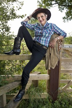
1 $Connie-00032-2_ppsmall.jpg(Spot the anomaly- no prizes!)
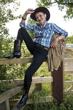

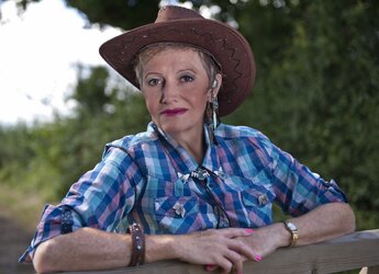
2$Connie-00046-2_ppSmall.jpg


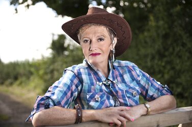
3 $Connie-00085_ppSmall.jpg (That's not a corn field, it's elephant grass, a bio fuel.)
 
I think they're great - love the 3rd one. My only criticism would be maybe the flash was a little harsh in the second.
 
Thank you. Yes, I debated including #2. I also notice (now that they're online) I missed "gentling" the back of her left hand in the first one: it's showing all the years I took off elsewhere.
 
Nicely done Granddad. In my opinion, #1 is a little underexposed for her face, #2 is a touch overexposed (light a little bit harsh) and #3 the exposure look great.
 
I'm with you Grandad, if we were really meant to photograph out of doors, there'd be electrical outlets every ten feet to plug our lights in to!

;)

I like these, and I think you've done a good job; I think the minor nits mentioed above pretty much cover it, but I will say that it looks to me like your modifier was just a bit too small. When I look at #2, I see a fairly pronounced fall-off just around her face. If I was shooting this, I'd want at least a 48" SB, and probably drag out either my 60 or 72" brolly-box to modify the main light source with.
 
Last edited:
I like the last one but I think the balance is off on the other two. The background light on the first one is over exposed and the subject is underexposed. The second one is better, the background is exposed under just enough to make the subject stand out but unfortunately she is a bit over exposed. It's been a while sense I messed with any out door flash work but if I remember right this is a high speed sync issue. Or I should say that getting the sync speed adjusted correctly would help this.
 
Thanks Shaylou, I can see all your points, thanks for those. I checked my exif data and I now realise I'd completely forgotten to consider sync speed. I'll do some research and possibly hold off on outdoor shooting when I'm fighting harsh sunlight. I don't have the experience to counter this.

John, the box/umbrella idea is good but without a third person to hold onto the thing there was no chance. There was a moderate wind blowing and I'd have been chasing my kit across the fields! :lmao: (I'll put those two back into LR and see what I can salvage - will add them later).

OK, tried again with the two in question:

1$Connie9814_00031_pp.jpg 2$Connie9814_00046A_pp.jpg I think I may have over-processed the face in #2 but the exposure looks better to me.
 
Last edited:
I think #2 is the strongest. The light is a bit uneven, it's focused on her face and her shirt and arms are falling into shadow.

I'm not fond of the edit on it. I would have only reduced the exposure on her face about -.25-.50EV, and then using the gradient filter, increased the exposure below her face up 0.5-1.0EV.

Then I would have warmed it up a tad. And using the radial filter--masking her face--bumped the clarity, contrast, and vibrance sliders. It's coming across a little dull if anything to me except where you lit her up (face/hat).
 
Thanks Braineack, now I look at it again I don't like the re-edit on #2 either, I'll try your suggestions. OK, so back to the drawing board...
 
Here are my feelings. My favorite is #3, the one where she's in the shade, with the tall grasses surrounding her and framing her face. That shot show off her beauty and good smile, and just looks thoroughly well thought-out and executed. The lighting on that one is well nigh perfect. The only nit might be the exact color temperature, which is a processing decision unrelated to how skillfully the shot was done while afield. It looks very accurate and acceptable in terms of color rendering, but I being hopelessly romantic on pics of beautiful ladies might have been tempted to warm it up a bit. Still, it's a really well-done shot, and it just comes together great!

Second shot, the low and off to the right flash placement is causing a shadow from the bridge of her nose, and it's not my favorite lighting pattern, although it DOES give good depth clues. I think the fae needs to be brought down in exposure level, since to me it looks a wee bit over-flashed.

I like the pose astride the fence for the most part. Not 100%, but pretty positive about this one. Good wardrobe and location, pretty good posing, but I think more fill on the dark jeans would help. It's not a bad shot, but the doggone post seems to carry a lot of the visual "weight", and it's hard to say why. Still, smart move putting the jacket on top of the post! Thinking for a few seconds here, I think the reason the post has so m much weight is the area between her leg and the post...and I think too that's why I want to see more "fill" on the jeans; the shot feels too back-lighted to me in the lower parts. I think that large triangular area between the post and her leg is the visual "pull" that's hurting your chance of getting the 100% Like score; changing the green luminosity or saturation might reallllly help this, or burning down that area, and burning down that top of that fence board would help make her "POP!" more.

Overall, pretty good shootin. Good model too, she's still pretty foxy.
 
Thanks Derrel, I'll have a shot at reworking #1 tomorrow.

... Good model too, she's still pretty foxy.
I think so, too, even without Photoshop and with my specs on ;). She's 63 tomorrow (and she doesn't mind who knows it); I think her secret is that her beauty shines through from the inside.
 
My favourite is #3, but I would prefer a tighter crop, getting her left (camera right) eye on the upper right-hand third. It says we're ok to edit your images, so here's an example of what I mean:

1zv8k6q.jpg


I'm not a fan of #1 - I don't think the pose does the model many favours and #2 is a happy medium, but I probably would have cropped a bit tighter on that one, too. Maybe it's just me who likes tight crops in portraits though!
 

Most reactions

New Topics

Back
Top