What's new

P&S Shots

TheBoombaGnome

TPF Noob!
Joined
Apr 10, 2010
Messages
84
Reaction score
0
Location
Suburbs of Detroit, Michigan
Can others edit my Photos
Photos OK to edit
Hey everyone!

I'm new to the forums, and I'm still working on the extra cash for a nice DSLR camera...Right now, I'm using a Konica Minolta camera that hasn't been made in years - but I was still able to get some halfway decent shots. I was hoping you guys could take a look, let me know what you think?

Thanks y'all!!


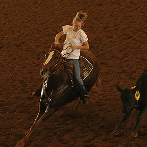
4511882714_01eddca1fb.jpg


4511243165_baa11715fa.jpg


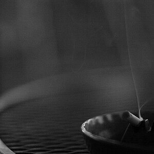
4511882872_b27d2ef192.jpg


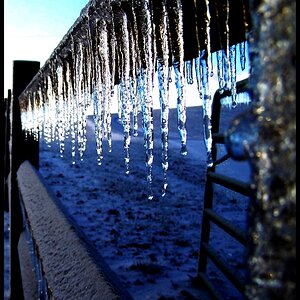
4511243545_e79fdcf698.jpg
 
Last edited:
#1 and #3 really have something, good work for a P&S. #2 and #4 seem really boring however, and #4's focal point is WAY left.
 
I like #3 with a bit taken off (cropped) the right side.

Also, good job taking a pic at the zoo (#1) and composing it in a way that it's not obviously a zoo picture.

So yeah, guess I'm just agreeing with Sushi.
 
I like them, but I think that you could really do a LOT with the last two. With those two, I think some dramatic colors would be amazing for the backgrounds. You have a lot of sky in both of them and it looks like sunset to me, even shades of grey would give it much more depth. Please don't take this the wrong way, but without any color, I feel like the sign "Pet Area" is pointing to a pet cemetary. I think of pet areas as happy and playful but the photo just doesn't communicate that at all.

You've done well with a p&s, I rarely ever got great ones on mine!
 
#1 and #3 really have something, good work for a P&S. #2 and #4 seem really boring however, and #4's focal point is WAY left.

Thank for the input! I'm in love with the first photo, have been since the day I took it...I tried to get the focal point for #4 way off to the side. I'm not quite sure why I did this at the time, but I think the color one that i'm going to post right underneath here makes it look MUCH better...

I like them, but I think that you could really do a LOT with the last two. With those two, I think some dramatic colors would be amazing for the backgrounds. You have a lot of sky in both of them and it looks like sunset to me, even shades of grey would give it much more depth. Please don't take this the wrong way, but without any color, I feel like the sign "Pet Area" is pointing to a pet cemetary. I think of pet areas as happy and playful but the photo just doesn't communicate that at all.

You've done well with a p&s, I rarely ever got great ones on mine!

The third one I actually took in black in white (Which i have realized since then that I NEVER do that. Always take in color and make b&w if need be in photoshop), but the Pet Area one I do have in color...I'm not sure if that makes it any better...but I figured I'd show you anyway...:)

4511243767_9ffa5fb335.jpg


I guess my issue with this one in color is that the sign almost seems underexposed or something...i'm not totally sure...
 
Last edited:
very nice pics...
 

Create an account or login to comment

You must be a member in order to leave a comment

Create account

Create an account on our community. It's easy!

Log in

Already have an account? Log in here.

Back
Top Bottom