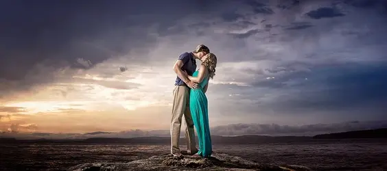
#1 is wonderful.. the subjects are clearly defined, and the colors stand out. I won't say the subjects really hold the eye as the single viewpoint... but I find this a pleasant image. I am sure your clients love it!
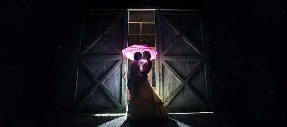
#2 great shot.. but the sides are just dead black space.. this one I don't get the panorama feeling like I do in #1. Could almost get the same effect with a wide black matte when framing. Cropped to 14x11.. I like it!
#3 Very nice, but I feel like the subjects are too small, and the building overshadows them. Nice exposure on them! The shadows are leading lines of sorts.. but since we seldom see long backlit shadows like this.. it just feels off. I might like it better with the shadows cloned out... and then again, maybe not...
I think having the subjects large like in #1 really would help to make this work... but that is me, and I am sure your clientele won't see the issues I see. Maybe if these were printed really large... it would show them off better than the small image does...
#1 looks like it right out of an old movie... except in color! lol! I really do like that one...


![[No title]](/data/xfmg/thumbnail/33/33449-978bff23ad40c63da778b7e59d54f546.jpg?1734163488)
![[No title]](/data/xfmg/thumbnail/32/32981-27e3d29bfa5b1638f18299ec111c7b87.jpg?1734162931)


![[No title]](/data/xfmg/thumbnail/37/37642-b84a3ab0bc05ccd30092514e185e7c01.jpg?1734170765)


![[No title]](/data/xfmg/thumbnail/32/32984-d9969dc997f82365b4d1f097cb5838c3.jpg?1734162939)