What's new

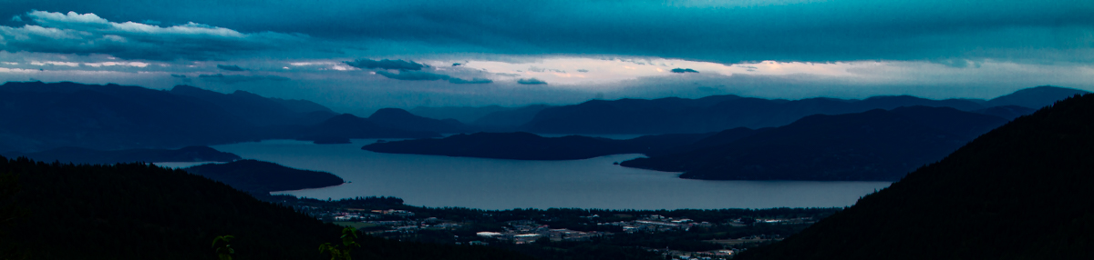
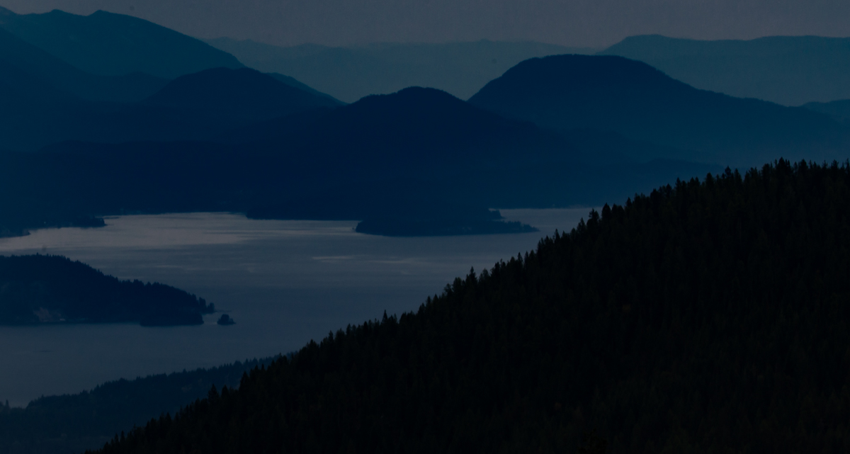
Pend Oreille at Twilight

Didereaux

Been spending a lot of time on here!
Joined
Oct 29, 2013
Messages
2,372
Reaction score
1,587
Location
swamps of texas
Can others edit my Photos
Photos OK to edit
Lake Pend Oreille, northern Idaho. taken from Schweitzer Basin above Sandpoint.

lIJDiCz.jpg


lRjKmri.jpg
 
The first one is very dark, but a great example of how the eye sees in relative values and tries to auto-correct.
The brightest tone in the image is on the left below (RGB 85;89;98) and even though it's placed next to the near white of the web page your brain still tries to interpret it as a full range of tones with the brightest part being white.

lightest tone.webp

The brightest tone in the first image is on the left and even though you know it when you look at the original image you still see it as a lighter shade.

Viewed on a screen in a darkened room without a fixed reference it is very easy to edit an image by it's relative values only and what you think is a well balanced image can actually be your eye auto-correcting. Now everybody's eye auto-corrects with reference to their own visual memory, so not only are no two alike but most screens are next to objects of normal contrast and brightness so an image is seen in values relative to them. (Prints are always seen in the same light that reflects off the objects around them and are always seen in values relative to the environment, screens generate their own light and it is very easy to separate them from any fixed reference).
Though there will always be a slight variation in the way everybody interprets an image, what appears to you, in isolation, as a well balanced image with subtle colour and contrast will appear to most as a very dark image with little colour or contrast. People don't always see your images the way you think they do.
As an analogy, you are sitting in a shaded room and your eyes are adjusted to your image. I have just been flicking through some bright colourful images, I have been in the bright sunshine and when I walk into your room it looks very dark to me.
I would edit the image by keeping the shadows relatively dark and soft in contrast. I would then have the highlights small in relative area but high in contrast. Because we see in relative values the way to make something look dark is by contrasting it with something that looks bright. You can raise the values of the shadows (and have a lot higher colour content because there's less black), and still make the image appear dark simply by having a small amount of near white. It is the contrast between the two that creates the effect. See how I've made the brightest tone in your image look dark by contrasting it with white, and you make it look lighter because it's contrasted with darker tones?

 
Last edited:
The first one is very dark, but a great example of how the eye sees in relative values and tries to auto-correct.
The brightest tone in the image is on the left below (RGB 85;89;98) and even though it's placed next to the near white of the web page your brain still tries to interpret it as a full range of tones with the brightest part being white.

View attachment 106382
The brightest tone in the first image is on the left and even though you know it when you look at the original image you still see it as a lighter shade.

Viewed on a screen in a darkened room without a fixed reference it is very easy to edit an image by it's relative values only and what you think is a well balanced image can actually be your eye auto-correcting. Now everybody's eye auto-corrects with reference to their own visual memory, so not only are no two alike but most screens are next to objects of normal contrast and brightness so an image is seen in values relative to them. (Prints are always seen in the same light that reflects off the objects around them and are always seen in values relative to the environment, screens generate their own light and it is very easy to separate them from any fixed reference).
Though there will always be a slight variation in the way everybody interprets an image, what appears to you, in isolation, as a well balanced image with subtle colour and contrast will appear to most as a very dark image with little colour or contrast. People don't always see your images the way you think they do.
As an analogy, you are sitting in a shaded room and your eyes are adjusted to your image. I have just been flicking through some bright colourful images, I have been in the bright sunshine and when I walk into your room it looks very dark to me.
I would edit the image by keeping the shadows relatively dark and soft in contrast. I would then have the highlights small in relative area but high in contrast. Because we see in relative values the way to make something look dark is by contrasting it with something that looks bright. You can raise the values of the shadows (and have a lot higher colour content because there's less black), and still make the image appear dark simply by having a small amount of near white. It is the contrast between the two that creates the effect. See how I've made the brightest tone in your image look dark by contrasting it with white, and you make it look lighter because it's contrasted with darker tones?


Quite a dissertation.
We have it printed at 16x20 and it is currently hanging on the wall and being enjoyed. ;)
 
Terrific shots well composed. Thanks for sharing.
 
Quite a dissertation.
We have it printed at 16x20 and it is currently hanging on the wall and being enjoyed. ;)

I'm sure that your print is beautiful. Just saying that you have a full range of tones which can be used effectively to communicate a point (in the additive colour of a computer screen). Your image is reminiscent of soft blue light/moonlight reflecting off a lake. But by restricting the the image to only a narrow band of darker tones you are leaving out the information that conveys 'brightness' from the image and are effectively forcing your viewer to add the brightness from their own visual memory after their eyes have adjusted. This not only introduces a wide variance in the way different people see and perceive the image, but also with a bright image/window open next to it I have difficulty seeing anything at all because my eyes are adjusted to the brighter image.
This is something that's not always well enough understood by photographers.
 
Quite a dissertation.
We have it printed at 16x20 and it is currently hanging on the wall and being enjoyed. ;)

I'm sure that your print is beautiful. Just saying that you have a full range of tones which can be used effectively to communicate a point (in the additive colour of a computer screen). Your image is reminiscent of soft blue light/moonlight reflecting off a lake. But by restricting the the image to only a narrow band of darker tones you are leaving out the information that conveys 'brightness' from the image and are effectively forcing your viewer to add the brightness from their own visual memory after their eyes have adjusted. This not only introduces a wide variance in the way different people see and perceive the image, but also with a bright image/window open next to it I have difficulty seeing anything at all because my eyes are adjusted to the brighter image.
This is something that's not always well enough understood by photographers.


It DOES communicate my point: Which is light, color, subject as it was seen at that moment, and the mood it imbued. The world is not an oversaturated, oversharpened HDR replica of a cartoon.
 
Not sure it my thing but I think its not bad, I like the fact it looks like a painting and you dared give it your own twist
 
It DOES communicate my point: Which is light, color, subject as it was seen at that moment, and the mood it imbued. The world is not an oversaturated, oversharpened HDR replica of a cartoon.

I couldn't agree more with you on the HDR. My problem, and the point I'm trying to illustrate, is that I have no idea how you want me to view the image because by not understanding how we see and perceive images you have left a lot of ambiguity.
You see if I was up at the original scene then I know my eye would adjust and see the image as a complete range of tones, it would try to see the brighter points as white, and this is exactly how my eye tries to see it if I look at it in isolation.
However this is not how you've presented it. You've presented it as a lot of very dark tones that only look dark when viewed alongside something of normal brightness and contrast. So everybody's perception and view of this image depends entirely on the environment in which they view it combined with their visual memory. You may see it clearly but other's views vary wildly. If you want it to appear dark then remove the ambiguity, this can be as simple as including a white border around the image. This is a fixed reference point on which anybody can understand the tones and values regardless of the environment in which it's viewed.
white.webp
 
Last edited:

Create an account or login to comment

You must be a member in order to leave a comment

Create account

Create an account on our community. It's easy!

Log in

Already have an account? Log in here.

New Topics

Back
Top Bottom