What's new

people pictures

powasky

TPF Noob!
Joined
Aug 5, 2011
Messages
168
Reaction score
14
Location
Virginia
Can others edit my Photos
Photos OK to edit
My first people pictures.

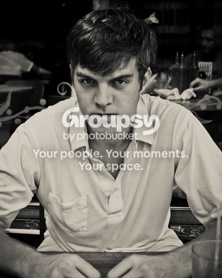
#1-
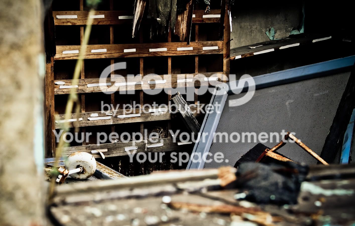
IMG_1152.jpg


Street shiv. I like this picture. I don't like the random hand in the background through the glass.

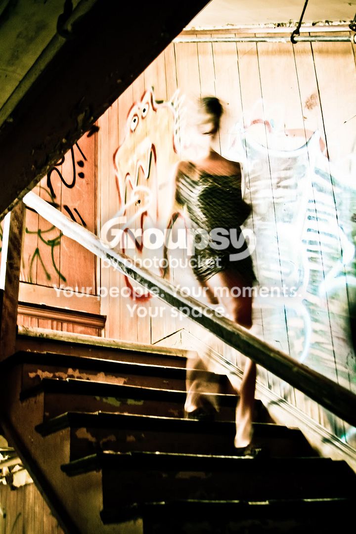
#2-
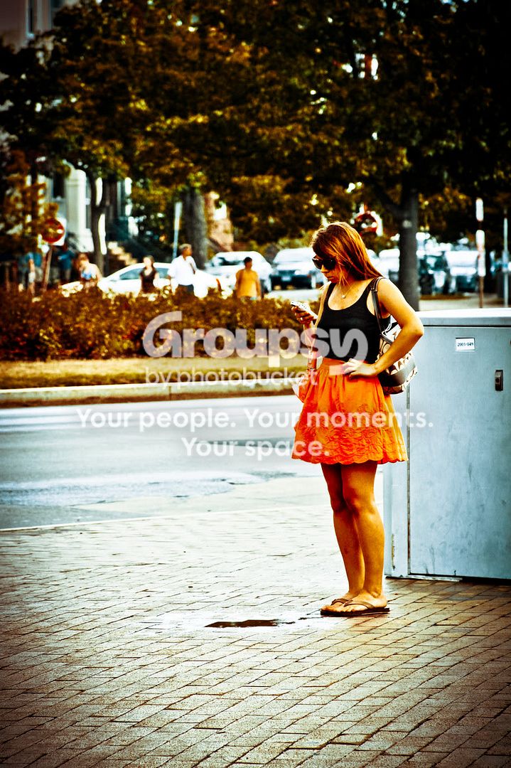
IMG_1097.jpg


I like this picture too, it was a handheld exposure so I wish the girl's surroundings were sharper but there's nothing I can do about that now.

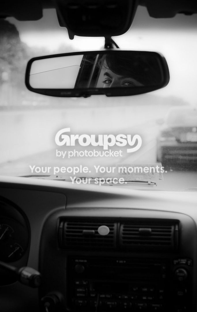
#3-
IMG_1031.jpg


I like this picture too, even though it's awfully dark. Her eyes are suggestive.
 
I really like the second one!! The colors and the movement make this a very interesting shot.

#1 Does nothing for me....just looks like a pissed off guy w/ a distracting background.
#3 The eyes in the mirror are fun and flirty but the rest of the picture is lacking anything interesting.
 
I appreciate your commentary. I didn't really like the second picture all that much until I looked it over a few more times. Any editing suggestions on that one?

Don't need any C&C on this one, just keeping the thread interesting ;)

IMG_1135.jpg
 
Aye, #2 looks interesting. You....could maybe change the bright lights along the wall/stair to alittle darker??? I dunno, I don't have much comment on it other than I like it lol.
 
Yeah, I like #2 also. You could try and burn in the wall behind her just a bit if there are details to be added. But not too much :)

#1 and 3, I agree with Mishele. That VA sticker sure has grown since I last lived in that state, lol.
 
I like the first one the best. It's straight, it's simple, and it's a potent stare that guy has, I also like the symmetry. Second one is pretty cool but it's a long exposure... kinda boring. I like the concept for the third one but the cropping and balancing of the visual elements and the actual subject just off. The eyes are suppose to be the focus but because of how small it is in the grand scheme of the photo, it looses its effectiveness.
 
In #3, I don't find her eyes very suggestive at all...unless the suggestion is "Beat it, punk."

I like 1 (minus the hand) and 2, but not 3 so much. The dark parts are too dark in it or something.
 
I love hearing everyone's different tastes and opinions. I truly appreciate the commentary; I think about the stuff I "learn" from you guys in these threads every time I go out to shoot.

Bonus shot, don't need C&C (though I do really love the angles):

IMG_1121.jpg
 
I still like the concept of number 2 the best. I think I will have to try that sometime...
 
#1 is good. Could be better if cropped properly.
 
one editing suggestion: dont edit it anymore.
 
one editing suggestion: dont edit it anymore.

I spent a long time being anti-PP, so getting into using LR and PS has been an interesting venture for me. I find it difficult to know what is too much and what is too little, so it's nice to have someone comment on that front.
 
I like the man's expression and the shadows on his face.

The second one doesn't do anything for me I don't find the blur or the exposure aesthetically pleasing


I only found the eyes in the last one interesting the rest is is kind of bland
 

Create an account or login to comment

You must be a member in order to leave a comment

Create account

Create an account on our community. It's easy!

Log in

Already have an account? Log in here.

New Topics

Back
Top Bottom