Photo Comparison for Lightroom Techniques

James W.

TPF Noob!
Joined
Dec 13, 2015
Messages
20
Reaction score
12
Location
Bozeman
Can others edit my Photos
Photos OK to edit
I recently took a short trip to Hyalite Canyon which is South of Bozeman, MT. I brought back several images that I like, but this one is my favorite of the bunch, so I've been playing with it in Lightroom.

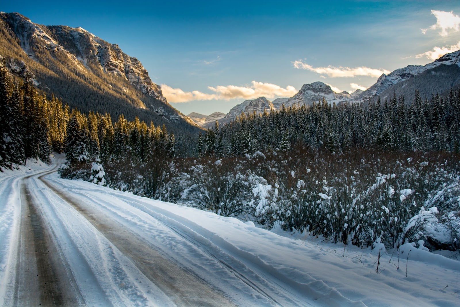
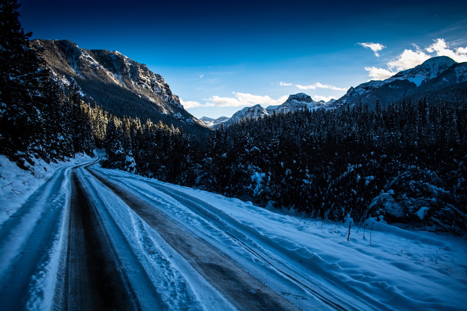
Here are the two "best" edits I think I've pulled off, but I'd like advice and feedback on how to make these photos more natural. The first one I wanted to keep, and even enhance, the winter blue tones and the second one I wanted to bring out the warmer sunlit tones just to see what would happen. I've also included the original photo for comparison.

Oh and yes, the mountains in the background aren't in focus. I didn't get the correct f/stop nor was I paying much attention. Obviously that will be corrected in the future. I've also just realized I edited a different photo for the bluish, cooler copy, but all the specs are the same, the angle is just slightly different, so shouldn't be much of a problem.

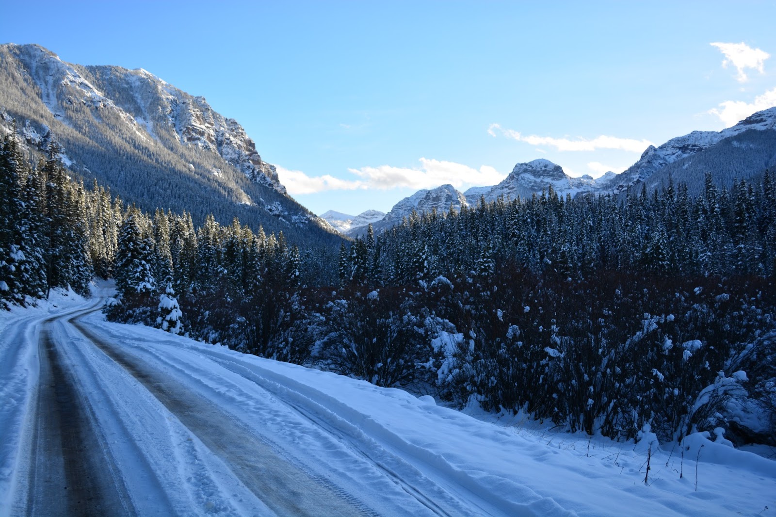
Here are the photos for comparison. Which do you like? What could I have done better in post editing?

Hyalite%2BCanyon%2BRoad.jpg


DSC_0272-2.jpg


ORIGINAL:

DSC_0269.JPG


Thanks!

--James
 
I think the first edit is better. The second one is to blue and looks in my opinion artificial.
Did you use the saturation /vibrance slider? You can on the colour tab (hue /sat/luminance) just target the blue and tweak there. I generally think these things should be done lightly. As for improvement, well I am not fantastic on editing, but tread lightly and maybe a little play with wb correction also.

For real deep blues in skies, a polarizer is your friend
 
I agree, the warmer image is much stronger here
 
Image #1 is by far the strongest. The original lacks details the eyes want to see, and the second edit is very cold with a high amount of contrast.

That said the first image has an odd effect going on, seems like a grayish / brown stripe or something that the other photos lack completely. Its odd to look at and pulls my eye hard.
 
Thanks guys, at a minimum at least I have a better idea of what people like in a winter photo.

To tell you the truth, the second edit is the closest to what my eyes were seeing. In situations like this, the camera can't (or at least is very hard to accomplish) take a photo just as the eye sees it. The sun was low and below the ridge, so the whole valley was blue and dark. Of course, Hyalite Canyon is such a unique place due to positioning of everything that such an effect is possible for both morning and evening. But now, looking at the photos a day later, I'd have to agree that the first image (which was my latest edit) is most pleasing to the eye.

Jaomul, I did use saturation and vibrance a lot on the second edit, but on the first photo I barely touched it. I was mostly concentrating on getting the exposure correct as it was a very, very high contrast image...

shmne,

...which explains why I have that grey stripe in the snow. I'll need to take that out and bring the exposure in that area back up a bit.

Once again, thanks! I appreciate the input.

--James Willmus
 
If you don't mind my two cents in the matter:

- The first one is gorgeous, it adds a lot of detail to the original, and the added warmth gives it a lot of life. Somehow there's a contrast between the far off mountains and the trees and the road on the foreground because the background has all this warm sun spill, whereas the foreground was left much "cooler" in comparison. Almost grey-ish. Did you try giving the road and the trees a very slight warmth as well?

- I agree with the other comments, this photo is too cool and dark, it's just not natural. I understand that it's as close as your eyes could see, but do remember that our eyes are WAY better than our cameras when it comes to dynamic range (which is why a well edited HDR picture looks a lot like our eyes see), so it would not be an easy task to translate what you see to what you shoot. Also, the blacks are black enough that the eyes just want to see the details around the trees but there's just nothing there.

Hope it helps.
 
I like the first one too because of the warmth it adds. But I also like the third one too because it has the wintery blue tones that I like in winter photos.
 
I think the first one, as others have mentioned, is the most realistic and best edit. HOWEVER, I really like the second one but I think it is just too dark. I think if it were brightened up it would be really cool looking!
 
Number one is my choice. The second one is too blue for me.
 

Most reactions

Back
Top