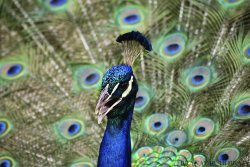
Photo entered for a competition.. how do you think it is?

Want us to see it post it here. Most will not click on your facebook page and like the image.
 
I want to like it, but honestly, I think the blur of the feathers kinda hurts my head. Sorry. Nice and sharp on the head/neck, I like that part. Did you increase saturation or is that really how vibrant he is?
 
$1.jpg

If you think its good it won't hurt to like it also :D
 
I like it. Feathers are a bit too much for me too look at though.
 
The pretty much dead center composition loses a lot of the potential tension and drama that would have been achieved by applying basic visual art composition guidelines.

The blurred tail feathers work nicely to separate the peacocks head from them such that the birds head has some pop.

One way to help a centered composition, is to crop it to a square, or just crop a bit of the right side of the frame to accentuate the space the birds head is turned towards.
 
Nice photo, I "liked" it for you on Facebook. Does it have it's issues? Yes. But I like it enough to try and help you win the competition.
Best of luck.
 
I think in future you might do well to get advice before actually entering it. It's a bit late now whether we like it or not!

It's a nice enough photo - as KmH said, you've done well to separate the head from the busy feathers behind, the exposure is good and the colour and contrast are nice, but the composition is a little bit beginner-ish, i.e, centred and taken from a standing position rather than at the bird's eye level.
 

Most reactions

Back
Top