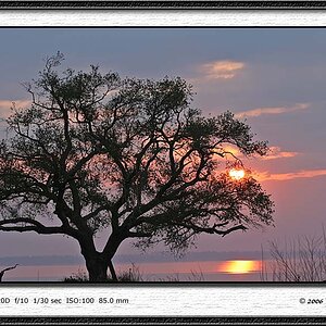
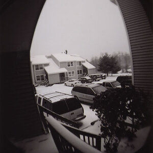
if the intended center of interest is the stuff on the far shore, composition is off, imo. poorly framed.
image as presented is flat and under processed.
I would demonstrate but your profile is marked as 'no edit'
if the intended center of interest is the stuff on the far shore, composition is off, imo. poorly framed.
image as presented is flat and under processed.
I would demonstrate but your profile is marked as 'no edit'
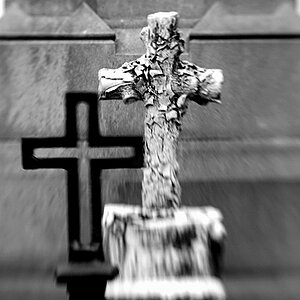
it has no center of interest. scenic shot. dulled near bw. framing, is intentional. flat and underprocessed. I might agree with you on this. I have another version I brought up the contrast, shadows and color in. im not sure which one I like better but the latter I wasn't really a large fan of either. I sent this one to get printed. Pick it up in a hour couple hours. if I don't like it, ill take your advice on the flat and underprocessed because I was kind of thinking the same thing. You just kind of concreted my own thoughts. I just don't have a good eye for this on what is "preferably". OR maybe I should just make it bw it is already 90 percent there?
Thanks.
I wouldn't go B&W. I would try to turn the grey more into white, lighten those up, and get more detail in the stones in the front. A lot of detail is lost because they are too dark.
I wouldn't go B&W. I would try to turn the grey more into white, lighten those up, and get more detail in the stones in the front. A lot of detail is lost because they are too dark.