What's new

Pictures of my daughter

dylanstraub

TPF Noob!
Joined
Oct 28, 2010
Messages
356
Reaction score
11
Location
Delaware
Can others edit my Photos
Photos OK to edit
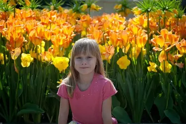
Her name is Rachel and she is 6 years old. Occasionally (when it suits her) she will pose for me.

1: $5663355478_19eede3539_z.webp


2:
$5662787635_526edaf783_z.webp

I couldn't quite fix her tone so if anyone has any pointers please let me know. I'm using Lightroom btw.

3:
$5662787581_bff30113c0_z.webp

4:
5663355158_d749479c4e_m.jpg


5: My Favorite
$5663355220_f9786e94bd_m.webp

I'd like some opinions about composition and pp. Obviously the latter is a bit more difficult but if anyone is interested I can post the originals. Thanks for looking. BTW sorry these are so small. You can click to expand them.
 
Last edited:
Can't really comment on post as this monitor is so old and out calibration her skin could be green and I wouldn't know it. Composition on the other hand... The main issue I see is that the subject is pretty much bang in the middle of all of the images. #1 for instance I think would be much improved by cropping out the railing on the left and most of the area above her head. That would eliminate the railing's shadow competeing with the child's for the viewer's eye. #2 desperately needs some fill light and a crop of one side or the other to place her off-center. #5 is nice, and again, a slight crop, this time removing the empty space above her head would make it that much stronger.

Just my $00.02 worth - your mileage may vary.

~John
 
Thanks for taking the time to respond. So I have to ask why everyone is so against putting the subject in the middle of the picture? Is this some kind of photographers golden rule or something? I have tried a few times to move her to the side but it just doesn't look right to me. 1 I thought about removing that fence 2 I agree that the flowers overwhelm the picture. Her skin tone looks a bit pasty and I had a hard time fixing that. 5 that would pretty much fill the frame with the subject and I wasn't sure if that would look right. Back to the drawing board. Thanks for your critique and I'll repost later tonight.
 
Rule of thirds. Can be broken depending on the strength of the image but is a useful guide to make an image dynamic.
rule of thirds - Google Search
An image can be cropped sometimes to accommodate.

Your shots are focused and clear. Nice start.
 
Traveler- I'm not sure why they turned out so small. Usually I don't have that problem but I think it might be a Flickr thing becasue they are bigger on the site. VTF thanks for the compliment. I agree-focused and clear is a good thing. As for the rule of thirds, I wanted her to have some flowers in the back but as stated earlier in the thread it should be cropped. I'm just happy that I got her to sit still for me. Usually she either runs away or hides when I bring out the camera. I'll keep shooting.
 
The second image is my favorite. I think that the flowers fitted well on the scene.
 

Most reactions

Back
Top Bottom