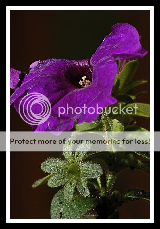
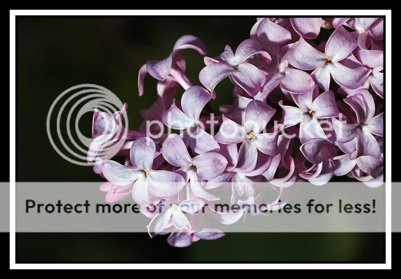
Thank you. 3 and 4 are no crops though. I agree in 3 that I should have zoomed back out a hair. With 4, there was nothing interesting to shoot any farther to the right though. Thanks again.
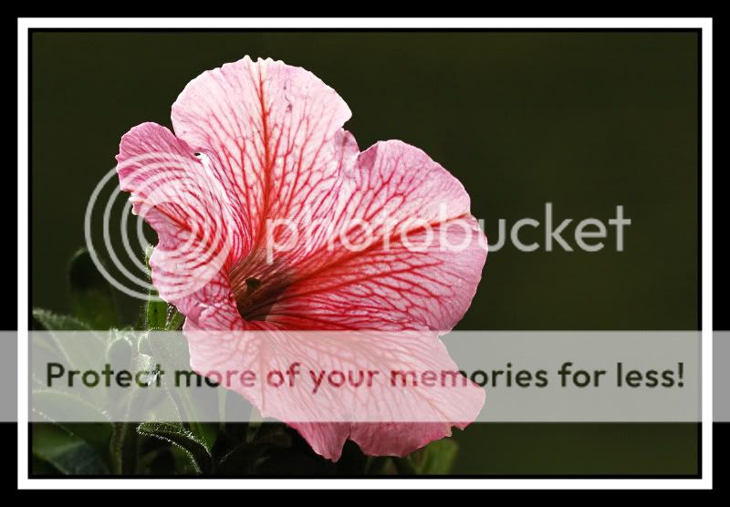
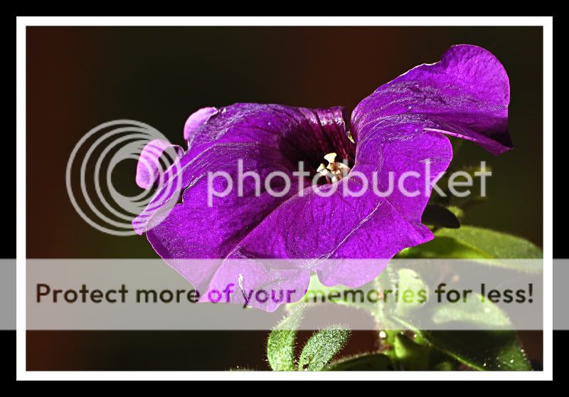
They are nice. The first one is the best IMO. The second one has some weird color stuff going on in the bottom right corner.. and I think the flower is lackluster.. it looks like its dying.
The third like a PP mentioned has that petal cut off and the comp could be better. And again with the dying flower...
The forth is somewhat uninteresting. I wonder how it would be if you flipped it vertical? And it might really pop in black and white.
Thanks for sharing. I think your lighting really worked in these shots.
Thank you for the comments. It's funny how two photography sites view the pictures drastically different. On this one, 1 seems to be the favorite (I don't like 2 or 3 and both are now "throw outs" to me), but on the other site 4 was a huge favorite by everyone. The same happened in another thread of mine recently which is why I always post the pictures on both forums. Thanks again for your comments.
")


![[No title]](/data/xfmg/thumbnail/32/32179-99b00fe3df8a5ed7303ced76980128fd.jpg?1734161047)


![[No title]](/data/xfmg/thumbnail/32/32177-3a3d923fa1584c6ef7d6602aaa24fbc6.jpg?1734161047)