CCarsonPhoto
TPF Noob!
- Joined
- Oct 27, 2009
- Messages
- 226
- Reaction score
- 0
- Location
- SC
- Can others edit my Photos
- Photos OK to edit
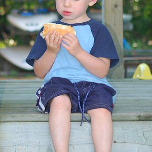
The WB is off in the original and in the edits, IMO. I really like your concept, and the artistry is shots are good. I would, however, prefer that the shots were not cropped so as to cut off extremeties.
Also, next time you do a shoot, and you have a wrinkled sheet in your livingroom, have your models stand about 5-9 feet away from the backdrop. This will throw the sheet out of focus, thusly eliminating the distractions.
Overall, I think you're off to a great start.
PS- another thing to try is having a light source on your background to evenly light it and reduce distracting shadows, then have lights on your models. A couple of lamps, and a DIY snoot is cheap on the wallet


