She's a lovely young woman. I like the lighting setup mostly, and think the fan for the hair movement was a splendid idea! I honestly do not think what is being used here is properly called negative space. As it is, she is looking out of the frame and up and away, and the "weight" of her gaze is making the frame exceptionally "side-heavy", and all the space on the left is, as the first respondent above called it, dead space, not "negative" space. Anyway, the LIGHTING is probably more of what we should focus attention on.
I DO LIKE the look of this, but there are a few areas I see that could be altered for a different result. FIrst is the degree of contrast of the shot. To me, it looks like the shadows are too deep and detail-less. Specifically, the shadows in her hair areas around her ears...I can see a specular highlight on an earring, but NO earring...because, I am thinking, the HAIR light was a bit too hot for your taste, and you corrected that in post production, and when you got the hair brightness just PERFECT...that exposure adjustment pulled the shadow values down too low...for my taste, the overall contrast is too high for a studio-lighted portrait...just a bit too high on the gamma, or degree of contrast.
I have mentally gone back and forth on the color balance...on one hand the light seems awfully yellow and golden, and her skin looks a bit too yellow-ish...and yet, it makes her look tanned and healthy...I dunno... I like the background's simplicity and color. It's always so awesome to get new gear, and the Alien Bees are going to be a treat to work with! Thanks for posting. I agree with you on the eyes thing...too,too much movement these days to go STRAIGHT to retouching real people...she's very pretty just the way she actually *is*. No need to rush right in an make her look like a plastic, imagined doll-like person who does not exist!


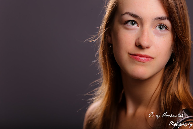


 It's actually just a tad tanner than how she looks. I didn't correct for the hair light with an overall exposure adjustment, just a bit of local brush dodge/or burn, which one is it!




![[No title]](/data/xfmg/thumbnail/36/36662-242aa39f5cb3a23494857864779f669b.jpg?1734169171)

![[No title]](/data/xfmg/thumbnail/31/31980-e5048a424621c7b3cd0d306d63c09d67.jpg?1734160756)
![[No title]](/data/xfmg/thumbnail/35/35966-4f59fb71a71adfe775ae568f8c534699.jpg?1734167835)