Playing with selective color - C&C

Neil S.

TPF Noob!
Joined
Jul 16, 2010
Messages
1,128
Reaction score
21
Location
Japan
Can others edit my Photos
Photos NOT OK to edit
I shot this years ago and thought it may be a good image for me to practice selective coloring on.

I am still a PS noob by the way.

1.
IMG_4572.jpg
 
Selective colour works well here because you have added emphasis to the primary subject. The geometric background works well in grey scale.
 
Selective colour works well here because you have added emphasis to the primary subject. The geometric background works well in grey scale.

I just thought it looked pretty descent for this type of shot lol. I had no idea why, thanks for the input and I appreciate it.
 
I disagree. It may look ok but you are not accomplishing much. You already have neutral colored floor ( I assume bamboo color) and black and white window. I bet the original looks far better than this one. I could be wrong though. :lmao:
 
As you are practicing the technique, I think you did a good job.

In terms of its usage, I think it fits well with the image. As oldpacman said, use selective colouring as a tool to help draw interest to your subject. Some people will take a photo of their kid and selective colour the toy they are holding. This puts emphasis on the toy and not the kid.

To add to what schwetty said, maybe not a full black and white background would work, what about just a slightly desaturated background with full colour subject?

Keep on pushing those PS skills. :)
 
meh. don't like it. just looks like she's floating.
 
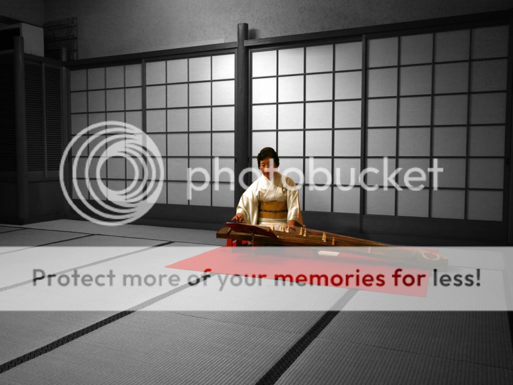
I'm not much of a fan of selective color, but here it works well and definitely adds to the picture. As has been stated, too often, it's used in a way that draws attention away from the subject. Here, it focuses your attention on the subject quite well.
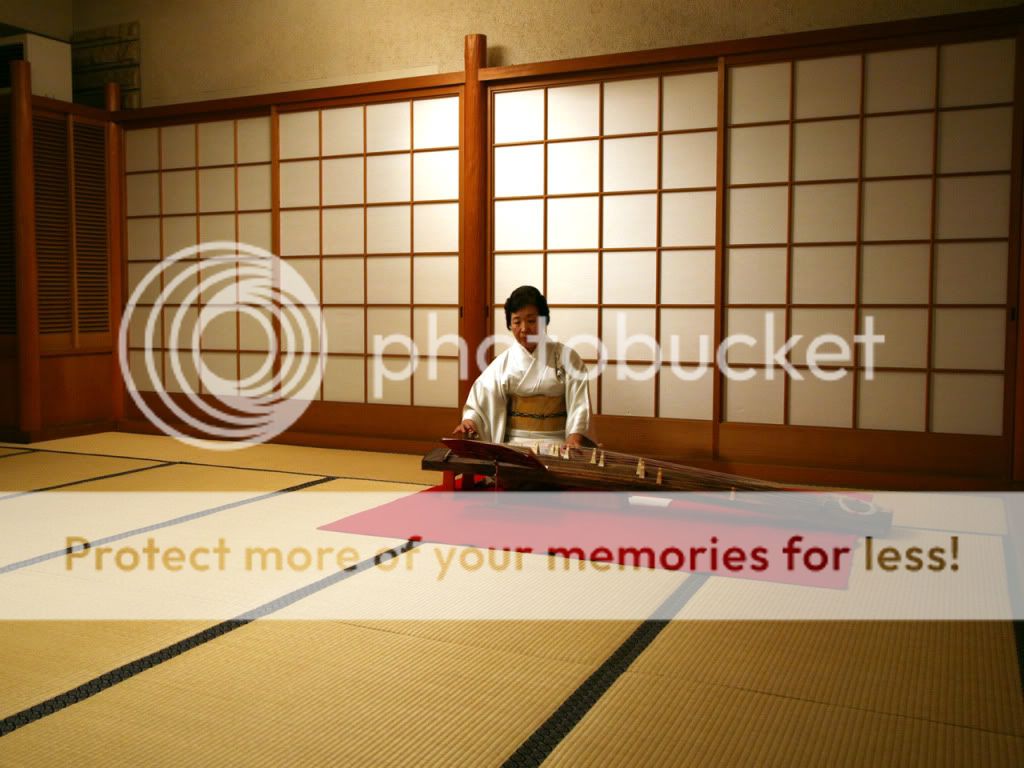
Nice picture.
 
Thank you guys all for the input. It is appreciated. :mrgreen:
 
Post the original Neil?
 
Nice. She is the center of attention already. I like it.
 
Nice. She is the center of attention already. I like it.

Ya you are right that the subject naturally was the center of attention.

Mostly I was just playing with selective color, because I had never really done it before.
 
I am not a big fan of selective coloring, but this isn't too bad. Seems to work decent enough and doesn't come off as just a "doing it just to do it" type deal. It could just be my laptop screen, but to me It looks like it would be better if the black and white portion was darkened just a bit. I think it would look better with the walls/window frames being closer to a black. Maybe its just me. I think it would make the red pop more also.
 

Most reactions

New Topics

Back
Top