0th - Always shoot RAW
1st - White in the water is blown out. If you don't have an ND filter, or say, Circular Polariser, decrease your aperture size (say f/22 or f/32 if you can) and make a pic of several seconds long, see the magic!
Step back a bit, lower the camera, Rule of thirds, have the barrel to the right, waterfall in the back, smooth, cotton, magic.
2nd - I actually kind of like. Keep in mind what the others have said.
The following is strictly my artistic interpretation so take it or leave it, or rather, absorb it, think and explore!
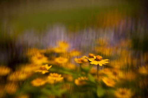
I'd crop it a little closer, but, Deliberately have it Out Of Focus. The colours look quite similar to Oil paintings, perhaps a little like Van Gogh, in that respect, BOKEH FILTER! Make your own, or go the lensbaby route:
From the website
Lensbaby - Shaped Bokeh | Creative Aperture Kit for Heart, Star Bokeh
3rd - The composition is OK, not the best it could be but you have the right idea. I would have taken several more pictures from slightly different angles and distances.
The colours are off, but that's what I like about it, it feels warm and alien. Something I have a lot of trouble with is white balance, so don't necessarily take my word as law. I like off colours.
Again, see the Bokeh blurb above. Make it look like paint strokes.
Lastly, your picture is too noisy and soft. It looks as though you had enough sunlight. Consider investing in a tripod, or at least a Gorillapod. Longer exposure with slow ISO is your friend, especially in shots like these. Don't be afraid to close that aperture, f/6 to f/11 is usually where your lens' sweet spot in terms of sharpness is.
4th - I'm not too sure what you where going for, but it just feels too much like "Layer Cake". Try pointing more to the right, having the tree and house as point of interest, again, rule of thirds. (I say that a lot, don't I?

)
5th - I would have preferred it without the human element.
I believe you have
two pictures here.
1st - Of and on the pier itself, framed in such a manner that one side of the lamps lead the eyes into the picture. As for contrast, B&W, colour, that's up to you.
2nd - Off the pier, it on the side, leading the eyes into the sunset. Colours, etc, would be interesting with what you have chosen. Feels fake. Not necessarily a bad thing, maybe like a postcard.
Right now you have those two mashed into one and it doesn't work too well. The pier leads the eyes away from the sunset, but the sunset calls to look at it. It feels unbalanced.
Those are my two cents, ENJOY!


") .
.


![[No title]](/data/xfmg/thumbnail/33/33436-1304fb294d2141a65ae8309383a3e52a.jpg?1734163466)


![[No title]](/data/xfmg/thumbnail/34/34685-17f2466cddc9890af6ca67c65e2e7d5c.jpg?1734165691)
