Navigation
Install the app
How to install the app on iOS
Follow along with the video below to see how to install our site as a web app on your home screen.

Note: This feature currently requires accessing the site using the built-in Safari browser.
More options
You are using an out of date browser. It may not display this or other websites correctly.
You should upgrade or use an alternative browser.
You should upgrade or use an alternative browser.
Please critique my work
- Thread starter samcolby
- Start date
OscarWilde
TPF Noob!
- Joined
- Mar 7, 2012
- Messages
- 229
- Reaction score
- 51
- Location
- Canada
- Can others edit my Photos
- Photos OK to edit
Have a feeling this is going to be moved to the "General Gallery" or somewhere...
Anyway, (These are just my opinions and aren't based on much in the way of "technicality")
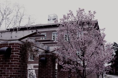
1. One is okay, a tad boring maybe? The angle may have been better from the "opposite" angle looking away from the building. Makes for a more interesting background. (maybe...)
2. Is my favorite. Some of industrial kind of stuff kills it a bit (the roof unit, and the lights? on the columns) but I like the juxtaposition between the blooming tree and the kind of "dead' vibes the lighting gives.
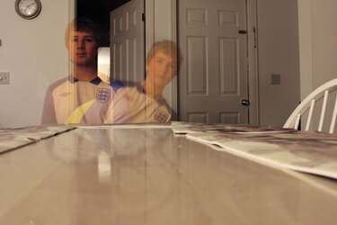
(Unlabeled #3). I know its fun when playing around with exposures to make ghosts of yourself, but as a photograph it isn't really much of anything nor is the composition very good
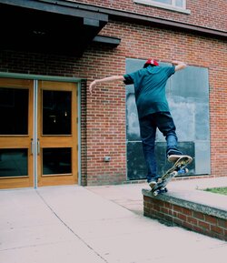
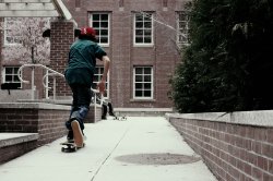
4. second favorite. It has the best lighting (for my tastes; although still pretty "dead" looking) and the timing and the angle are both good. Could have had some tighter framing on the skater. (ie. Zooming in closer to the window.)
Overall,
Not sure if it is just the look you are going for, but you definitely have a "sorrowful" vibe to your photos. Nothing is vibrant or very positive looking. Which isn't necessarily a bad thing, I just wasn't sure if that is what you were going for!
My 2 cents!
Cheers
Edit: (You also haven't selected whether your photos are okay to edit, otherwise I would demonstrate for a couple of my comments... )
Anyway, (These are just my opinions and aren't based on much in the way of "technicality")
1. One is okay, a tad boring maybe? The angle may have been better from the "opposite" angle looking away from the building. Makes for a more interesting background. (maybe...)
2. Is my favorite. Some of industrial kind of stuff kills it a bit (the roof unit, and the lights? on the columns) but I like the juxtaposition between the blooming tree and the kind of "dead' vibes the lighting gives.
(Unlabeled #3). I know its fun when playing around with exposures to make ghosts of yourself, but as a photograph it isn't really much of anything
4. second favorite. It has the best lighting (for my tastes; although still pretty "dead" looking) and the timing and the angle are both good. Could have had some tighter framing on the skater. (ie. Zooming in closer to the window.)
Overall,
Not sure if it is just the look you are going for, but you definitely have a "sorrowful" vibe to your photos. Nothing is vibrant or very positive looking. Which isn't necessarily a bad thing, I just wasn't sure if that is what you were going for!
My 2 cents!
Cheers
Edit: (You also haven't selected whether your photos are okay to edit, otherwise I would demonstrate for a couple of my comments... )
- Joined
- Apr 9, 2009
- Messages
- 41,401
- Reaction score
- 5,706
- Location
- Iowa
- Website
- kharrodphotography.blogspot.com
- Can others edit my Photos
- Photos OK to edit
Yep. I have moved it to the General Gallery, because like it says in the Beginner's forum description:Have a feeling this is going to be moved to the "General Gallery" or somewhere...
.......This is NOT an actual gallery, but more of a place to ask questions and get feedback on technical issues. Use the TPF Galleries to show us some of the photos you have taken so far and get some review - so you can learn where there is room for improvement!
Frequency
Been spending a lot of time on here!
- Joined
- Oct 17, 2010
- Messages
- 8,864
- Reaction score
- 683
- Location
- Calicut, Kerala,India
- Website
- www.photosenzitive.com
- Can others edit my Photos
- Photos OK to edit
The action shots should have been more filling the frame i feel 
The tree + House looks fine; but showing a house after hiding it mostly is not good; if it were all about the tree, i would prefer a tree-alone image with low DOF
Ghost image is OK
Regards
The tree + House looks fine; but showing a house after hiding it mostly is not good; if it were all about the tree, i would prefer a tree-alone image with low DOF
Ghost image is OK
Regards
F_Stopped
TPF Noob!
- Joined
- Mar 25, 2012
- Messages
- 7
- Reaction score
- 2
- Location
- Boulder, CO
- Can others edit my Photos
- Photos NOT OK to edit
2 and 4 are my favorites also. 1 isn't bad, I wish the depth of field were adjusted slightly. I think it would add a little more visual interest. I like the composition of those 3. 3 seems a bit gimmicky, but kudos for trying something out, it's how we develop as photographers.....no pun intended  Well done.


![[No title]](/data/xfmg/thumbnail/42/42062-136a63ad7d0bd740e99ca1fc477f214c.jpg?1619739997)
![[No title]](/data/xfmg/thumbnail/37/37113-886cb28b1e3fb197bdd00a9148269407.jpg?1619737882)
