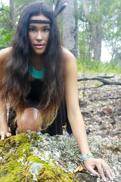
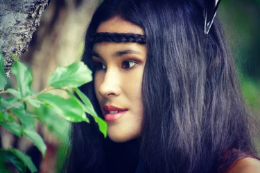
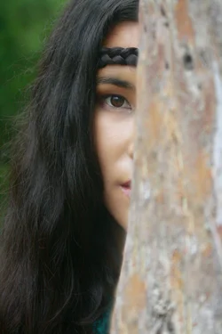
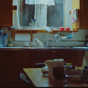
I think I can see what your intent was with the shoot, but I'm not 100% sure you acheived it.
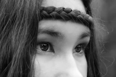
1. Not bad, but I would prefer to see herlooking more (but not directly) toward the camera. Watch the fly-away hairs image right. They really hurt. Good monochrome conversion.
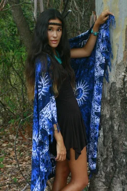
2. This doesn't work for me at all. Way too much DoF, the pose is.... well... awkward and the expresion forced. In order to pull something like this off, you need to go all the way with the accessories, and the blue blanket doesn't cut it.
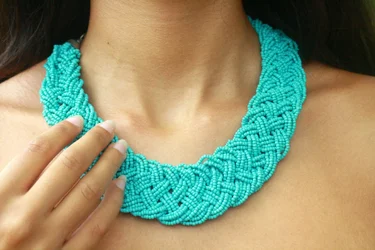
3. This should have been shot vertically to include more of the hand. Good exposure and colour.
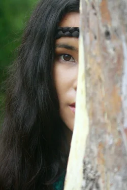
4. If the foreground didn't have the large white strip in the middle, this would be much stronger.
5. Potential here, but you needed a couple of foreground lightsto knock down the ambient. The blown sky is really killing this, and why the tight crop? NEVER bisect a limb along its lateral axis!
6. Unfortunate composition. Without the leaf "resting" on her chin, this would be a nicer image.
It's a good start on a neat theme, but I think you need to revisit it. Spend a little more time in the prep & research stages.
Just my $00.02 worth - your mileage may vary.
~John