Portfolio critique needed

ralphh

No longer a newbie, moving up!
Joined
Jun 29, 2012
Messages
222
Reaction score
58
Location
London
Can others edit my Photos
Photos OK to edit
Edit; based on ceeboys comments, a couple of these are probably not work-safe, or at least getting on that way so apologies on that - really should have thought about it...

Hi all,

The other day I decided to have a little prune on flickr... But the more I looked, the more I hated everything and the more I deleted. Before long I got depressed and had to take a break and came on here to have a cry and get a hug instead.

Anyway, in the end I decided I wanted a no-junk 1-page flickr account. There’s 18 photos on a flickr page, so I set myself the goal of getting down to just 18 photos, which I have now done. Going from 100’s to 18, I’m sure I chopped out some that were the best if only I had the brain-power to realise it, and left in others that weren’t as good, but overall I do think it’s representative of my better stuff.

One thing I definitely found out though through all of this is that that my photos are not nearly as good as I thought they were!! :lmao: And I really want to get better!

So, now I am down to this manageable number, can someone(s) have a look and tell me how to move forward from here? What am I consistently doing wrong (I can spot a few things myself, but I’ll see what people come up with), and what can I do to improve, whether it’s classes, books, sites I need to be keeping an eye on for inspiration, anything.

If you need some context, well they’re mostly portraits, or concepts I wanted to shoot that needed people modelling them. This is a hobby, I’ve never taken a penny for a photograph and don’t plan to – good way to ruin a perfectly good hobby if you ask me! Also, all but 2 were taken in natural light… I know that’s considered the 8[SUP]th[/SUP] deadly sin round here, so you have been warned. Or is that just being a “natural light photographer” when asking for money and not knowing what a harsh shadow looks like?

I don’t think my work is really terrible at a fundamental level, so this isn’t just going to be a quick case of “they’re all out of focus and badly exposed, go away” (at least I hope not!); they're more in the 'mediocre' category I suspect, so I appreciate that it’s probably going to take effort to provide constructive criticism, so thanks in advance for that. Not worried about any individual image critique unless it’s you really feel the need. Over to you;

Flickr: Ralph Hope's Photostream

(appologies is this is the wrong board, seemed like the closest match)
 
Last edited:
I like your style! I looked at all of your photos, and I have to say....GREAT JOB!

My favorites were "Taken" and "After you're gone". I also really like the Angel pictures, but here is an idea when shooting with mirrors, do an opposite pictures, so on 1 side she is an angel and in the reflection she is the devil/naughty.
 
Thanks parker!

You have actually addressed a concern I had -- about half of these are modeled by my wife, and I was worried I couldn't critique them as impartially as photos of other people, but then again, when I have a concept I want to shoot, rather than just making a portrait, I tend to get her to model, so I really couldn't tell if I had a more better ones of her, or if I just liked them better because they mean more to me cause she's in them. The three you mentioned were all modeled by her, so I guess it's no bad thing I left so many of her in :)

On the Angel one, I was kinda attempting what you're suggesting in a way; if you look at where the halo is, only the reflection has the halo - I didn't put it on the mirror above where my wifes head was, but above where her reflection's head is, and she's looking at it, and not happy. Kinda lost halo kinda thing, or seeing something in the mirror that doesn't reflect who you are any more. Or that was the intention. Clearly it didn't work as well as it'd hoped! :lol:
 
Last edited:
My take. Most of your images are overexposed, undersaturated with a single focus centered figure. I have several issues with your images, the foremost being the explotation of your wife's nudity to get people to look at your portfolio, and secondly, the forced posing - which, in a properly exposed image would probably pass muster. Once I look at the figure, there is nothing else in the scene to hold my attention and they are holding my attention marginally.
 
Ceeboy, thanks for taking the time to comment, I do appreciate it, but I'm having trouble pulling much constructiveness out of the criticism, hoping you'll be able to elaborate a bit..

I 'm not seeing what you mean about a lot of the subjects being center-focused, but perhaps a lot are are centralized horizontally within the frame if that's what you mean..?, however with portraits I wasn't aware this was a particular problem; I've found that I just end up with a lot of dead space if I off-centre portrait subjects and gave up trying to off-centre unless there was interesting background elements that made sense to give frame space to. Could you show me some examples here? Maybe there's some compositional techniques I'm just not clicking with. Doesn't have to be your work, though it might be helpful as you can talk me through the shot.

Another I'm a little confused on is the idea that there's not much else in the scene to hold your interest. This could be said of just about all studio photography on a plain background, no? Ok, most of mine are shot outdoors, but does that mean I should always have secondary subjects in the background? I'm generally working towards subject isolation with perhaps a few things in the background to look at, or just provide a soft back-drop, but nothing attention holding... perhaps mistakenly, so again, examples would probably help me here.

Saying most are undersaturated seems a bit odd, given that half are B&W or toned B&W. I'm generally not a fan of very saturated colours in portraits and tend towards more a neutral look, but looking through them I don't see them as being particularly badly undersaturated..? I'm also unsure about the overexposure. I don't see where the shadows and mid-tones are far from where they should be, but you're obviously seeing something here I need to understand. I do tend to push a lot of contrast in during post-processing, it's just a look I like, is this what you're referring to? If so maybe I just need to tone it down a notch in post. A few of them I've exposed for my subject and let the background blow out - maybe it's that - again, some clarification would help me here.


I'm not trying to argue against your points - you see what you see, I just need a little help turning your feedback into something I can use to move forwards with my photography


As for the nudity thing; I hadn't really considered anything on there to really be 'nudity'. This is possibly just an age or cultural gap thing; yeah there's some bare skin, but only her back. Walk along any beach in Europe or open any English tabloid newspaper and there will be bare breasts on display, which is not the case here. A bit of unclothed shoulder-blade doesn't strike me as anything to raise an eyebrow about, however I've removed the flippant comment from the previous post, and added a "perhaps-not-work-safe" comment to the first post - sorry if I've offended anyone.
 
Last edited:
First, I wasn't offended by the "nudity," as much as I found the invitation tobe a bit on the tacky side. You fixed, it's done, no biggie.

Can you post several of these images on here so I can do an edit or graphic overly to show what I mean? specifically, Hanging out in the UK and Still Waiting.
 
here ya go, bit of a random selection but including the two you mentioned


7460028838_05cb213ca2_z.jpg


8493333170_0fc13e68c5_z.jpg


5439970548_cc3edb1f44_z.jpg


6256846671_ec249f6d3c_z.jpg


5523537569_a7d0278106_z.jpg


8495018105_ccfd17fb0c_z.jpg


7471853330_db6811fa88_z.jpg
 
Last edited:
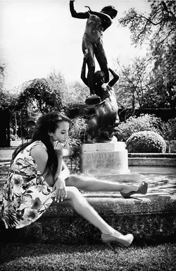
Compositionally, the model's head in front of the statue didn't work. It got very confusing. Also, the overall image was overexposed by at least a stop. Both of these edits are somewhat crude because the images posted are small and only 72 dpi.

$8499244090_9ffca1a2b6_o.jpg

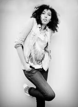
In the second shot, which I think is your best of the lot, I added some needed headroom, darkened her right sleeve to pull it up off the background and darkened the inside of her overshirt on her left side. I also darkened here heel as I felt it was drawing my eye too much. It's always just a matter of opinion. This is mine.

$8498139853_8696b32555_o.jpg
 
The second one. - There is lots of space to her back, her hat is obvious, textured, light and pulls my eye away from her face

Four - the model has no defined waist and this pose exaggerates that - not a good point. Images generally should diminish faults not put them front and center. Showing boobies doesn't make up for that. Ditto, five.

Last, she has a statue growing out of her head.
 
Thanks the feedback, the hat is an interesting point i really hadn't considered.. Was taken candidly, so was options at point of capture. i've toned down the hat in post and the image does indeed look better! Thanks! :thumbup:

I feel #4 has been taken a little out of context by me putting it on here for ceeboy to edit - the shot was titled "after you're gone" and was about how she feels (not her best), and as such was meant to flatter or show her off at her best -- certainly wasn't meant to be about showing off bodies - it's about feeling crappy, not looking good.

Please don't take that as an attempt to dodge your feedback - quite the opposite in fact - to me it points to a much deeper issue in that the image is clearly not communicating what it was meant to if your thought it was about showing off a body. Blast...

My take. Most of your images are overexposed, undersaturated with a single focus centered figure. I have several issues with your images, the foremost being the explotation of your wife's nudity to get people to look at your portfolio, and secondly, the forced posing - which, in a properly exposed image would probably pass muster. Once I look at the figure, there is nothing else in the scene to hold my attention and they are holding my attention marginally.

^^^ i'll come to this is a second


ceeboy, 100% agree on the statue out of head thing, school boy error on that one.. I'm amazed you took the time to photoshop it; for me that photo is only good for the bin. I just can't believe i didn't spot it myself.

Interestingly enough - you say "it's at least a stop over exposed", however grass is generally considered to around 18% grey, and in my image.. it's very close to that, is a little hot - closer to 12% grey perhaps. In yours it's about 30% grey, putting you a long way out.. whatever, clearly I did not expose for the grass, but her face - on yours not even the highlights reach 18% grey. On my original, the highlights are very slightly above 18% grey, and the mid-tones on her face very slightly below 18% grey, and the shadows darker still which is closer to what I'd expect. So I have no idea which part of the scene you think you've exposed for. While I believe exposure is a matter of personal taste, clearly you don't, but even from a purely technical standpoint, mine is significantly closer than yours for the part of the scene I would meter from - ie the subjects face.. anyway, the image is a write off regardless of exposure, so moving on...

On the second, I can barely see what you've changed, except to remove the only background detail the image had- ie killing off the refection of the building opposite which looked like the british flag to me and was given frame space on purpose

84483460.jpg


You've done nothing to address any of the points you made, all of which i asked for clarity on - unless the tiny tweak to her arm you've made was the exposure issue that you've made such a fuss about in which case i'm lost for words, and i don't see how removing the only background element in any way addresses the the point you make about not having enough interest other than the main subject.. quite the reverse.

Regardless, I have to say I found the tone of your original post astonishingly rudely written, with a lot of criticism without any constructiveness. In the original post I was asking now to improve and move forward as a photographer, which you've really not bothered to address beyond telling me that you think just about every aspect of my photos is wrong. BUT I took what you said graciously and without complaint and asked you to elaborate and demonstrate, assuming you were an experienced fashion or portrait photographer with something to teach once I got past your rudeness.. And now today, after looking at the photos you've posted up for critique hoping I could learn something, I find I'm just astonished that you can be so offensive in the language you use when giving feedback to others when your own people images are at beginner level.

Combine that with the fact you seem to think dpi has some bearing on image editing, and the fact you've stated that most are center-focused, which is simply, categorically is not the case - from a quick look back, more than half are not even focused within the region covered by any of the focus points, let alone the center one, and I'm left wondering if you've just picked up, but not understood a bunch of phrases you've read on the internet and decided to just throw them about because that's what other people seem to be doing.

I still appreciate your time, and your opinions, but really, if your gonna be such an ass with the delivery of your thoughts, your own work needs to be pretty good, and your comments either need to be accurate or at least limited to something a bit subjective so you're not just plain wrong.
 
Last edited:

Most reactions

Back
Top