amandalee
TPF Noob!
- Joined
- Jun 9, 2011
- Messages
- 208
- Reaction score
- 12
- Location
- Lubbock
- Can others edit my Photos
- Photos OK to edit
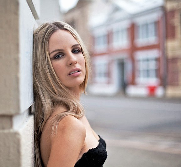
I'm gonna do something crazy and disagree with traveler... I think that the first one is great... I like the lighter version much better ") The other two just don't seem sturdy lol
The other two just don't seem sturdy lol  but GREAT JOB!
The other two just don't seem sturdy lol but GREAT JOB! I've actually been trying to do photography since I was 16, but have been with it very on and off - as in I would try it for a few months, and then put down the camera and not pick it up for a year. All in all I've been doing it more consistently since I was 21, but still have quite large gaps in between taking photos.
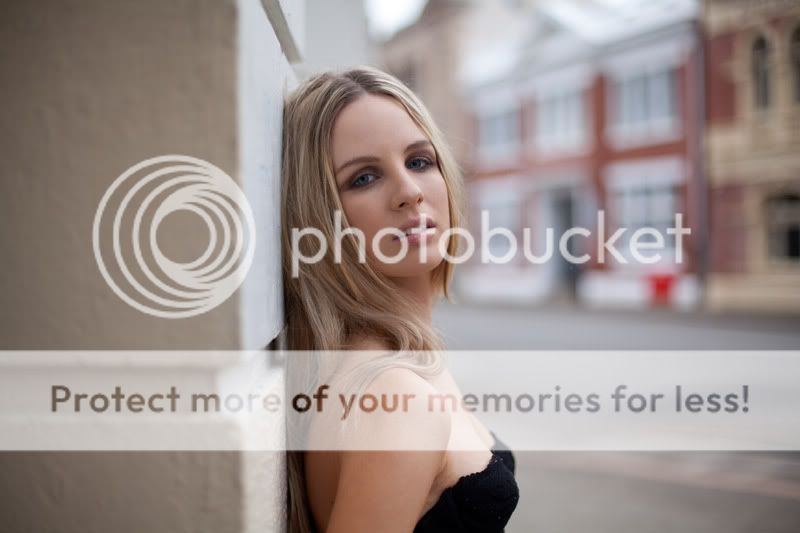

![[No title]](/data/xfmg/thumbnail/33/33449-978bff23ad40c63da778b7e59d54f546.jpg?1734163488)
![[No title]](/data/xfmg/thumbnail/41/41765-153b10bab62ae8adbcc4d984fd08ed74.jpg?1734176069)


![[No title]](/data/xfmg/thumbnail/33/33447-c3f5563c9b8b1f19498a3062f60f92b1.jpg?1734163486)


