What's new

Portraits for critique!

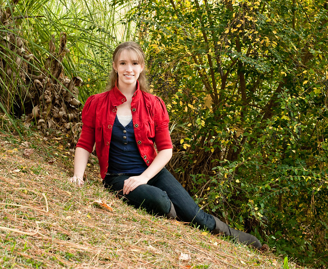
#4 just seems very awkward to look at because of the angle she is sitting on. I almost want to cock my head.
 
Maybe thats a fail then! Just trying something different
 
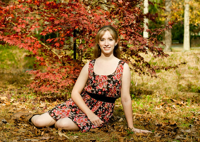
1. the color is very yellow on her skin. A reflector should have been used to avoid that very harsh butterfly effect under her nose and on her neck. It's not flattering to any subject like that. Elongates the nose. The pose is nice and simple. Cropped a little better will work very nicely for rule of thirds and a dynamic s curve leading through the image. Exposure is fine. A bit brighter that my personal taste outdoors, but that is totally a matter of taste. It seems extremely sharp on the leaves next to her head and that draws the eye. I am not so sure it's missed focus, just that you had a large enough depth of field to keep the leaves there in sharp focus. Moving her toward you a couple of feet or using a wider aperture would have taken care of that. Did you do some skin smoothing or cloning on her upper chest? It's totally flat white and I think maybe that is what is bothering me on the brightness.

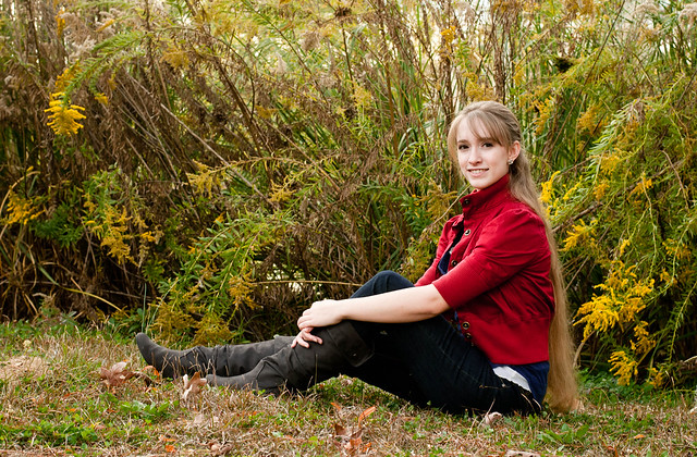
2. the pose is very nice, very nice on the composition. The depth of field is a bit much on this one too. The weeds behind her are entirely too sharp in focus. Color is much better on this one, so are the shadows. I like this one much better for the bright exposure.

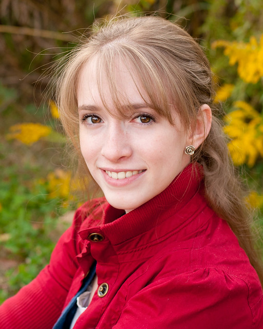
3.Very nice. Nice exposure. She's a touch to the pink/magenta but not by much. Eyes are brightened and sharpened nicely at this size. I'd probably fix the fly away hairs if it's going to print, but otherwise I'd leave them there.

4. I think the tilt actually works on this one. It wouldn't be my first choice to tilt, but it's OK. It places your subject as a nice line leading through the image. Exposure look very nice here. Color is very nice. The depth of field is too much again. Moving her forward away from the hedge thing there and/or using a much wider aperture would have helped on that. It's a lovely set!
 
Mleek thank you for the detailed critique. As far as the Dof goes, that was me being overly cautious as to not have too shallow of dof, mainly because in the past I've used too much and made much of my subject out of focus. It's a balancing act I need to work on!
I didn't do any adjustment to her chest in the image you asked about, maybe just overexposed there.
I was thinking after uploading that she looked a tad too magenta in the third as well.
As far as the tilt, she really was sitting at an angle on that slope, was not done with the camera. I thought it worked here too!

You are totally fine and wise to use the tighter aperture if you are concerned about focus. In which case you want to keep your subject several feet in front of your "backdrop" so that there is some separation between the two with the DOF. Don't forget that DOF has to so with not only the aperture, but the distance from the camera to the subject (both physical distance and zoom*)
 
Nice photos. It is difficult to shoot on angles, however, that one actually looks good. Try a smaller angle next time and see what happens as it might be better. I love #1. Nice colors, just off center with the upper body so it isn't dead center in the photo so this way the tree also shows up. Well done with that one. Keep up the good work. Can't wait to see more.
 
Thanks all for the feedback! Love to learn from my mistakes!
 
They're technically great, I love the colours in the first two, but did you put a plank of wood down the back of her shirt?! I've never seen a girl sitting so bolt-straight! You could could calibrate a spirit level on her back!
 
Pretty good, I like 3 the best. 1 she blends in with the background too much for me. 4 makes me want to turn my head.
 
I actually really love the slope on #4, I think it makes it very interesting. There's not really much I can say with my limited knowledge, but I think you did a really great job here, I love the colors, and the posing it great
 
They're technically great, I love the colours in the first two, but did you put a plank of wood down the back of her shirt?! I've never seen a girl sitting so bolt-straight! You could could calibrate a spirit level on her back!

haha, Forkie..she sits that way all the time! She has great posture!

I loved the colors as well, when I went out to do this, my intent was getting the fall colors in. I do wish I had used more shallow DOF in most though as I can see now where the backgrounds are distracting.
 
1+2 she is too close to the bushes and the background is way too much in focus, 3 is the best 4 she is sliding down hill
 
1+2 she is too close to the bushes and the background is way too much in focus, 3 is the best 4 she is sliding down hill

Yep, I have to work on that :)
 

Create an account or login to comment

You must be a member in order to leave a comment

Create account

Create an account on our community. It's easy!

Log in

Already have an account? Log in here.

Back
Top Bottom