Ok I'll give it a try.. just keep in mind that I'm not all that great myself so this is just my inexperienced opinion. Don't take it too seriously.
1. I like the way the tone mapping/hdr brought out the detail in the bricks, but the amount of perspective distortion hurts my eyes. Also the bright green at bottom right draws my attention out of the frame.
2. I like the idea behind this shot. The pose is interesting and the lighting is creative. I think the brightness of his hair could be toned down a notch, and I wish his fingertips wern't cut off.
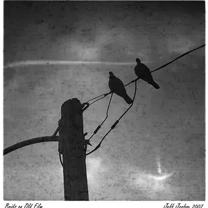
3. I like the b/w conversion, it looks like a photo from the 40's war era to me.
4. I actually like the extreme perspective distortion in this one. You lost details in the subject's hair (shadows), and I can't make up my mind on his face, it's either underexposed a hair or the light is just too flat. And of course had it been a product shot the product name should have been entirely readable.... but that's getting kinda nit picky I know.
5. it's getting late so i'm skipping this one.
6. Again very creative, dramatic lighting. A little too much blank space above IMO, and not sure about the outstretched arm as it pulls my attention out of the frame.
All in all I think you have some pretty creative shots. Just some nits here and there but I think you did well. I hope my comments are somewhat helpful.