KLDSRF
TPF Noob!
- Joined
- Jul 1, 2011
- Messages
- 1
- Reaction score
- 0
- Location
- amman, jordan
- Can others edit my Photos
- Photos OK to edit
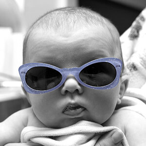
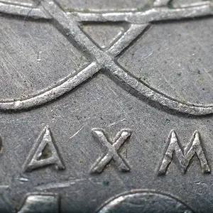
A quick selection of three portraits I took of my friend. What do you think of the shots, and whats your opinion on portraits that are taken in horizontal/landscape form, so to speak? Awaiting your replys!

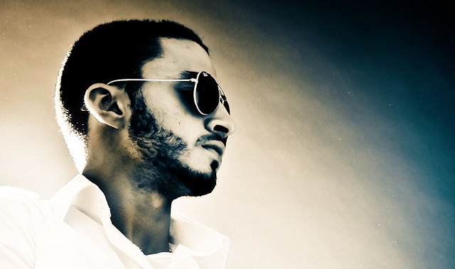

(click on the photos to see them larger on flickr)
(click on the photos to see them larger on flickr)


![[No title]](/data/xfmg/thumbnail/39/39509-3c2c5856429b4b8ff3cf44cd3b2afa8c.jpg?1734173650)
![[No title]](/data/xfmg/thumbnail/42/42494-ba608b57b09b00c0ee005a2360a510f5.jpg?1734177014)
![[No title]](/data/xfmg/thumbnail/35/35264-5ade32b7036391926536661aeb7491c3.jpg?1734166921)
![[No title]](/data/xfmg/thumbnail/36/36663-6033a8e60c3aec9731283de0f7f2aafb.jpg?1734169171)