composition is ok, I like the idea and the metaphore. But I'm not keen on photos with specia meaning, hope you know what I'm talking about I prefer photos of views (mountains, rivers etc). Try to tilt it, it looks for me as if it was falling on one side. I'm not sure. But the idea is nice
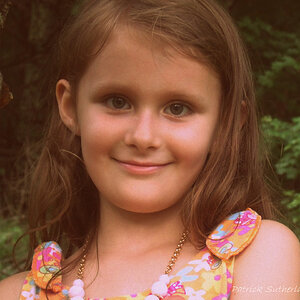
I think you've got a great idea there, but for me, the photo has too many elements so I can't decide where the emphasis is. The child in front grabs me first, but he seems to compete with the home in the background. I think a tighter crop might help here.
Agreed with tighter crop. For me though the child looks well dressed, well fed, and happily at play. I don't see the "poverty" if that's what your intention was. Not to say that you need to dress up your models to portray or anything like that, but I don't see the emotions poverty brings.
If anything I see a child's innocence making the best of what he has. Playing in dirt is loads of fun.
i think...going b/w might do the trick...and i too think that, after much viewing of this photo, the DOF is too wide...could have done with a smaller F number.
and thks for the reviews from all of you. thank you.
I also think the house takes away too much emphasis from the child. But I wouldn't completely eliminate it 'cause I think it is needed to support the caption and theme. A gradient blur in PS could possibly improve the image.


") I prefer photos of views (mountains, rivers etc). Try to tilt it, it looks for me as if it was falling on one side. I'm not sure. But the idea is nice
I prefer photos of views (mountains, rivers etc). Try to tilt it, it looks for me as if it was falling on one side. I'm not sure. But the idea is nice
![[No title]](/data/xfmg/thumbnail/34/34061-e097813b3719866d07ff3e78e8119ffa.jpg?1619736258)
![[No title]](/data/xfmg/thumbnail/31/31978-02cde49248ebdf1b82fba5c899e08378.jpg?1619735136)
![[No title]](/data/xfmg/thumbnail/39/39291-a89dc472765e04f66f617dd9acc8030d.jpg?1619738958)
![[No title]](/data/xfmg/thumbnail/34/34065-43f99c081a04bd087c00711d2fe010ee.jpg?1619736261)