PR Photo

Granddad

Been spending a lot of time on here!
Joined
Jun 22, 2011
Messages
2,271
Reaction score
1,333
Location
Lincoln, England
Can others edit my Photos
Photos OK to edit
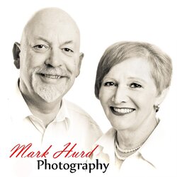
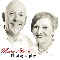
My assistant (wife) and I have been looking for a new PR photos for my contact page etc. I posted some last week to mixed reception. I think we have finally decided on this one:
$Couple.jpg

It's been through the post mill, I forget all that I did, but I had to steal my wife's hair off another in the set as I'd missed the fact that it was all over the place. I then did a cream tone conversion in LR3, various processes to make us not look quite so old and haggard and then I dodged away the bottom and bottom left to insert the logo. The colour version didn't look too good as we were both wearing white shirts against a white background and this seems to solve that problem.

C&C always welcome.
 
A beautiful couple. I personally like white shirt white background shots. So, I am not understanding the grievance in that department.

I tend to prefer my processing look more natural. But that could just be a matter of choice. I dunno.

Its a nice shot.
 
I'm viewing mobile but this looks great. Nice and friendly expressions. And I'm loving that you used the word haggard.
 
The top of your head is being cut off
 
The top of your head is being cut off

And in this instance, that seems very wrong to me. Just does not seem right to be clipping the top of your head. I like the LR creamtone look, and use it myself a fair bit. You both look friendly and personable in the photo, and the skin work looks excellent. Your wife has a bit of a white section on her left forehead though, which would look better toned down to match the rest of the skintones.
 
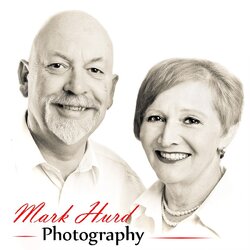
Right, points taken and agreed. Added more space at the top and cloned in about a pixel worth of head. Brought the exposure down on SWMBO's forehead by a tad and a fraction. Also moved the whole image down and to the right 1 smidgeon which seems to give me a jot more prominence.

$Couple2.jpg
 
Phrases you won't read on any other site:
"...I had to steal my wife's hair off another..."
"...cloned in about a pixel worth of head."

Better. Already really good but even better.
 
Phrases you won't read on any other site:
"...I had to steal my wife's hair off another..."
"...cloned in about a pixel worth of head."

Better. Already really good but even better.
We're an odd bunch.

Thank you, Sir. :)
 
A beautiful couple. I personally like white shirt white background shots. So, I am not understanding the grievance in that department.

I tend to prefer my processing look more natural. But that could just be a matter of choice. I dunno.

Its a nice shot.

Re the white shirts on white background, it was a problem in this case because it just looked kind of - bland. I dodged the background white then the shirts looked like they'd been washed in an off-brand laundry powder (grey). When I dodged the shirts they lost definition... you see what I mean? I don't have anything against white on white per se.

As for the processing, when you reach our age you may change your mind. ;) I didn't want my clients to worry that we might drop dead in the middle of a shoot.
 
:biglaugh:You crack me up. I just love your sense of humor.
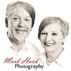
 
Overall very nice image and processing, however I'm not sure if its just me, but your (Granddad) right ear just seems slightly too dark to me. I don't think most people will notice it, but I've found now that I've identified it, thats all I can look at.
And then I'm not sure if it happened due to resizing, but your actual fonts are pixelating quite badly. Improving the resolution of your fonts or finding higher res fonts will give the image a slightly more professional look.

Another thing, is that the lower chest area of your wife has been lightened, but not made fully white, so it just looks very badly overexposed there. Maybe make that bit completely white or bring back her normal skin tone. I think completely white will work better.

Looking at the font again, I think that your "photography" need to move slightly more to the left, right now it is slightly too far displaced from your name above it making the gap before photography just look too big and uncomfortable. I would also add some lines in with the 'photography' to help with your directional forces lines that will guide your viewers eyes from your name (which will be seen first because it is red) to the 'photography' and then use your wifes collar as another directional force to direct the viewers eyes to you two, like so:

$Couple2(2).jpg

I think that the lines will also help emphasise the point that your business is in photography. And personally I think it just help to tie the whole image together a bit more. Some people don't like lines, but I love them :D

Note, in the image I posted, I also lightened your ear slightly and 'fixed' the exposure problem on your wife's chest.
 
Right, points taken and agreed. Added more space at the top and cloned in about a pixel worth of head. Brought the exposure down on SWMBO's forehead by a tad and a fraction. Also moved the whole image down and to the right 1 smidgeon which seems to give me a jot more prominence.

View attachment 46800

I think this pretty much nails it!
 

Most reactions

Back
Top