mooimeisie
TPF Noob!
- Joined
- Feb 17, 2009
- Messages
- 711
- Reaction score
- 12
- Location
- Edmonton, Alberta, Canada
- Can others edit my Photos
- Photos OK to edit
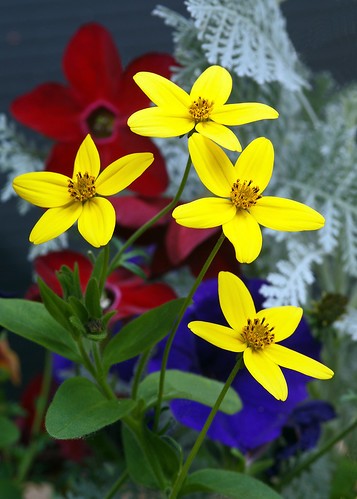
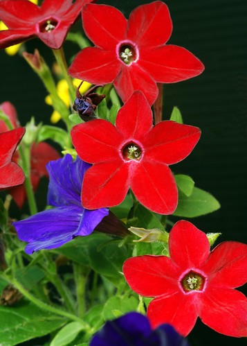
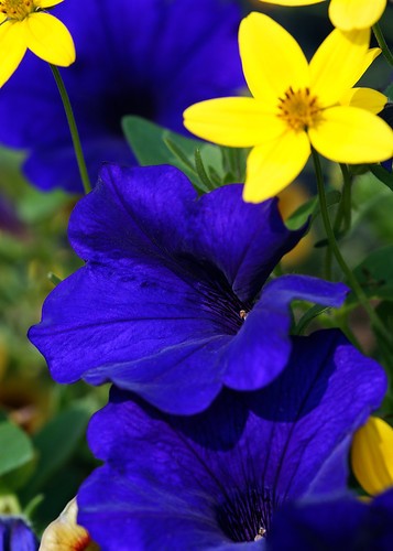
These photos were taken this morning in the bright sunshine. The blue was at f/8 and the red & yellow at f/11. I was trying to use the flowers in my boxes showing primary colors with doing as much composition in the camera so I had as little cropping as possible to leave large files for printing. Thanks for looking and all C&C is welcome and appreciated.
Yellow
Red
Blue
Yellow
Red
Blue
Last edited:


![[No title]](/data/xfmg/thumbnail/32/32162-dd2cfb373402c59de9c6f13cee73b0fb.jpg?1734161046)


![[No title]](/data/xfmg/thumbnail/32/32165-6bb394c486dda7ec16d8fee786f03151.jpg?1734161046)

![[No title]](/data/xfmg/thumbnail/32/32163-b5a5e5cde131a9d14df7f164ab9cb8ab.jpg?1734161046)


![[No title]](/data/xfmg/thumbnail/31/31050-824a861ee359cd274a794fc7b9ff8f7b.jpg?1734159158)