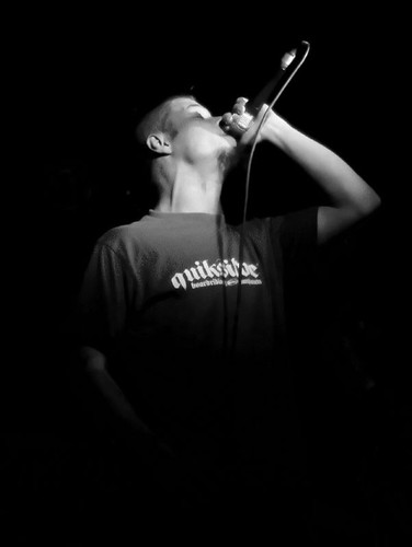
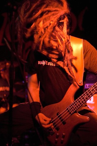
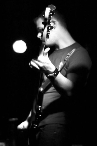
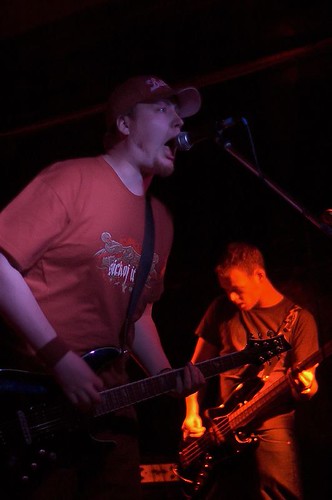
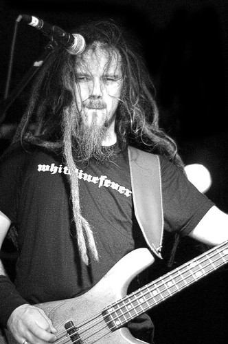
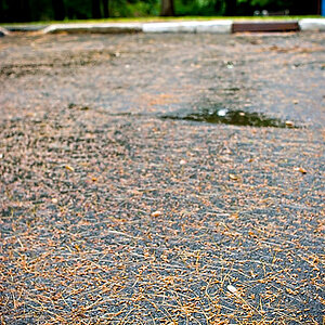
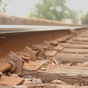
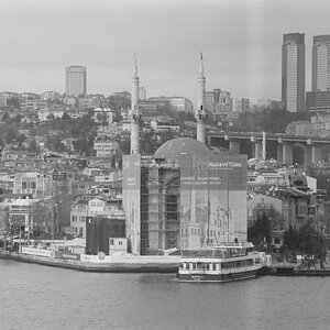
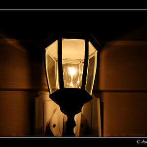
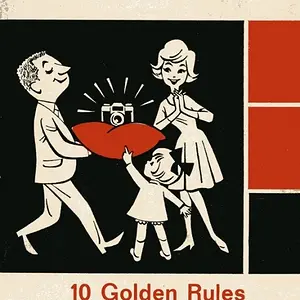
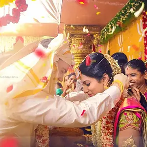
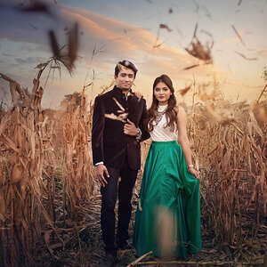
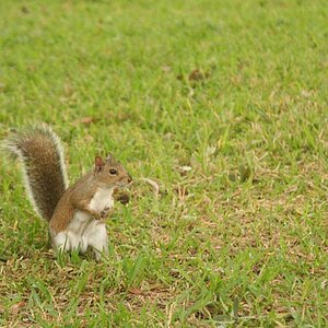
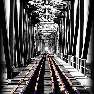
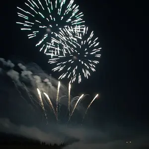
I really like the first one and the third one. good composition and lighting, made them interesting. The second one, the arm and the rest of guitar is cut off which would help in the picture I think. As for the rest of them in the series above, the composition are okay but the lighting seem off. Just my 2 cent.