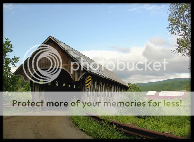
" PURE COUNTRY TIME ""

Joined
May 13, 2007
Messages
453
Reaction score
0
Location
Vermont
Can others edit my Photos
Photos NOT OK to edit
Well I guess I don't have to ask a question to receive a review anymore, which in my opinion is a step in the right direction! BRAVO !!

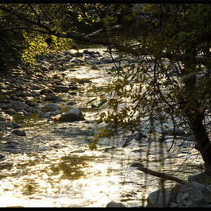
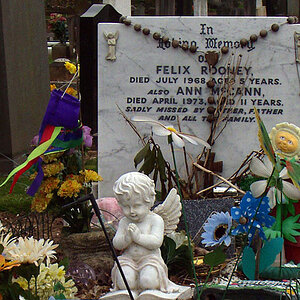
So here s ' a finished product, Critique away !!

I think IMO the shot comes across almost painting like, which personally I like with this scene and composition..


  • Focal length: 9.5mm (35mm equivalent: 37mm)
  • Exposure time: 0.010 s (1/97)
  • Aperture: f/4.5
  • ISO equiv.: 50


CountryTime.jpg
 
Yes it does seem like a painting with those lovely soft pastel-like colours. Composition is great as it keeps me interested for a lon time looking around the photo in the foreground and the back. The anlge of the shed really helps guide my eyes. The textures on the shed are awesome!

So now on to what I don't like about it.
I find the vingetting/shadow edge on the photo very distracting - in fact it was one of the first things I looked at. Esp on the RHS under the tree.

The other thing is the yellow and black sign. It almost doesn't fit in with the rest of the scene because of both it's colours and the graffitti on it. Maybe if it was more the rusty fence colour at the bottom of the photo it would match a bit more.

But the best thing about this photo is the colours I think - they all complement each other so well.
 
the composition and perspective are flawless. the foreground is well placed as it could very easily dominate the image if more were included. the leading lines lend themselves to the eyes being thrown around the photograph, but kept with in it:

1leadct.jpg


the placement of the focus of interest is perfectly placed (yellow) and your use of suggested points of intersection of diagonals (blue) is well done.

2gsct.jpg


the photograph is comprised mostly of primary and complimentary colors which leads to an overall pleasing palette.

the gritty, yet smooth 'road' in contrast with the clean sky lends itself to a grounding of the photograph.

your natural framing by usage of the trees is well done. the verticals are clean and there is enough information to know that they are trees without having to see the entirety thereof.

you selected a wonderful time of day for this shot. the lighting and exposure are spot on and there aren't any distracting deep shadows or blown highlights.

i struggle with the yellow sign. at times my eyes rotate around it, others my eyes fixate up on it.

the vignetting does detract from the image. there also exists a vertical gray line on the left side of the frame. i'm unclear as to what it is, but it's a strong vertical and is distracting.

i'm drawn by the want to walk across the bridge in no hurry to reach the barn in the distance. perhaps reading Poe along the way.

indeed a painterly image, but i'm not fond of the painterly feel. with this image i'm more partial to a little more saturation and clarity.
 
This is a much better angle than some of the past ones youve posted. It fills up the entire frame and does keep my attention for awhile. You still get that feeling of going through the bridge to get to the barn even though the shot isnt actually looking through the bridge.
 
holy c rap! motcons critique makes mine feel a little inadequate.

i didn't have nearly as much to say, as this subject matter isn't my favorite, but for that subject matter i think you did well.

the yellow sign is unfortunate i think, and it may be my monitor (or something that could be attributed to the painterly feel) but if it was mine i would have bumped the contrast almost everywhere but the sky.
 
I tried a few setting in PS, but nothing made it better than it is....

The yellow sign added to the county-ness of the shot and IMO does not distract.

Nice warm country feeling......good composition.
 
I really enjoyed this one. Not anything I would change.
Thanks for showing this to us!

n_sub.jpg


To keep this Forum at a high standard, all responses should contain substantive critique about the image and, if appropriate, suggestions for improvement. Take some time to edit this post by june 28th to meet the guidelines and reference lists. Thanks.


ok........not sure why I have to pick it to death, but here goes: I like the leading lines. It takes the eye where needed. I think the composition is pleasing as well as I like seeing the barns in the background. The color is very pleasing to the eye. Not too bright, not too dark.
So in other words, I like it and wouldn't change I thing.

General Critical Analysis Guidelines
General Critical Analysis References
Specific Technical Assistance Guidelines
Specific Technical Assistance References
 
Meysha... Thanks for commenting... I back you up on the frame..lol... I don't know how that came about, or how to fix it.... I just hit the frame button on the ole Adobe and it runs with it... Had a norm black frame, but how this guy showed up is beyond me ...

Motcom... Wow, first Thank you so much for your time on this photo.. I really do appreciate your involvement with this !! As said above, I got to figure out how to get rid of that fuzz frame ????
Again THANK YOU for your time , appreciate reading your review..

jimismydaddy... I thank you also for commenting...

Mike.. Thanks, I can understand this type work not being your cup of tea...and appreciate you commenting anyway!

PNA... yeah I thought about removing the yellow sign, but then said , hey its country, looked kind of pure without it lol... Thanks PNA..

elsaspet.... Thanks for stopping by!! Appreciate your comment!
 
too bad you cant ditch the sign all together. I think of covered bridges as old past century scenes, without automobile signs lol.
 
It is slightly underexposed which shows up in the less than vibrant greens and browns in the foreground and the limited detail on the front top of the bridge as well as slightly dead brown colours in the wood. I would also like to see a little more detail in the front inside of the bridge as well.

On camera a graduated neutral density filter would have brightened the foreground a little without overexposing the sky. A polarizing filter would have also improved the sky as well. In postprocessing I would work on the sky making the clouds a little more delineated and the rest a little deeper blue, brighten the dark foreground area and if necessary use a filter on the finishing touches of colour correction.

skieur
 
jimismydaddy,,,,Haven't seen a bridge in Vermont without a sign lol... but understand, and feel the same as you...

skieur... hear ya on underexposed, but just like the warm feeling of the shot... I was a little unhappy without the light into the bridge myself.. but it grew on me, as said just the feel of the shot I was overall happy with..

Hey Thanks for commenting skieur ! and jimismydaddy !
 

Most reactions

New Topics

Back
Top