What's new

Quinceanera (Sweet 15) Session. C & C If You Please.

Scoody

No longer a newbie, moving up!
Joined
Feb 18, 2011
Messages
395
Reaction score
124
Location
Texas
Can others edit my Photos
Photos OK to edit
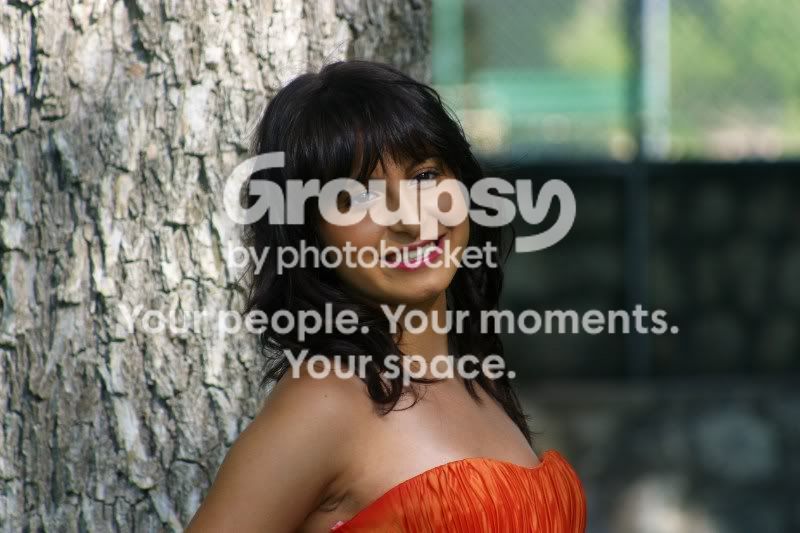
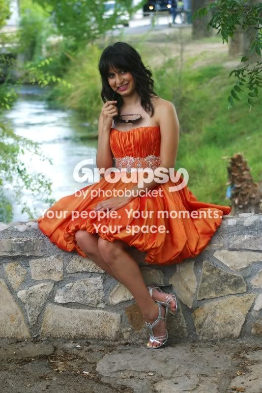
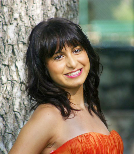
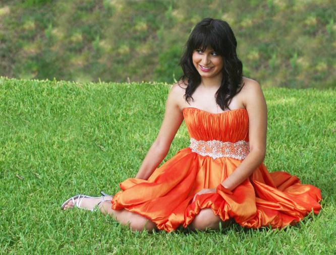
Did a Quinceanera session the other day. A very pretty girl was the model and she was a natural in front of the camera. Her mom absolutely loved the photos and bought almost the full set. Me, I know they could be better. A couple seemed a little soft among other flaws. What all is wrong here?

Number 1/Uno

IMG_8417a.jpg


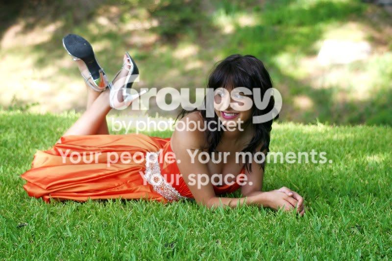
Number 2/Dos
IMG_8469a.jpg


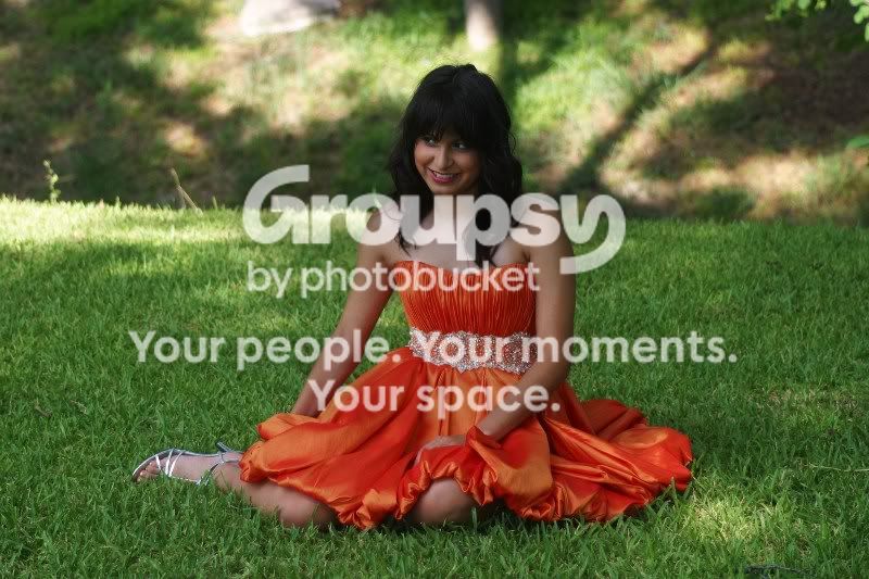
Number 3/Tres
IMG_8444a.jpg
 
Last edited:
Mom brought her to the shoot and she was a distraction. Even though she is looking away in the last shot, I do like the cat-that-ate-the-canary look of mischief in her eyes.
 
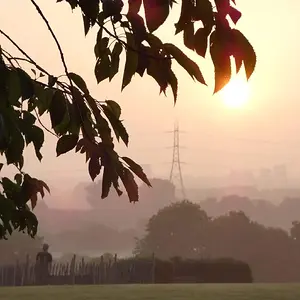
Here two where she is looking where she is supposed to.

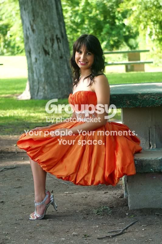
Number 4/Cuatro
IMG_8481a.jpg


Number 5/Cinco
IMG_8490.jpg
 
Last edited:
Oh come on Scoody! You know to number your photos by now!

Let me have a go at it...

I think over all they are not bad. As evidenced by her mom buying almost all of the shots, you obviously did a good job. The following are things that I think you can look at to get even better shots next time and maybe even sell ALL of them =)

1 2 and 3... Dappled sunlight is almost always a bad thing in portraits. The light and dark draws the eyes all across the image.

1. It seems a little underexposed. There is no detail in her hair that could probably be fixed with sharpening? I saw someone fix this the other day though I forget how. The bright spot on her right breast is a bit distracting. I can't tell if it is a dapple of sunlight or her tan line from wearing a swim suit. Either way try to even the skin tone there. I think this would be a lot better with the two lines not stabbing at her face. The light and dark at her face with those lines is terribly distracting. It would have been nice to have her looking directly at you with a little more catchlight in her eyes.This is a quick edit I did.

foYCe.jpg


2. Smile looks forced. Same in 3. Having her facing more towards you would have elongated her body and made her look more sophisticated. Make sure her hands are doing something. They just looks kinda "laying there" to me.

3. Don't be afraid to "fluff the dress" (Big Mike can give instruction on how to do this) The knee peeping out looks out of place. It should have been covered or the whole leg should have been exposed. The floating right hand is the same. Though it should have been showing (side to you not the flat back of the hand) with the dress covering her knee.

Again, not bad overall, just some thing to pay more attention to.

 
She is centered in everyone of the pictures!
 
Jeez, man, crop out the car head lights in the still yet to be number image.
 
Number your shots so we can tell ya what we think!!!!!!!
 
#4....looks like she only has one leg.........odd
 
One is centered, and it shouldn't be.
One isn't centered and it should be.
One needs leveled.
One has a rather awkward crop.
One needs the blue bit, or even what it is attached to, removed.
One should have been shot portrait.
 
One is centered, and it shouldn't be.
One isn't centered and it should be.
One needs leveled.
One has a rather awkward crop.
One needs the blue bit, or even what it is attached to, removed.
One should have been shot portrait.

Okay, now that they are numbered, which critique is for which image?
 
She is very photogenic, which is an attribute of the photos you weren't able to take maximum advantage of.

The light is so very important.

Dappled light is a poor choice to use in outdoor portraiture. Avoid it like AIDS, unless you can use it like a leading line. Human eyes are immediately drawn to the brightest part of a photograph. Having that brightest light in the background doesn't help make your subject the star of the show. But, isn't that what they pay for, to be the center of attention, the star?

Find and use open shade. And supplimental lighting. White foamboard from Wal-Mart or Staples is cheap and can be used as a reflector.
Did you scout the location before hand?

The concrete picnic table she is sitting on, and the one growing out of her head in the background of the same shot is...not good.
You didn't move the stick in the foreground, or the cigarette butt and trash at her feet in the bridge shot.

All the locations you posted here had issues of one kind or another. The devil is in the details. I recommend working on seeing more of them before you release the shutter.
 
No comments on my edits? I was just trying to help show what I meant. I know they are bad heh...
 

Create an account or login to comment

You must be a member in order to leave a comment

Create account

Create an account on our community. It's easy!

Log in

Already have an account? Log in here.

New Topics

Back
Top Bottom