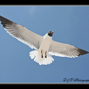
Not a big fan of 1 or 3. They look almost like accidental exposures. Is there a content message I'm missing in those?
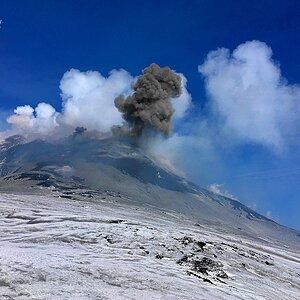
#2 is very pretty! Esp. lighting wise. It does feel horizontally cramped, though. Just barely clipping off the nearest circle part on the left, and cutting the arm on the right into multiple pieces



![[No title]](/data/xfmg/thumbnail/42/42459-a7a996b715ff4999d07738140fdd0fe3.jpg?1734176996)



![[No title]](/data/xfmg/thumbnail/42/42460-80970c44cc9fb42dd0c86d08e7bc401d.jpg?1734176997)
![[No title]](/data/xfmg/thumbnail/42/42456-a5a32b76e115de404d99d09173cd71f2.jpg?1734176994)