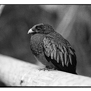
My main problem with this picture is that it's a little bit too simplistic and therefore a little boring. Don't be put off though, your photos are interesting in that their different and that's always important.
My main problem with this picture is that it's a little bit too simplistic and therefore a little boring. Don't be put off though, your photos are interesting in that their different and that's always important.
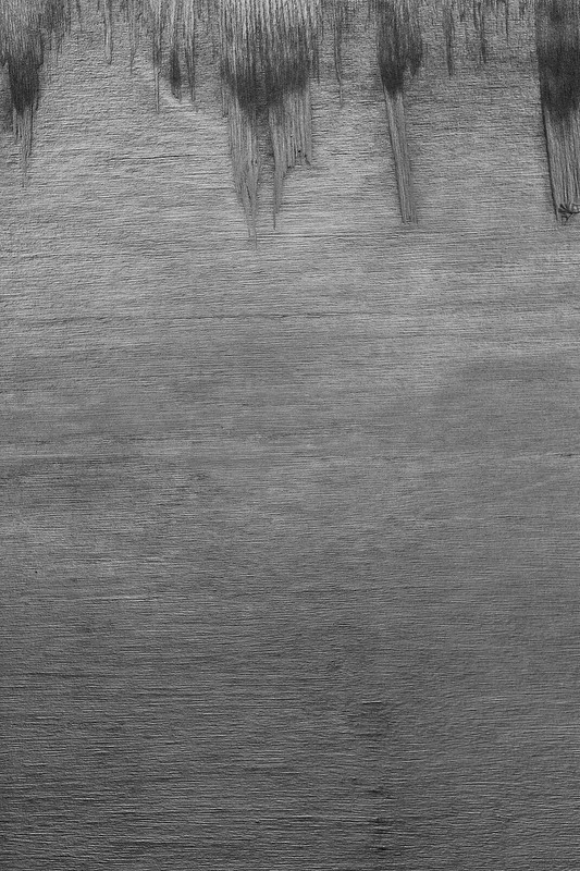
Unpop, I'm not as big of a fan of this one as I am of your pathway. This one lacks contrast overall, but I think with some inventive processing you could create some more contrast between the elements. I also think there may be too much negative space at the bottom. An 8x10 crop might look nice.
I would tend to agree, there is too much negative space, but I also like the line formed on the bottom third. I'll look into it later.
As far as contrast, I like the subtlety and "graphite" look. I had it the shadows pulled a bit, but as you may have already figured out, I prefer things a bit flatter than most.




 Do settings need to be adjusted when using an adapted lens?


![[No title]](/data/xfmg/thumbnail/32/32165-6bb394c486dda7ec16d8fee786f03151.jpg?1734161046)

![[No title]](/data/xfmg/thumbnail/38/38724-0b9c26c57726c91c6c504310e4428e55.jpg?1734172598)
![[No title]](/data/xfmg/thumbnail/32/32164-d68fa2de02f9bef524bbd68aac2f12e4.jpg?1734161046)