What's new

Railroad Shop

unpopular

Been spending a lot of time on here!
Joined
May 17, 2011
Messages
9,504
Reaction score
2,004
Location
Montana
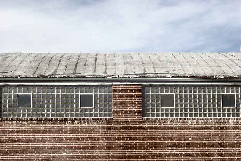
A bit cliche, but it's what i've got today :)

7153946303_1314456a8f_b.jpg
 
I love the roof texture and the contrasting textures in general. Overall though, it feels too symmetrical, perhaps flat, and even a bit overexposed(?). I'd love to be able to click to a hi-res version. I'd also reduce the amount of visible sky unless it had something more interesting to add.
 
Not symetrical enough for me. As a result, I would lose the symetry completely by cropping out a sliver in the left and crop out the far right window at a point mid way between the 2 windows. Symetry doesn't work for me unless there's perfect symetry. Others probably feel differently. Then I would either adjust the black point, the curves, or increase the contrast. The image has nice texture, but is too flat and the impact is lost.
 
I don't think there lacks contrast. The shadows are open, which is something I value. I'm not a big fan of the punchy slide film look which we've come to expect in color photography. Symmetry could use some work, I'll look into cropping when I get the chance. Not so sure about the sky. I feel it adds atmospheric context, but I appreciate your thoughts, Jaemie, and will see if less sky helps at all. Thanks for the feedback.

 

Create an account or login to comment

You must be a member in order to leave a comment

Create account

Create an account on our community. It's easy!

Log in

Already have an account? Log in here.

Back
Top Bottom