Random selection for C&C please..

MillerPhotography

TPF Noob!
Joined
Sep 21, 2011
Messages
17
Reaction score
0
Location
Essex, London, England
Can others edit my Photos
Photos OK to edit
Hi, here are my first selection of photos from my first DSL, a Pentax K-R with 18-55 DAL kit lens. All C&C is very much welcome..

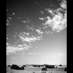
1. This was taken early morning, and I liked the brooding sky and the fact, although not greyscale, there is a limited colour palatte.

Seaside.jpg


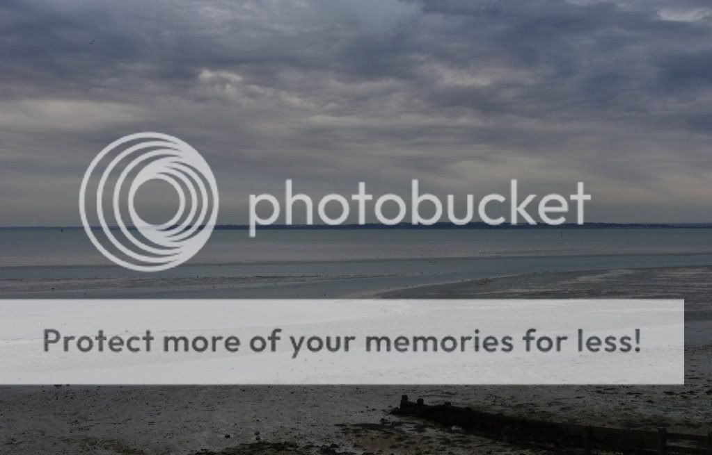
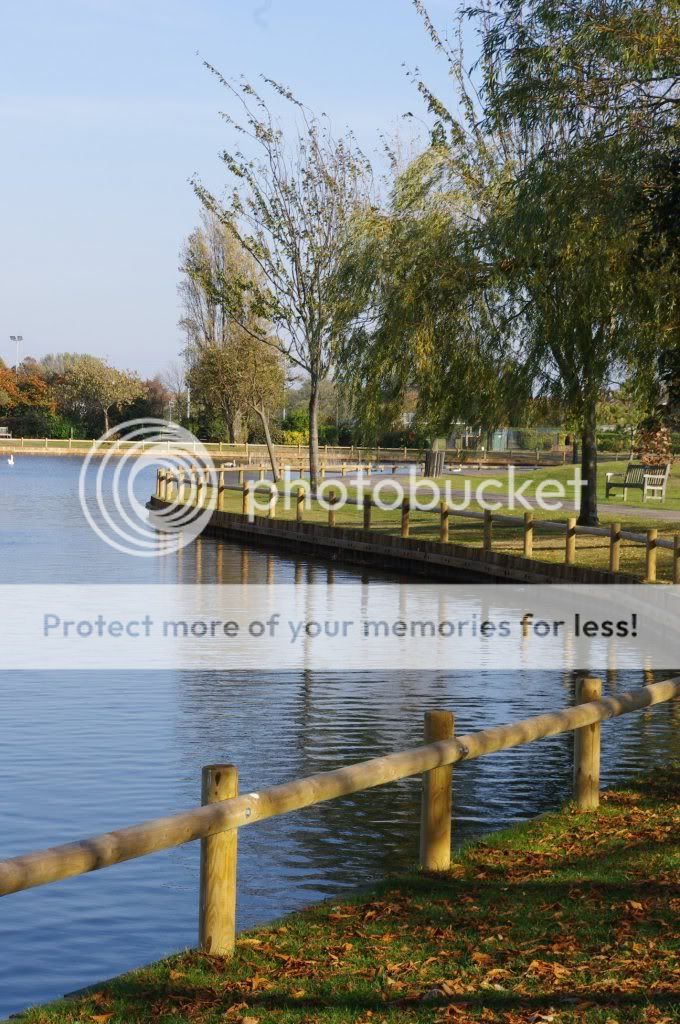
2. Lake, I took this one as I liked the curvature of land versus lake, it seemed to split the composition nicely.

Lake.jpg


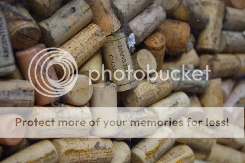
3. Corks - could this be used as a print by a wine lover?

Corks.jpg


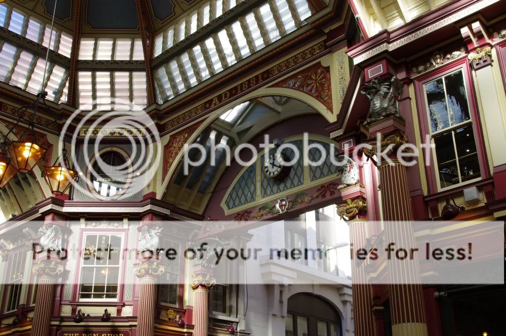
4. Leadenhall Market, London. I liked the colours in this one, and the building framed in the exit of the market to the right.

Leadenhall_Market.jpg


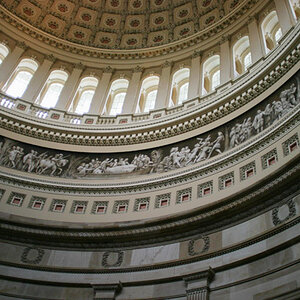
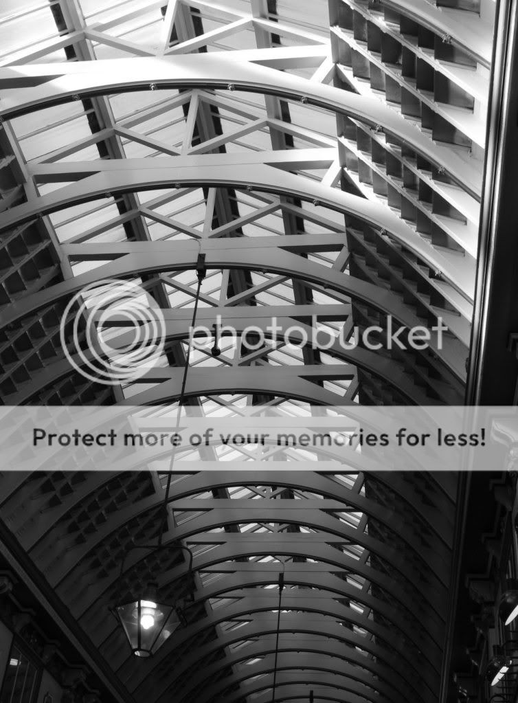
5. Repeating beams of the market roof, along with the hanging light that sits in the area of darkness to lighten that part of the composition.

Leadenhall_Market_Roof.jpg
 
#1 does not hold my attention. It has no subject, the horizon is splits the image in half, is underexposed

#2 is much better. Interesting landscape subject, well exposed, nice compositional elements, duality between light and dark and between land and water, contains nice curved elements and strong linear elements.

#3 nice idea but, ... depth of field is too shallow, general lack of contrast, could be helped with a bit more saturation.

#4 nice exposure. Brings out the subtle colors in the architectural details.

#5 an attempt at abstract interpretation. It needs to be stronger, it has no drama.
 
Thank you for your comments. I think in shot one I didn't use the two thirds rule although I think it exposed correctly as it came out how I saw it. Was very early morning and quite dark, I liked the dullness of it if that makes sense lol with a low contrast.Maybe the cork pic would have been better B&W, I'll give that a try.Thanks again and welcome any further comments.
 
Some interesting and some not so interesting...

#1. needs some brightening up and horizon splits the image - check out rule of thirds...
#2. nice composition - curving lines etc., but would have been a lot better IMO if you hadn't cropped the curving fence on the right, this cuts the "flow" of the curving fence line to take the eye through the image. Again, watch your "horizons" - your pseudo-horizon of the shoreline on the far side of the lake almost cuts the picture in half and is not as level as it could be.
#3. interesting sort of abstract - not my "cup of tea" but will appeal to some...might be a bit better if all the corks had been in focus - my opinion FWIW
#4. this one is very cluttered and has no obvious object of composition, at least not one that any of the compositional elements make stand out...looks like just another snapshot. The exit does not really "frame" a building, just part of it and this adds to the clutter - IMO.
#5. Nice image and nice conversion, but unfortunately the hanging lights clutter the image up as it is presented because, to me, the image is really in the repeating patterns of the beams . Don't know the "area" but the subject/image, as presented, does nothing for me - but then maybe that is just me.

One of the issues that I find in my own photography is that I often look at something - scene, indoors or out and think - "hey that looks neat" - only to be disappointed when I see the image on my screen - it just didn't capture the "feeling" of the scene that I felt when I was there - I sense that this may be something that you have to think about from time to time - what is the "feeling" in the scene that I am trying to convey to my audience(?) and how do I best do that. My 0.02¢...

Cheers,

WesternGuy
 
To me, I feel the left side of #4 distracting. The lanterns tend to catch my eye before anything else.

Love the cork picture
 

Most reactions

New Topics

Back
Top