Recent "Senior" Session--NEED C&C

brobinson

TPF Noob!
Joined
Dec 25, 2007
Messages
19
Reaction score
0
Location
Raleigh, North Carolina
Can others edit my Photos
Photos OK to edit
Hello,

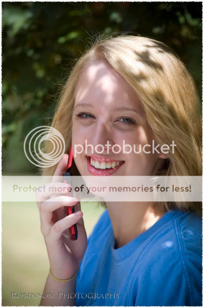
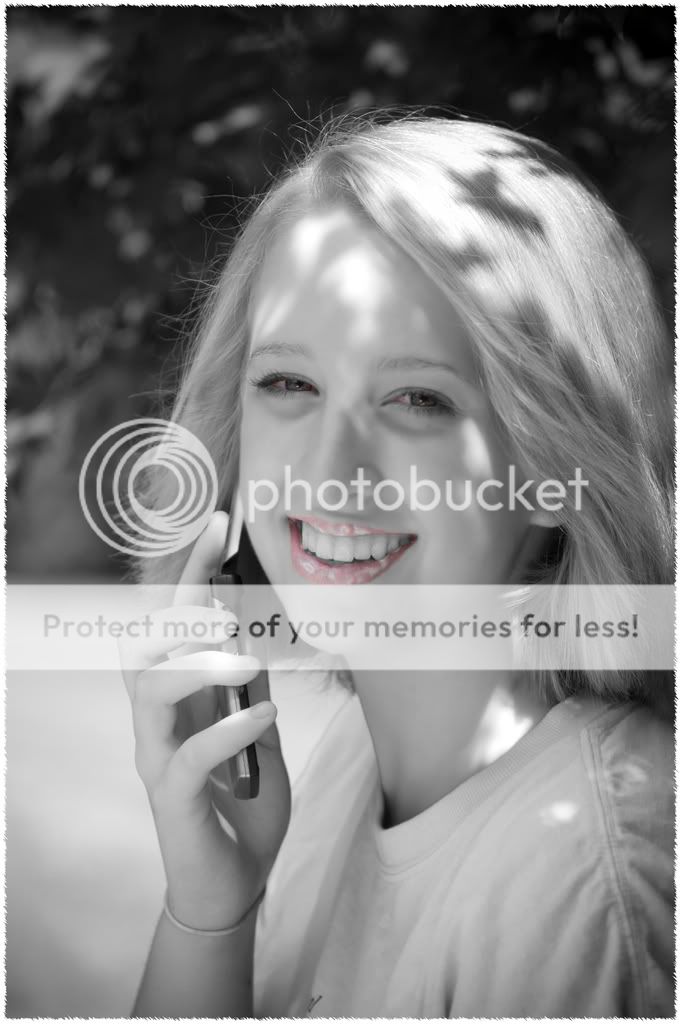
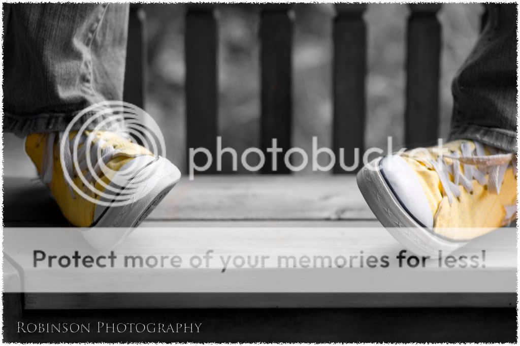
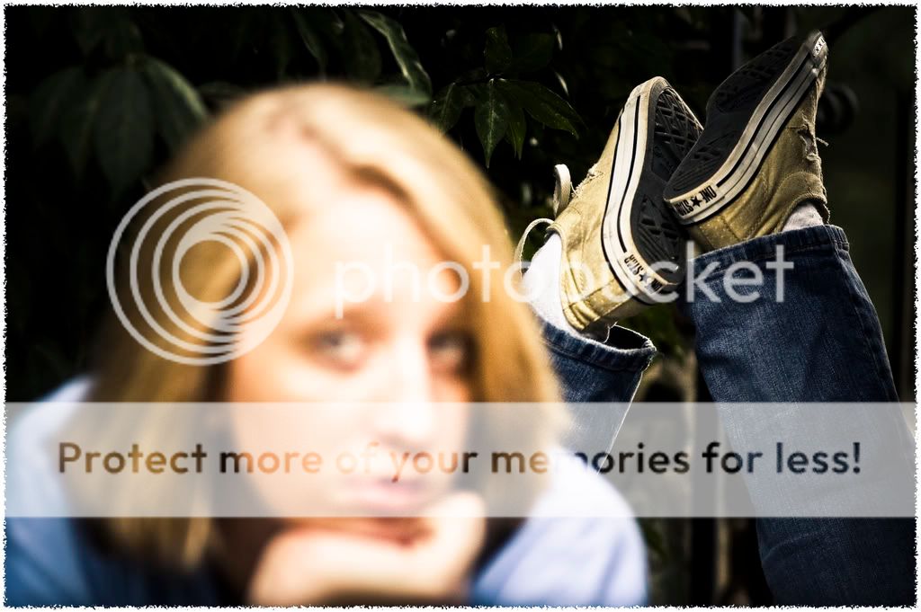
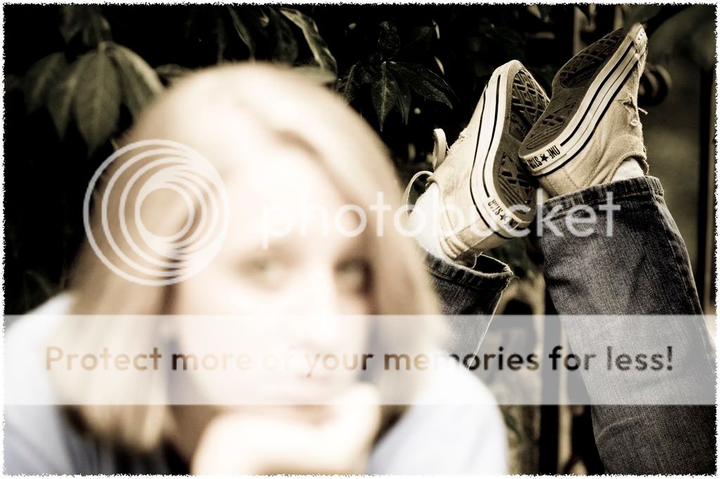
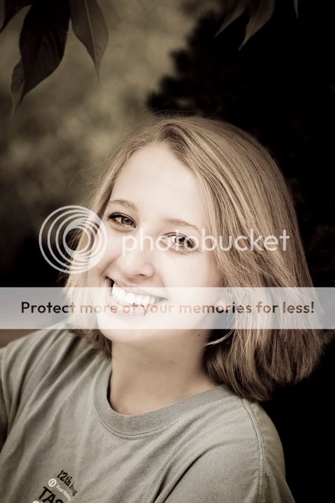
I recently had a friend sit for a "senior" photography session. I am not a professional by any means, but I'm trying to work on posing, lighting, outdoor conditions, etc. Most of these were shot with my 100mm f/2.8. I would love some C&C regarding the composition and the post-processing.

1).
kate.jpg


2).
kate1.jpg


3).
kate2.jpg


4).
kate4.jpg


5).
kate5.jpg


6).
kate7.jpg


Thanks in advance!
Brendan
 
Well, I definitely like some of the photos... I like #3, although there is some ghosting on her left foot which is distracting, and I'm definitely not a huge fan of selective coloring, but, sometimes it works. #4 is a creative idea, making the face completely blurred but focusing on the shoes.

Another bright side is that all of the photos (with the possible exception of #3) are very sharp, and I think well composed (though the last one may have a little much headroom).

On the downside however, is that I would say that for senior portraits I don't think they work well. I definitely like them as shots, just not as senior photos. I think that although the cell phone is very important for her, it really detracts from her. In numbers 3-5 the fact that they don't have her face or that it's not in focus would make it so that it probably wouldn't be a shot she would ever hand out to people (which is what I assume is the purpose of senior photos... maybe I'm wrong). #6 almost works, I generally like the semi-desaturated look you gave it, but it's got a lot of head room, I don't like the two leaves coming in at the top left, and the lettering on her shirt is rather distracting (I love the eyes though).


Hope that helps.
 
C&C per req:

I can only assume that the "Senior Portrait" is something indigenous to the US as I've not encountered it here in Canada, and so therefore cannot comment on how appropriate the images are from that perspective, however, I'll offer comments assuming that these are portraits of a young lady.

1. Nice pose and expression, however dappled light is very difficult to work in. I think a reflector was needed to provide more even facial illumination and generate some catchlights for the eyes. Good background. The cellular telephone doesn't really bother me one way or the other.

2. This does not work for me. Selective colouration can (rarely) be used on people to good effect, but it needs to be a strong contrast (eg bright blue or green eyes). While not so evident in the colour version, it's clear in the monochrome; the lipstick doesn't follow the contour of her lips. At the very least this should be filled in in post.

3. Well done, but, not really portrait work.

4, 5. Sorry, don't like either of these. I honestly can't think of an occasion where you would want the feet sharply focused and hte face not.

6. Nice, like the pose and expression; would like to see a full colour version as well.

Just my $00.02 worth - your milage may vary.

~John
 

Most reactions

New Topics

Back
Top