Recent Wedding - Please CC

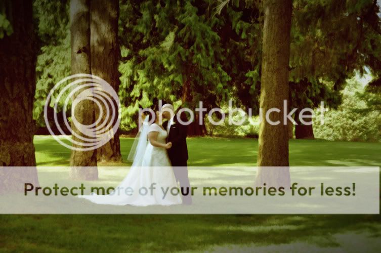
1- I'm not really digging the "fairy tale" look of the picture. I find the couple is also a bit too centered in the image, even if they are off center.

2- I'm not liking the selective colouring. And the colour that has been kept looks a bit too radioactive and totally fake.

The one of them walking down the isle has an odd angle to it, and its too zoomed out. There is alot going on in the image and zooming in would probably help isolate your main subjects

The last one is creative, but I don't like the choice of the foreground image - ie the empty church. It gives a whole ghost / creepy feel to the image.
 
i agree 100% with twinky...
a couple general comments too...
the lighting on the indoor ones seem rather harsh...could you share your setup?

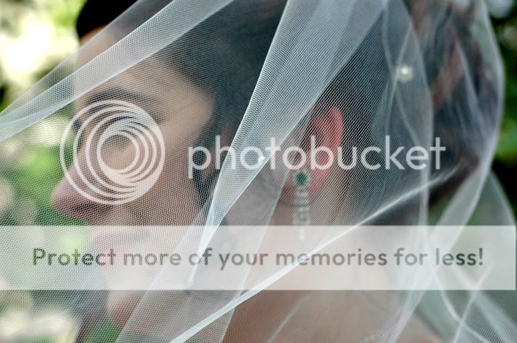
the one with the veil seems to focused on the veil itself. (it comes off to me as a missed focus...but im not a wedding photog so maybe this is common?)

the guest book one is cute, but it appears that only 4 people signed it.:(

i think some of these could be improved with some PP.

*EDIT*
here's a 10minute PP job on one of the photos.
this look may not be for everyone, but just an idea of what i think could be done to add a little something to it.

3725016928_92d3cbe685_b.jpg
 
Last edited:
SrBiscuit...I can't see the originals (blocked at work) but your image is a bit cool for me.
 
Thanks guys for taking the time to evaluate my
photos, gives me some things to think about.

"the lighting on the indoor ones seem rather harsh...could you share your setup?
"
Well, I just use a Nikon SB800 mounted on the camera, that's it. Oh, and a white diffuser.

"i think some of these could be improved with some PP.
"
Um, I don't know what PP is.

-Bob
________________________________________
http://www.squidoo.com/starting-child-photography-business
 
Last edited:
SrBiscuit...I can't see the originals (blocked at work) but your image is a bit cool for me.

looking at it again, you are quite right....definitely a bit cool...all i really did was desaturate...i should have warmed it up though.:thumbup:
 
The first one is very nice! Nice pose. Good placement of the couple within the setting. Did you consider vignetting?

ArmstrongWedding108.jpg


The sixth one is interesting, but could use a big bump in contrast.

ArmstrongWeddingOriginals242.jpg


-Pete
 
Thanks for your reply Pete. About the vignetting, for some reason I tend to
forget to do that. It would enhance that first pic I'm sure. The veil photo,
yes I agree, could do with more contrast. Maybe sometimes I'm in too much
of a hurry, and don't stop to think how I could make an image a lot better.
Gonna work on that.
-Bob
____________________________

Child Photography
 

Most reactions

New Topics

Back
Top