I'm looking these on a crappy monitor at work, so don't take me seriously but here we go...
First of all, there are too many photos here and I just can't offer much of constructive criticism because I'm overwhelmed
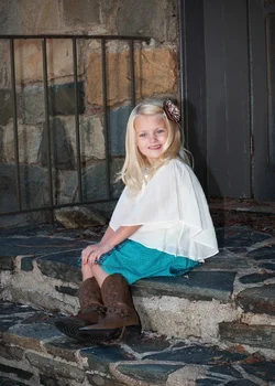
#1 smile is forced and that's my biggest critique. it would be much better if she looked at you. Again, harsh light. You could get more pleasing background by moving her more left or more right
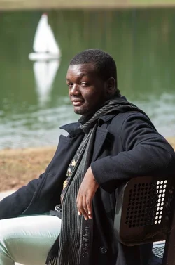
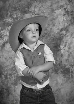
#2 I like expression, don't like how you cropped his left arm. no catchlights in the eyes
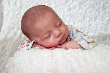
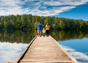
#3 you could come closer, they should be bigger in the frame considering light conditions and background. Because of harsh light you have some blown out blobs on the stairs and I'm constantly looking at them.
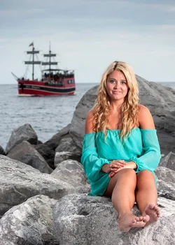
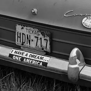
#4 I like the dude but don't like the crop.What should be the subject, him or the boat? the boat is white and gets all of attention
#5 and #7 harsh light and unflattering pose. #5 Where are her curves/legs/hands? #7 Don't shoot straight on people. Rarely it is flattering for anyone. You should pose a woman to show her curves. Spine needs to be straighten always when posing. Collarbones shouldn't be strait forward. Why is she so sad?
#9 I like it the best

think it's a bit over processed but, that might be just my monitor.
Kids shots I like the most, but can't comment anything because I'm afraid of my monitor...










![[No title]](/data/xfmg/thumbnail/31/31097-95606cf1bf0ecc862078bc333f20d4f7.jpg?1734159259)