Reflected Sunrise. B&W or Color?

zulu42

TPF Supporters
Supporting Member
Joined
Jul 18, 2015
Messages
4,148
Reaction score
5,993
Location
NV
Can others edit my Photos
Photos OK to edit
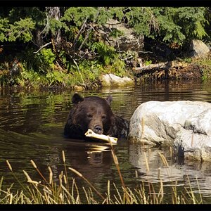
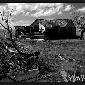
Special thank you to SquarePeg for the inspiration in the weekly theme!


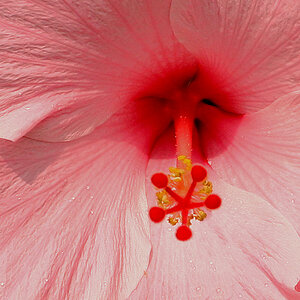
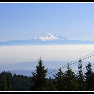
I like the B&W for the shapes, but this shot had some interesting color also.
Which version do you prefer?

Any C&C most appreciated, Thanks for looking :)

Reflected Sunrise Crop BW-1.jpg


Reflected Sunrise Crop-1.jpg
 
B&W for sure. It’s great as is, but I feel like I might selectively lift a few of the dark shadow areas just a touch.
 
Thanks very much for the replies.

Destin, are you thinking about bringing up the foreground a bit?
 
Thanks very much for the replies.

Destin, are you thinking about bringing up the foreground a bit?

Not the entire foreground, but the area underneath the railing maybe. I’d also bring the sky up a bit in the BW version I think.

I’m not certain I’d like these changes, but I’d play with them and see.

Just 100% personal opinion, YMMV.
 
I appreciate your suggestions and will try them out :)
 
Black and white, hands down. The colors detract from what's truly interesting about the scene - the shapes, the light, the overall geometry of the composition.

I personally am a fan of shadows, and in this case, I am not convinced seeing more detail will add anything.
 
B&W and I'd leave the shadows nice and dark: they provide a feeling of stability and solidness.
 
Thanks very much for the input.!

Okay, the votes are in... a moment to calculate the results ..... hmmm, let's see... carry the one... Aaaaaaand... The winner is...

COLOR!! Kidding, of course.

I made a few final adjustments, as this may be the first of my images to go up on my wall. Intending to lighten the sky a little, eventually I actually darkened it a tiny bit, helping to frame the shot and contrast the building.

I had a happy accident with this image. stepping back, the overall composition had a familiar feel. I realized, the shape. It's Yin Yang. I wish so much I had intended the compositional reference! In fact, I'm going to tell all my friends that I composed the image as a play on light vs dark, structure vs nature, yin and yang. It will be very deep and profound of me!

Any last editing comments before it goes to print, otherwise thank you so much for looking and commenting!!


Yin Yang
Yin Yang-1.jpg
 
Looks a little darkish. While I like B&W, and like this in B&W, I actually like the color version better. The panes of glass across the bottom are such a range of subtle color differences, tans and blues. When you remove the color those are not that different in tone (they are somewhat because there's some range of black and white) but I like the nuances of color in this.

With B&W I learned in darkroom work to adjust for a 'black' black and a 'white' white somewhere in a photo. And found to not look at highlights or reflections for that; usually if I'd use that as my 'white' white it threw the whole thing off. I'd adjust for the white maybe in the reflected clouds. Of course on here it seems to show up a bit more grayscale I think.

If anything I might have shot it a little tighter, particularly along the left side. But a nice photo and great use of the sun low in the sky with that subject.
 
Thank you for commenting.
I aslo find the color version hard to ignore. Each pane is like a filter, reflecting different parts of the spectrum.

I have a difficult time committing to editing decisions. I think I will be happiest with this, as a print, in B&W, provided I can get a pleasing conversion and print.
 
I vote for the color also. While I like contrasting shadows and tones in black and white usually, the color version directs my interest toward the reflection because of the subtle shades there.
 
Color. But, to be totally honest, I prefer a color photo to a b&w 99% of the time.
 
Either one in my opinion. A good photo is a good photo. When you are torn, it's a good photo.
 

Most reactions

New Topics

Back
Top