Reflections for C&C (BESP)

pharmakon

TPF Noob!
Joined
Aug 7, 2009
Messages
365
Reaction score
7
Location
Western NC
Can others edit my Photos
Photos OK to edit
This weeks BESP Project - the distorted view, we were to take a picture utilising a reflective surface that would distort the image in some way. The object used to reflect the image should not have been obviously apparent.

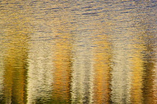
My first photo is River of fire. It is the reflection of a brightly colored building that was built right on the river bank. This was shot late in the afternoon and the sun was shining directly on to the building.
4494983391_53412e912d.jpg


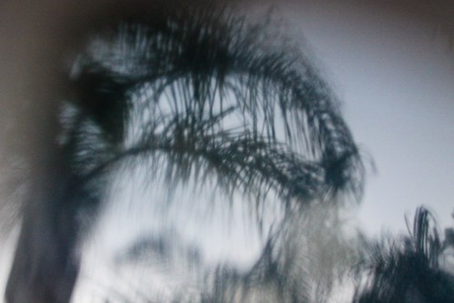
My second image is misty palm. I chose this because it seemed to have an eery cold feeling. I also thought it had a look similar to that of a pinhole camera.
4494984927_b3dd1833e2.jpg


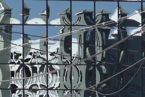
and just for kicks... the most frustrating pic I have ever taken. I tried on 3 seperate occasions to make it work (climbing up in different buildings and different angles from the street), but I just couldn't find any angle that looked interesting without all of the foreground distractions. This was about the best I could get.
4494984241_542f1bd0fb.jpg


This was yet another challenging assignment for me this week, and again something that makes me always look at things differently now.
 
I love the last one, it's a bit of a pity about the power lines in the front though. In fact I think that is one of coolest photos I have seen in a long time. The other two don't really do much for me.
 
#3 is super cool. The power lines(?) don't really bother me, the sweeping lines cut the vertical and horizontal ones of the windows(?).
 
Fokker:

That's exactly why it was so frustrating for me. I spent literally hours trying to find a better angle, but the only high vantage points didn't have anything interesting reflected in the building, and everything from the street had power lines/signs in the way.

reznap: thanks. I think it would hae been ok had there been a couple of lines, but there are just so many it becomes a distraction to me.
 
Well, you can only do so much, it's still an awesome shot I'm glad you posted it. Maybe someone with a lot of photoshop skill and too much time on thier hands could clone out the wires but it would probably be a pretty big job.
 
#1 is neat. I want to flip over though. I think my mind wants the blue ripples as a baseline *shrugs*.

#2 What was the reflective item?

Love #3. I like the powerlines myself. This seems busy, but enjoyable. My eyes roam all over again and again, piecing the puzzle together. A personal preference of mine on something like this is to clean up the distortion, and get all the verticals and horizontals true, and try to frame it with the grid that you have. But again, that's just me.

I do find it funny, that after everyone had such a hard time going abstract, and this project could be totally representational, that I am seeing so many abstract images. :)
 
you know, i would cnc but i got kicked from the group for messing with bitter so
 
Fokker: I started to clone earlier today.... gave up. It was just too much.

Bitter: funny you mention flipping #1 because it's upside down. I flipped it to give the look of fire and smoke.

#2 the reflective surface is a solar panel. It had lots of water stains, leading to the blurriness, and very close. I almost rested the lens right on the panel.

I will work on #3 some more, I had actually straightened up the perspective before I started cloning, but I scratched the whole thing when the cloning didn't work. What I posted is straight from camera + crop only, since I didn't think it would be the winner.

iBats: Not sure what that has to do with me. I'd still be happy to C&C your photos when I see them, even if they're not from the group assignments.
 
I like #1 and #3... nice colors and lines, even with the power lines... they're not so identifiable as such. #2... I do get the eery feeling you wanted to portray, but it's not enough to hold interest for me. And don't worry about feeling sub-par, I felt the same this week.
 
I like # 1, IMO this is the best of the 3. The color in the river is really amazing along with the texture in the water. Nice shot.

#2 I don't get it. It looks to me like those palms shown in the weather channel after being hit by a huracan. I don't see the reflections.

#3 I like it too. Because of the distorted forms shown and the contrast of the colors. I wish the cables weren't there.

In general it was a nice job.
 
Nice work.

#1 - I like the colors but the building is not very easy to make out.

#2 - stormy mood, I wish the trees were more in focus.

#3 - Very cool. My favorite by far. The power lines add to the chaos (which I think is good).
I did try a crop, to see what less windows would look like. Turns out almost like a storyboard.

4506495619_c55bfaeb18_o.jpg


Fast Eddie
 

Most reactions

Back
Top