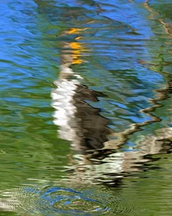
The more I look at this, the more I like it. I like the contrast between the yellow head (?) and the ripple. It might benefit from a crop to remove the curved branch at the top right, though, I think it adds a third visual target which isn't needed. Something like this, maybe?
I like, but it's a bit too clear what this is a reflection of.
I think a bit more abstraction would have made for stronger image.
Hard to say with abstracts though.
I like it. I like the colors. They could be pulled out a bit more. Nothing wrong with bending pixels to create your vision. The ripples are confusing, though. First thought was, "So the subject is this. .... Or this?"





![[No title]](/data/xfmg/thumbnail/40/40306-ea393f71adcd88a9abb9fb16dc6af2d5.jpg?1734174714)
![[No title]](/data/xfmg/thumbnail/37/37634-504722605a418b398f3cd1dbabf936e5.jpg?1734170757)
![[No title]](/data/xfmg/thumbnail/40/40284-f59f6230f0d5b9eacf977f8b0392f087.jpg?1734174694)
![[No title]](/data/xfmg/thumbnail/37/37603-739c5d9b541a083a12f2f30e45ca2b7b.jpg?1734170731)