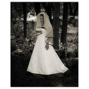
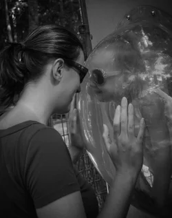
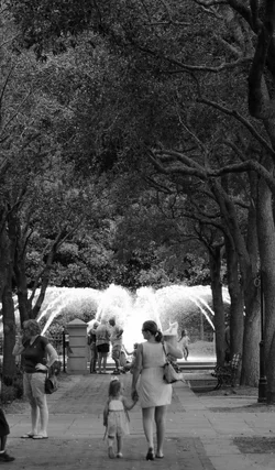
The first is a very cute picture and a good concept. As executed it will mostly appeal to the people in the picture. With a little more visual pop, more contrast, more appealing light, and perhaps a bit more attention to the symmetry of the situation, you could easily have something very very good.
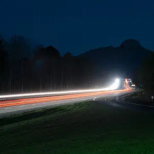
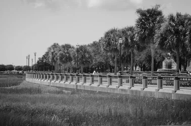
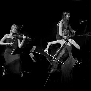
The second one is not very sharp, but more importantly lacks and clear subject, and central point of interest, all of which are specific cases of the general problem: There's no hierarchy of visual interest. Where do I start? What's the important thing? What's the interesting thing? What are the second most interesting things -- where do I go next? It's just a mass of similar tones and textures.
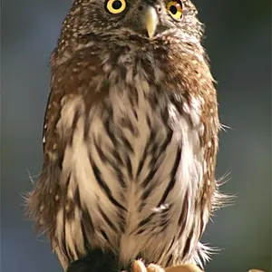
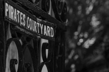
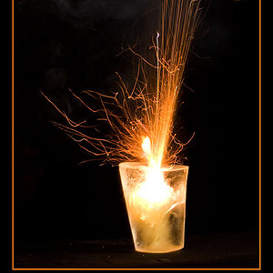
The third one if quite nice.
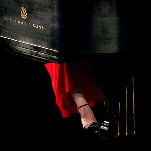
The fourth one is another one that could be excellent with some slightly different execution. The mom and child are, I assume, the interesting things, but they don't pop out visually. The fountain behind them does.







![[No title]](/data/xfmg/thumbnail/35/35948-700e0d840da0ca73727b1bd6d99b4142.jpg?1734167751)